AMA Designs
Roles: Brand design, product design, creative direction, photography, website design
Date: 2017 - 2024
Tools: Figma, Adobe; Photoshop, Lightroom, Indesign, WIX, Zettle, Shaper 3D, Rhino 3D, Procreate
Project Details: AMA Designs is a creative brand I founded and developed, beginning with handmade wooden homeware and expanding into jewellery and accessories. I led the full design process across branding, packaging, product, and digital, including logo development, colour palette, e-commerce website design, and supporting visual content. The goal was to create a cohesive and tactile brand experience that reflected the handmade nature of the products while feeling fresh and contemporary across physical and digital touchpoints.
Brand & Visual Direction
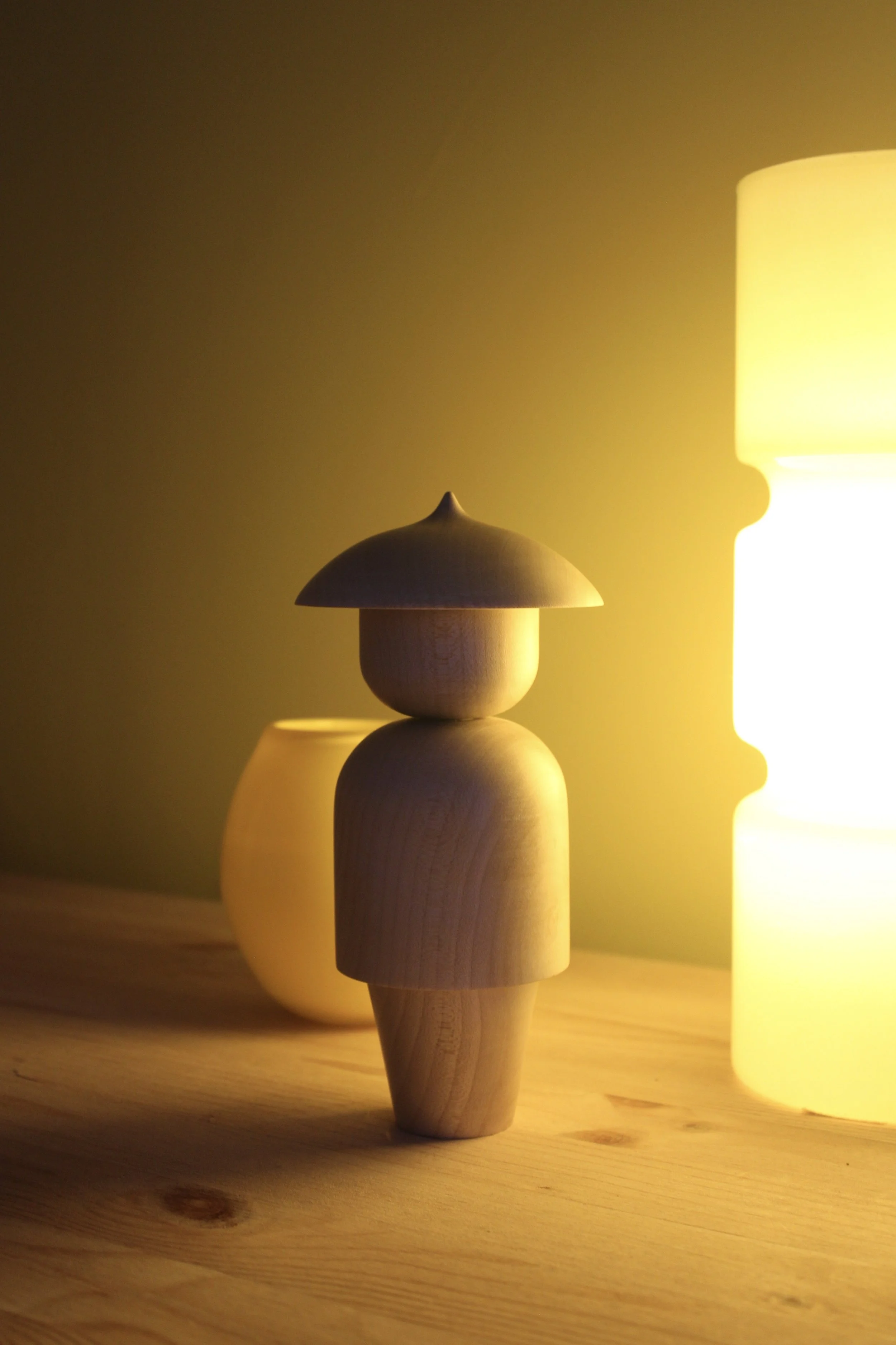
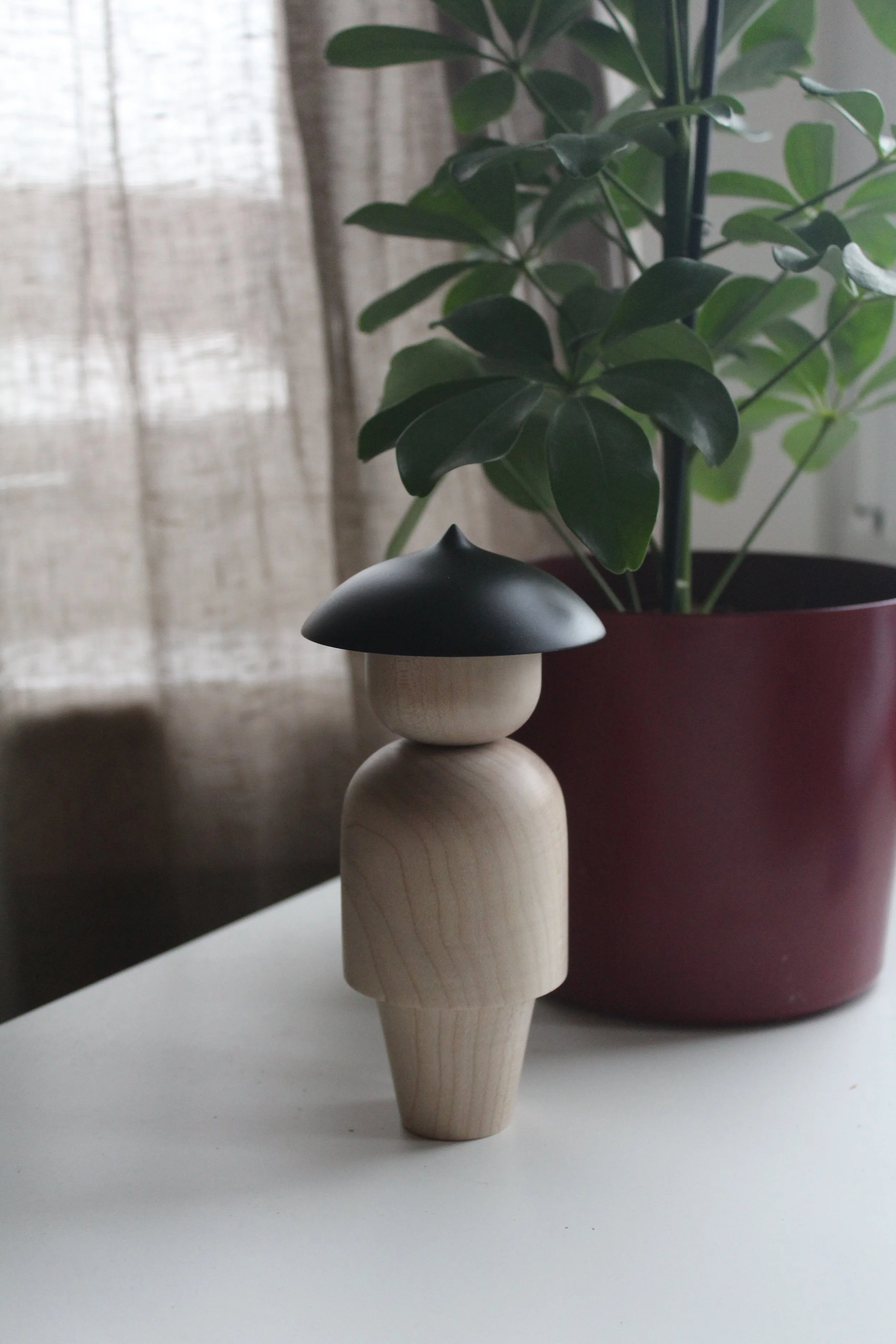
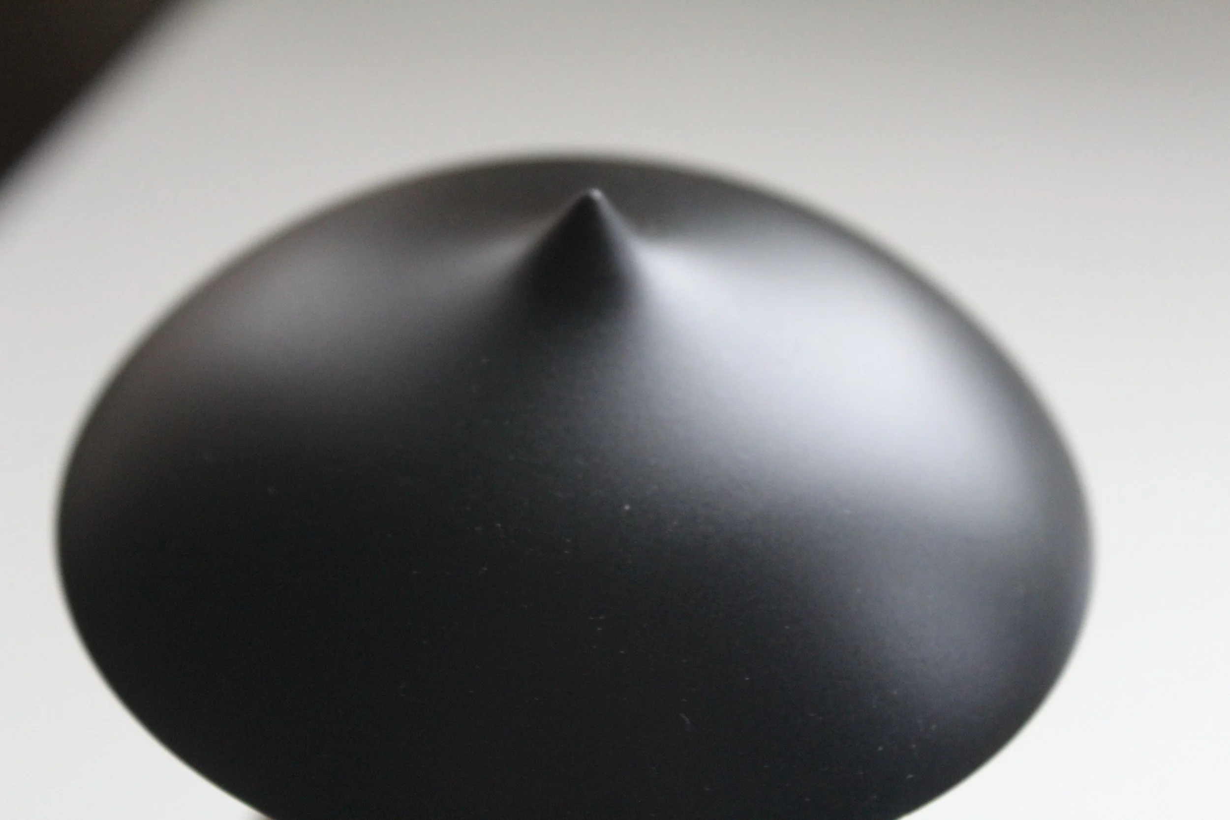
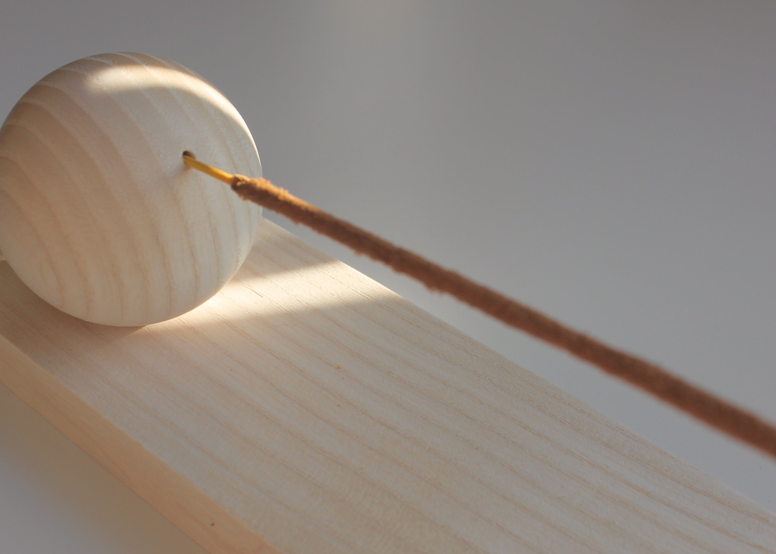
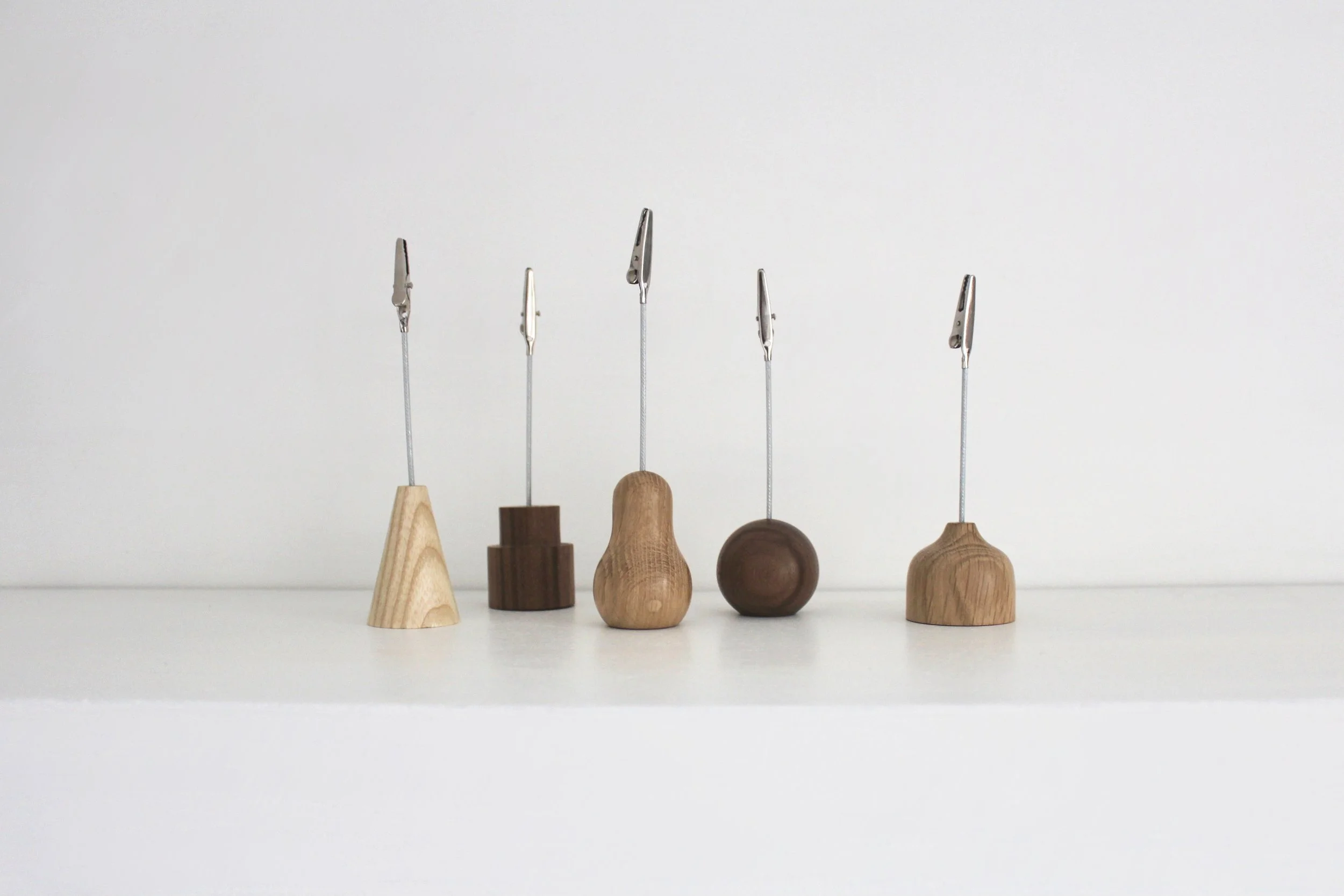
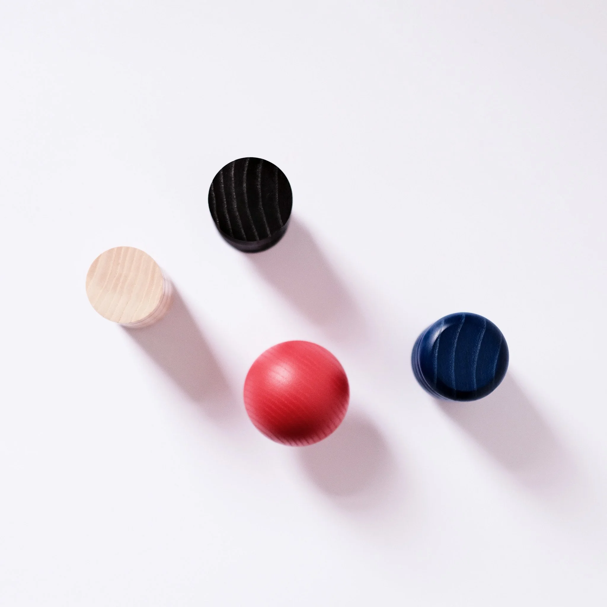
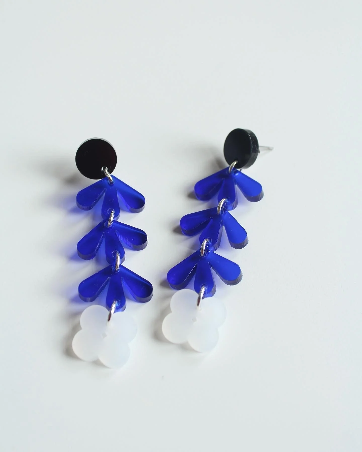
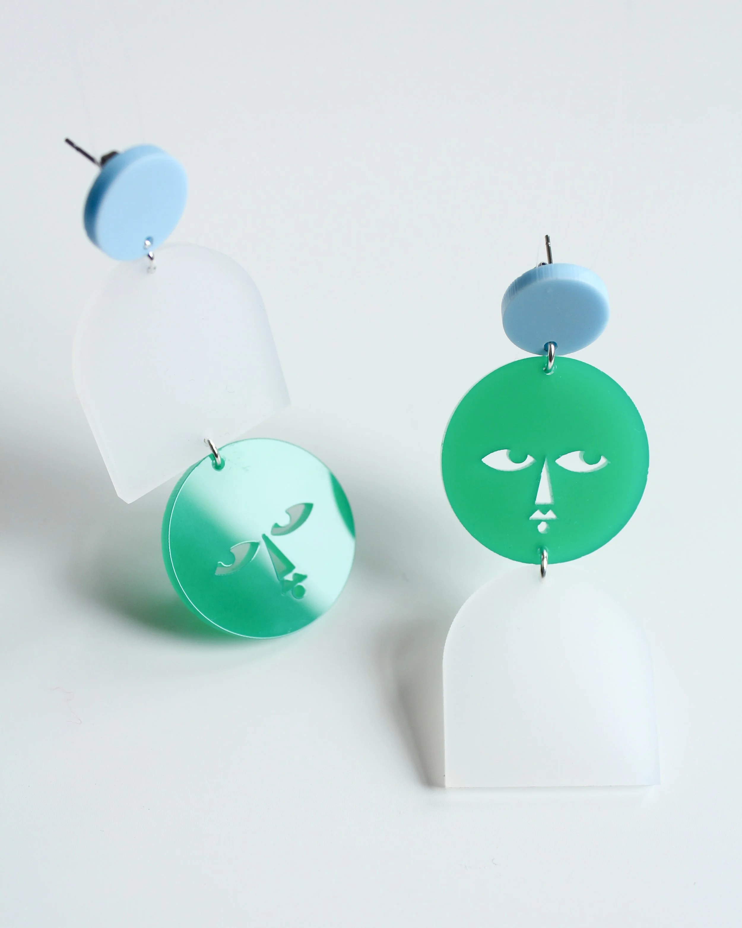
AMA Designs started with wooden homeware items that were playful and minimal in style, combining clean lines with a sense of craftsmanship. Over time, the brand evolved to include a wearable range of jewellery, carrying the same design principles of simplicity, bold forms, and careful attention to material. The visual identity reflects this continuity, balancing minimalism with personality, and ensuring that whether in homeware or jewellery, each piece feels intentional, tactile, and distinctly AMA Designs.
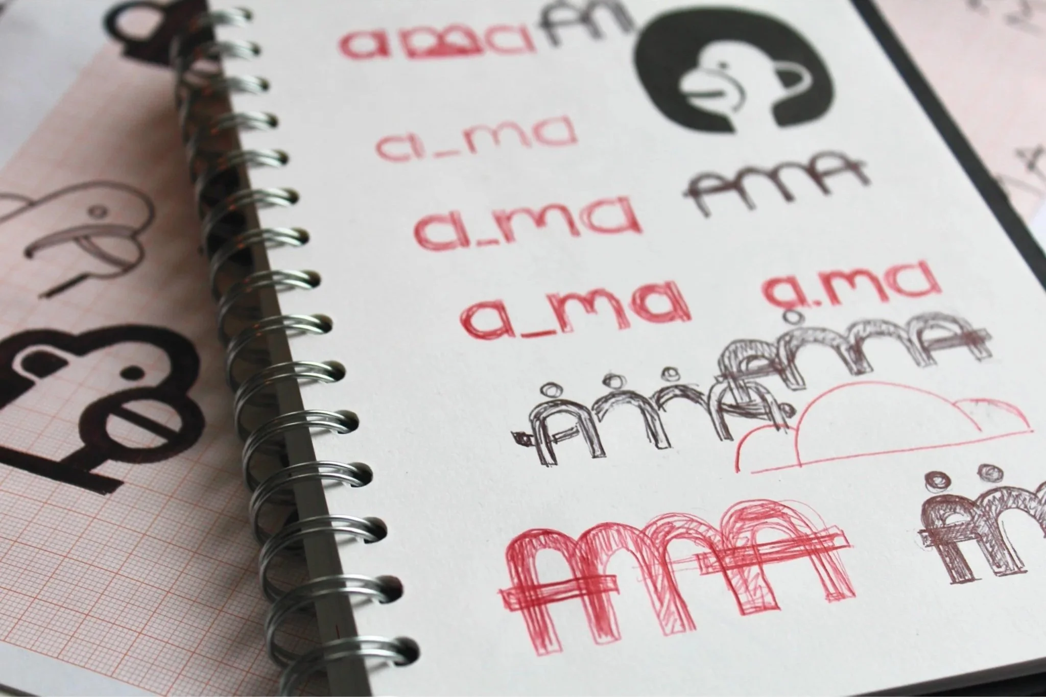
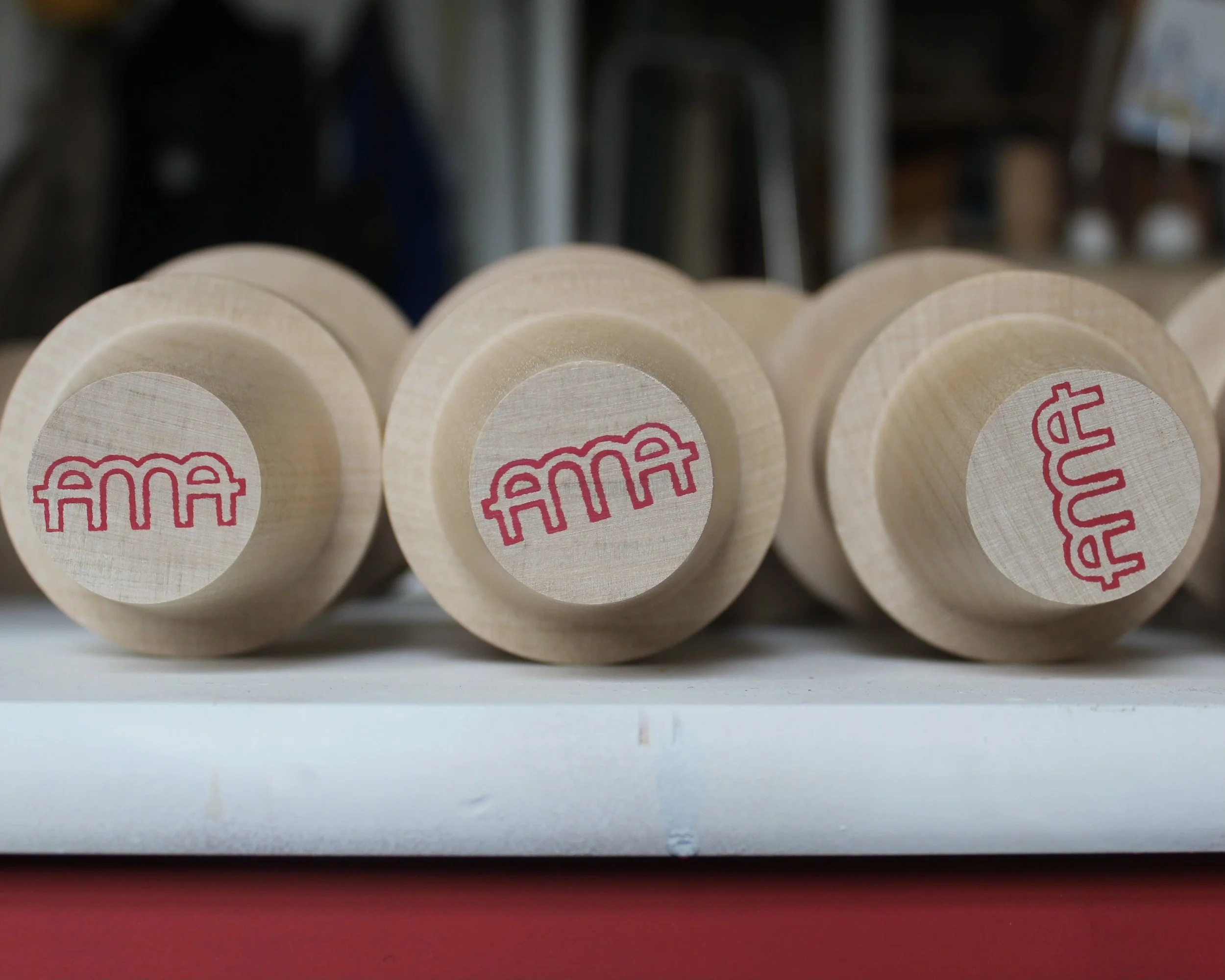
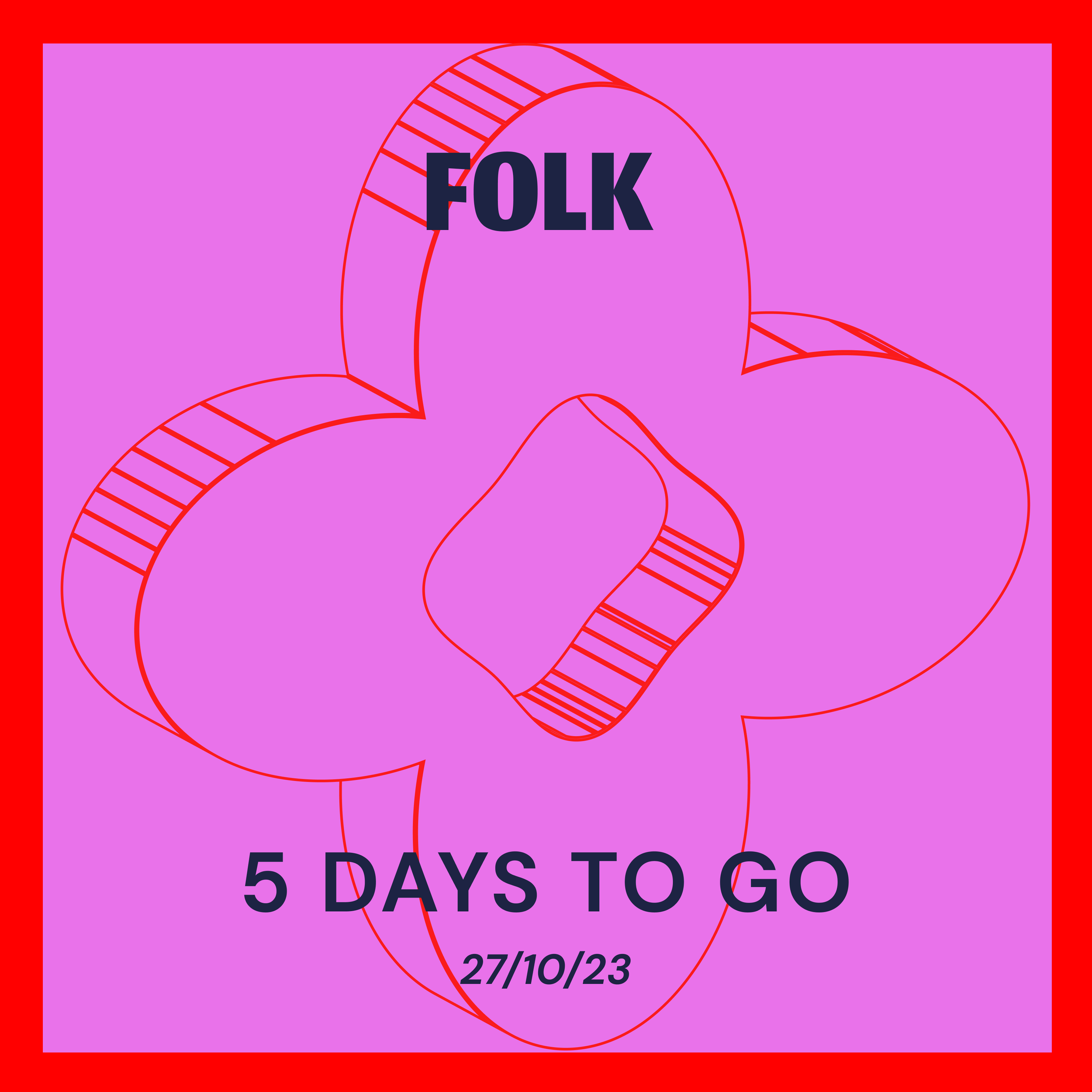
Logos
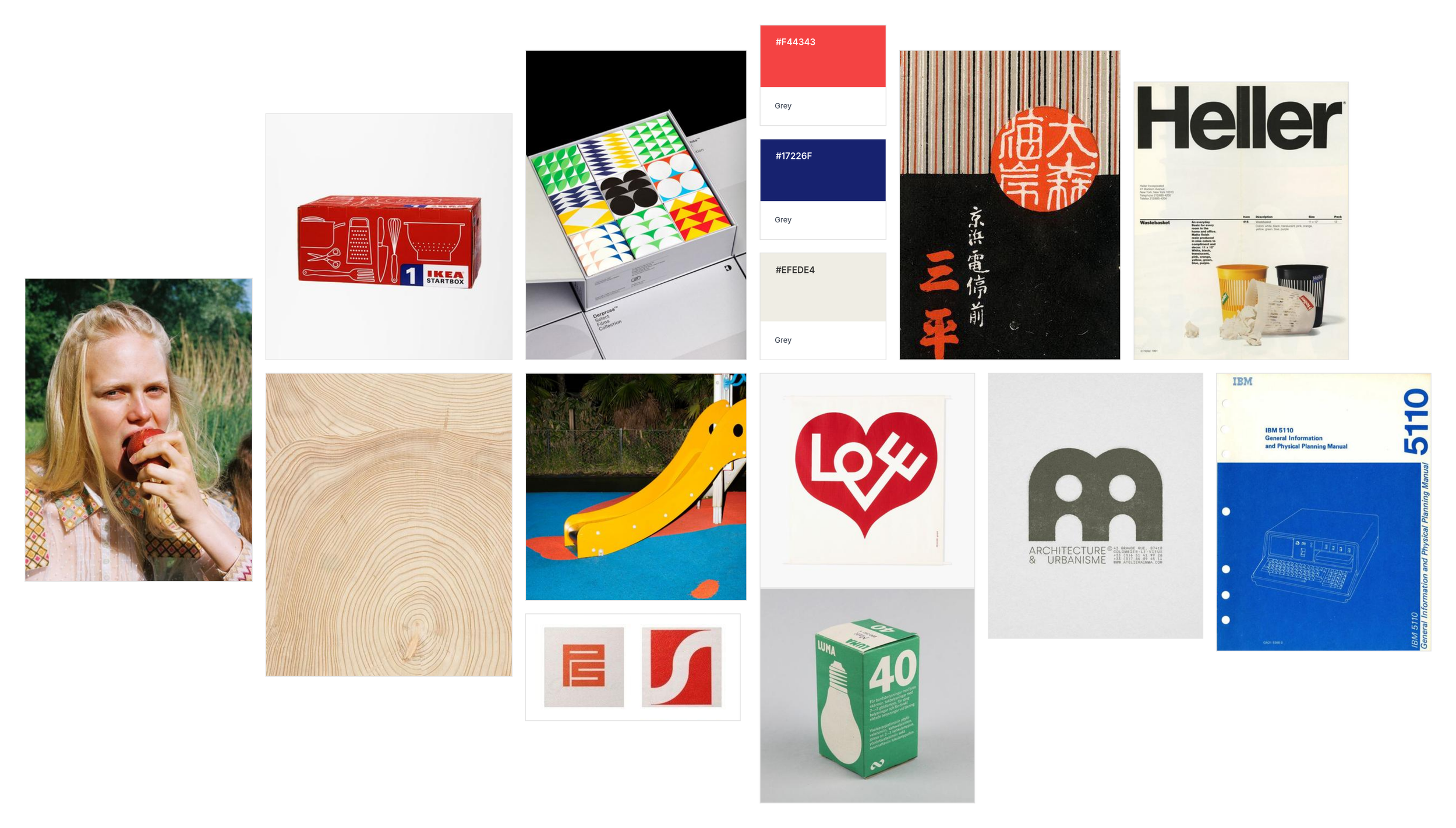
For the logo, I was inspired by traditional Japanese makers’ marks often found on the bottom of ceramics and turned wooden objects. I wanted to capture the same sense of craftsmanship and permanence while giving it a bold, graphic feel. The mark is presented in both black and red. Red is traditionally used in Japanese and Chinese makers’ stamps and seals, where it conveys authenticity and authority. I also drew inspiration from the form of a letterpress block of the letters ‘FFI’ which in reverse suggested a natural fusion of the letters A and M. This combination created a distinctive, confident mark that reflects the brand’s strong identity while echoing the clean, minimal influences of Japanese and Scandinavian design.


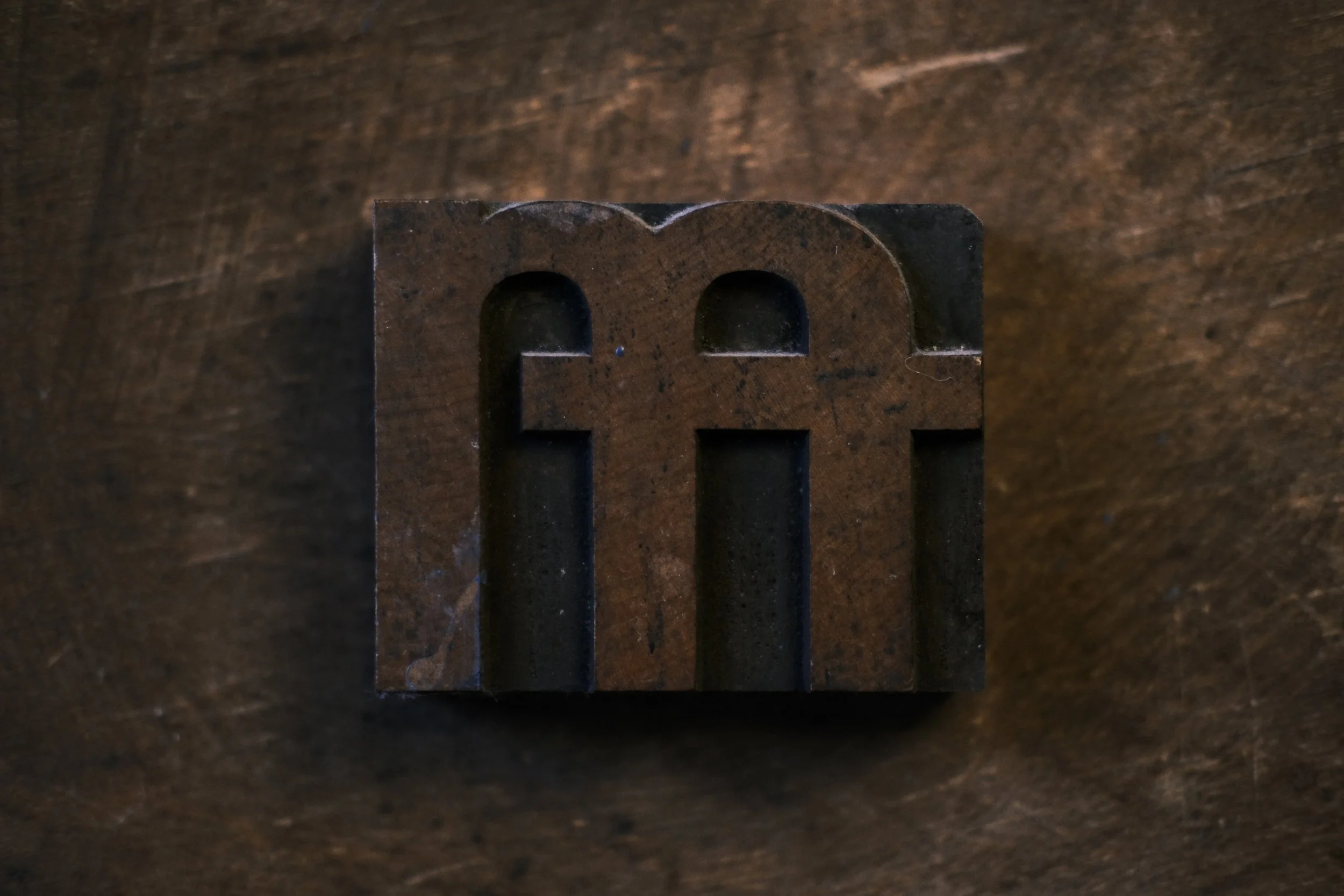
‘FFI’ Letterpress stamp

Bases of Japanese Kokeshi Dolls stamped with maker’s mark.
Brand Colours
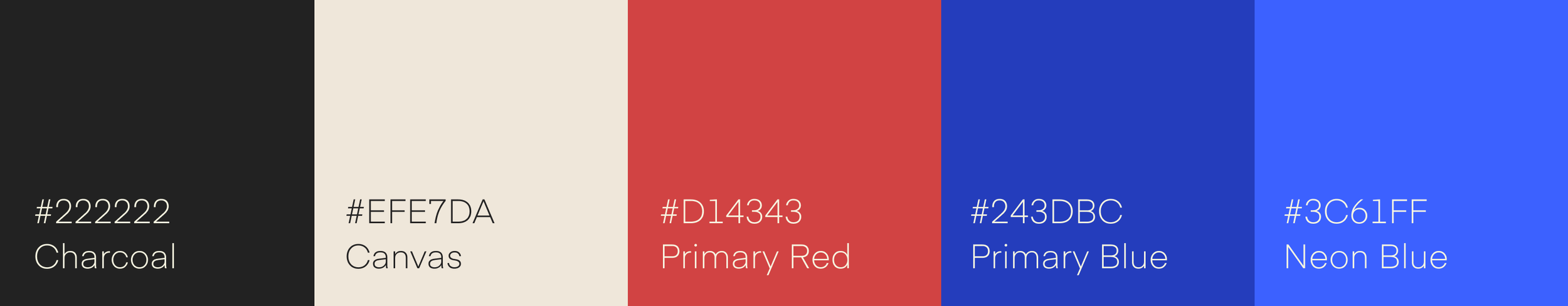
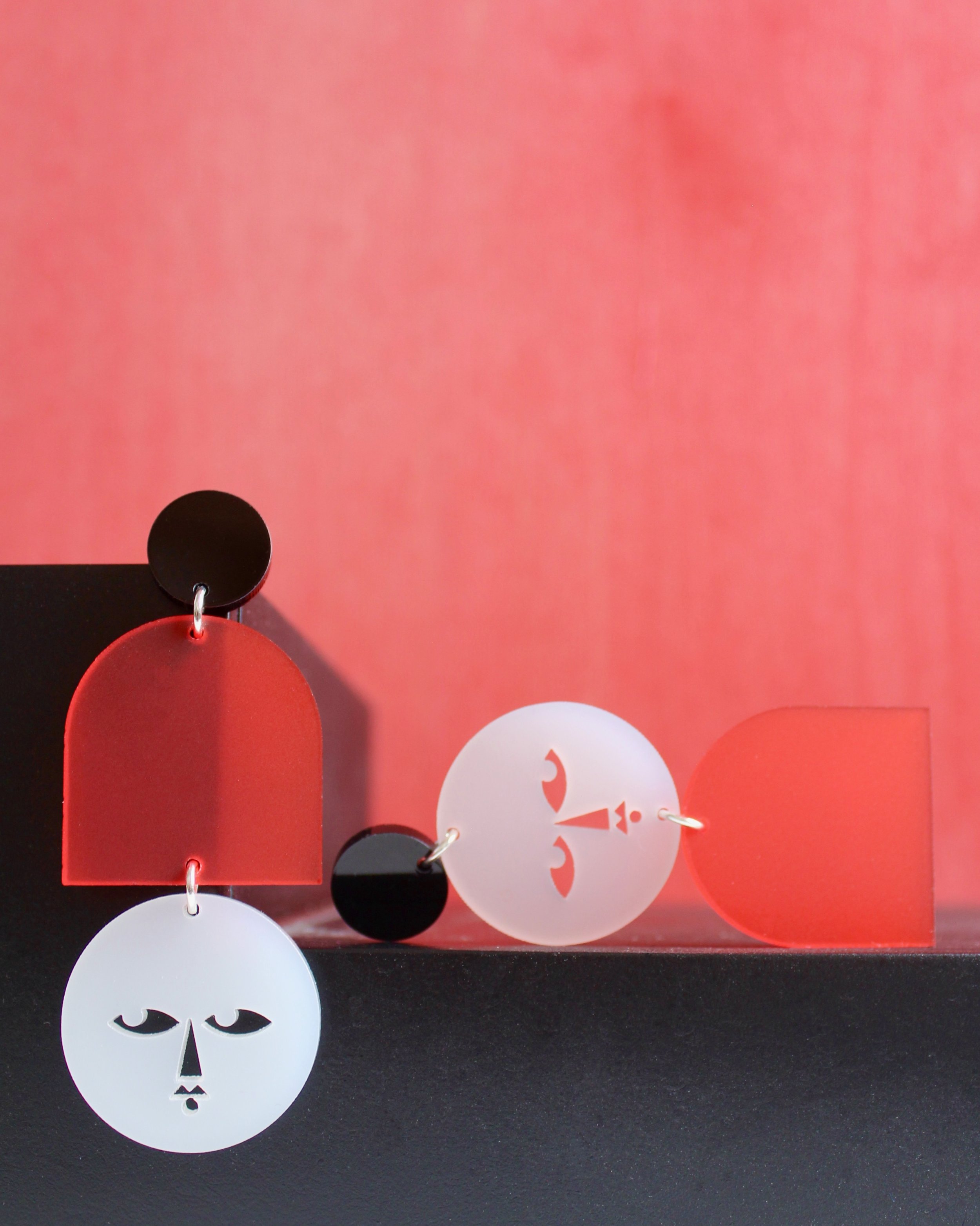
The colour palette for AMA Designs was inspired by modernist art and movements such as the Bauhaus, focusing on bold primary colours. This approach supports a playful, confident identity while keeping the brand visually clear. Red is used prominently in the logo mark, influenced by my interest in Japanese design, where stamps and maker’s marks often use red to signify craft and authorship.
Typekit
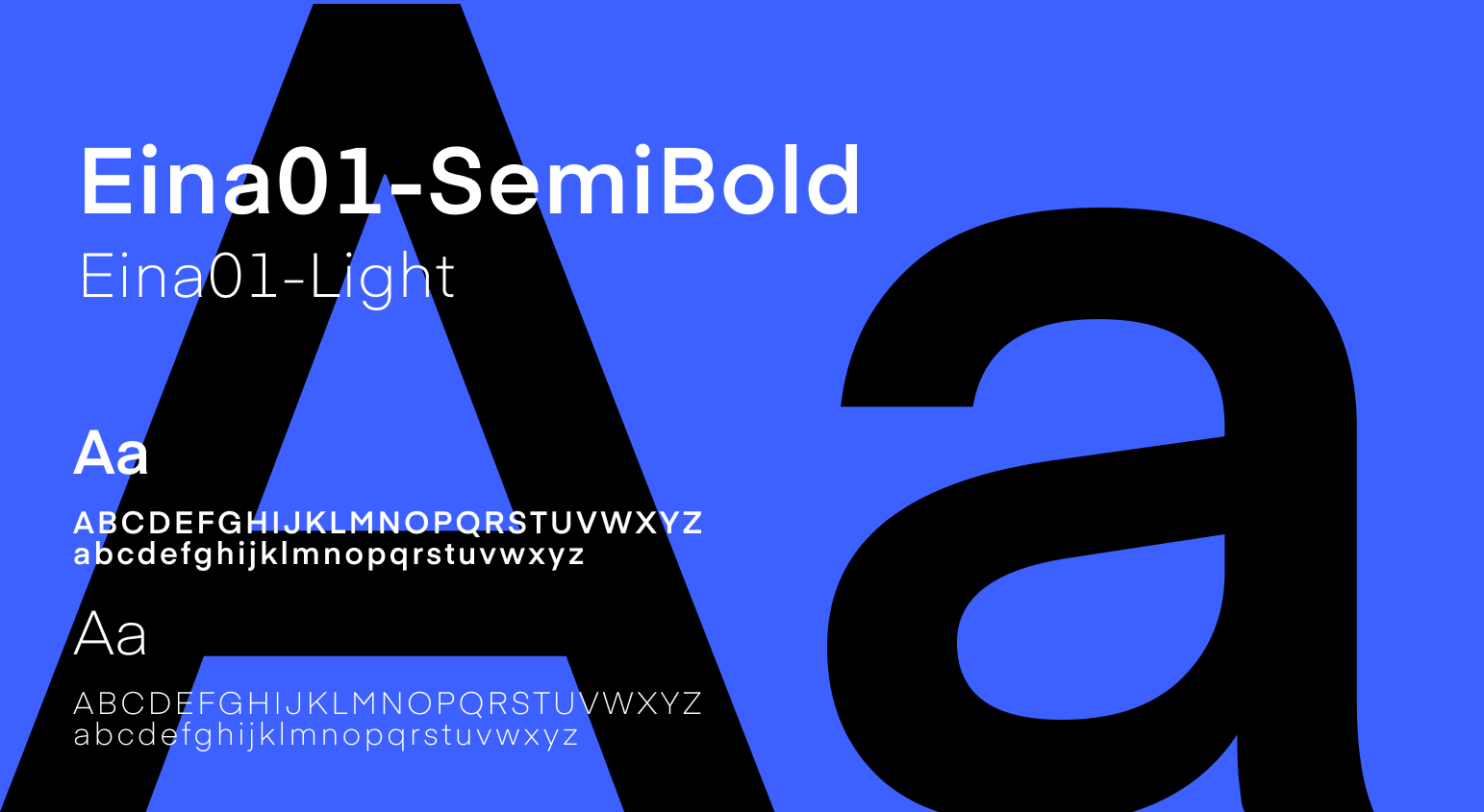
For the AMA Designs brand, I chose Eina as the primary typeface for its clean, geometric forms and contemporary feel. Its balance of playfulness and precision reflects the brand’s roots in minimal, handcrafted wooden products while remaining adaptable to the bold, graphic language of the jewellery range. Using a simple hierarchy of light for body text and Bold for headings ensures clarity and consistency across applications, from product packaging to the website.
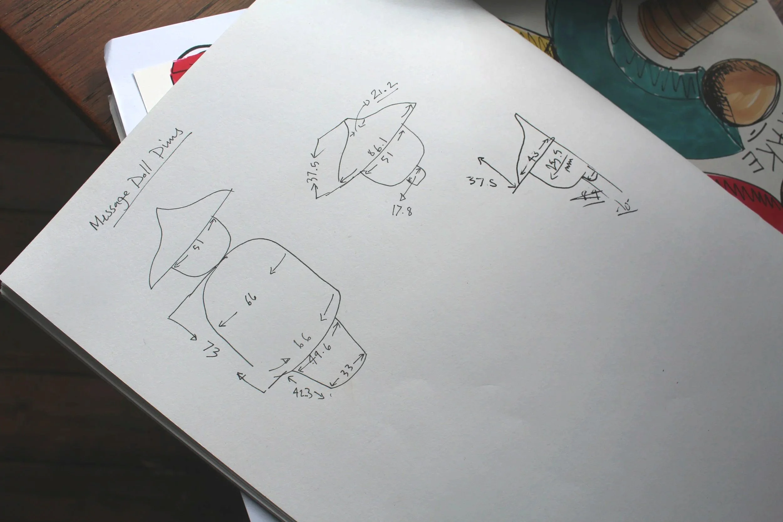
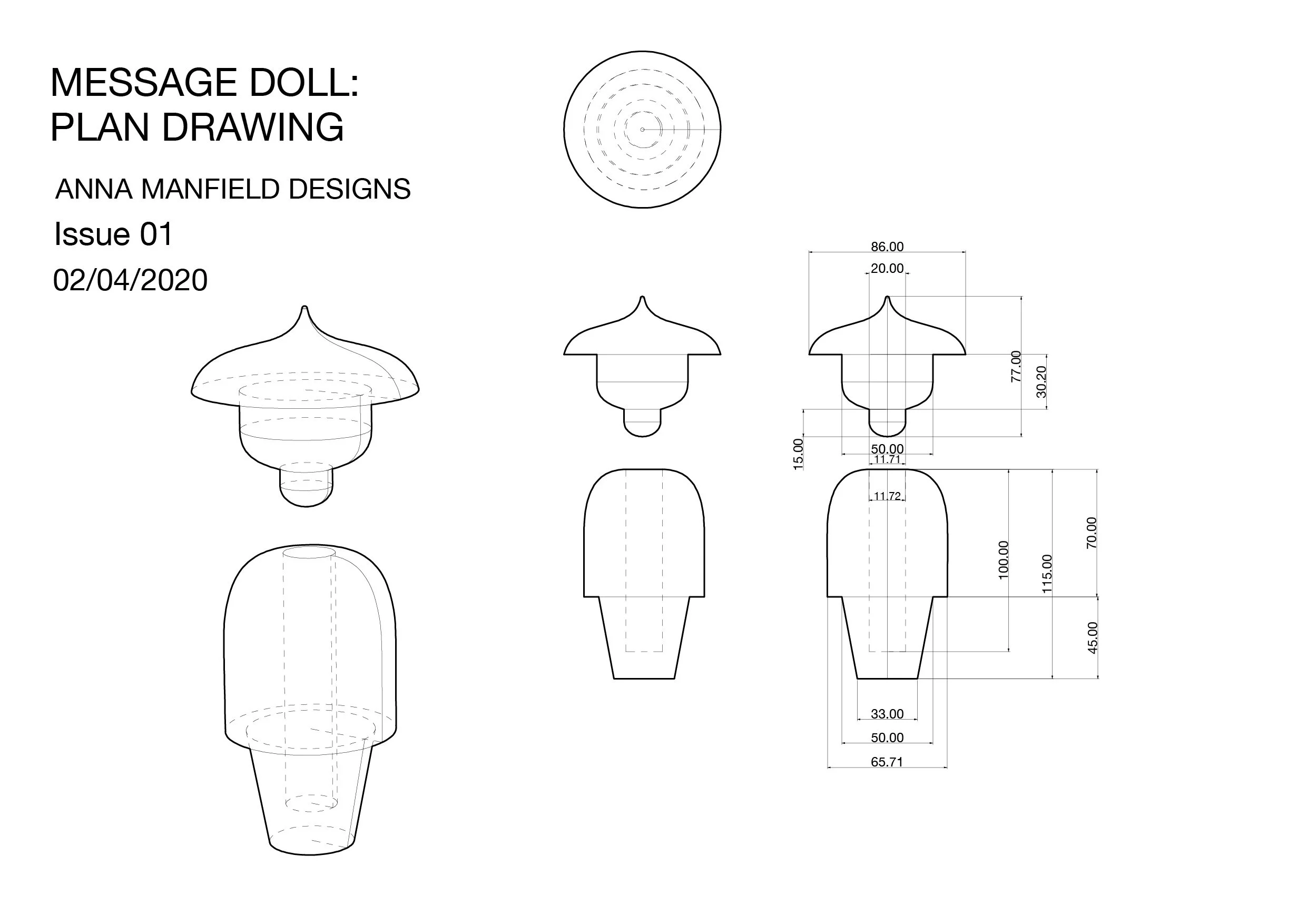
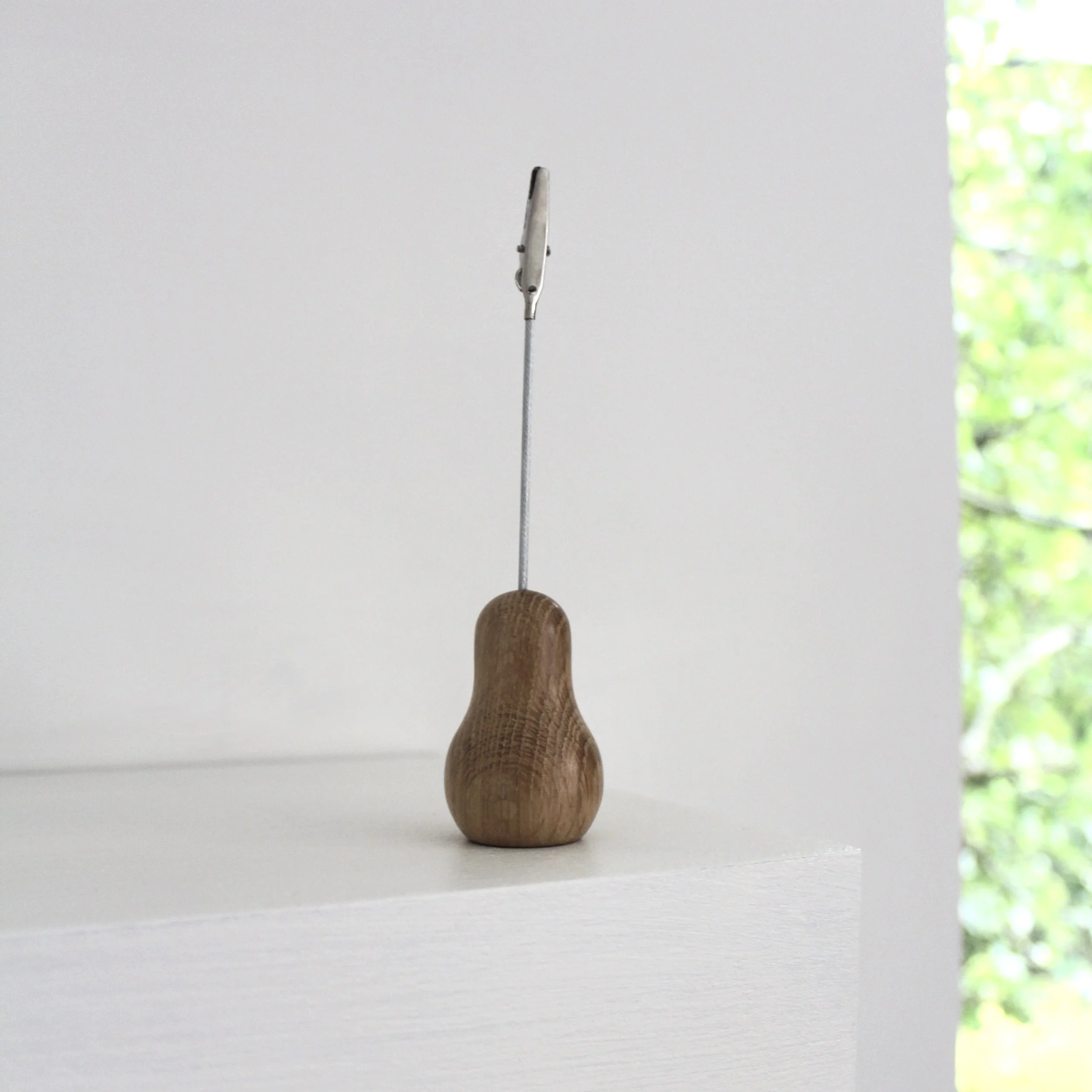
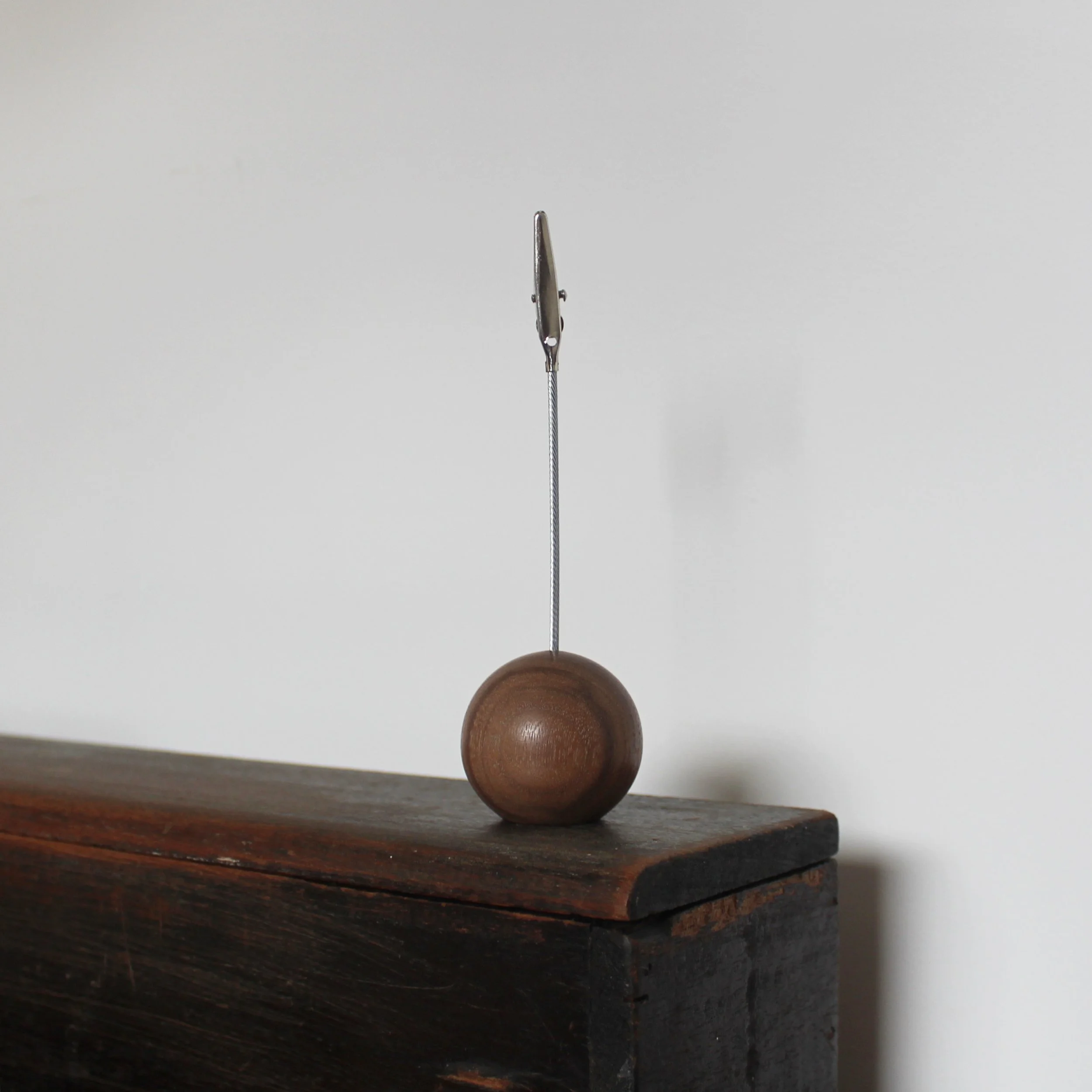
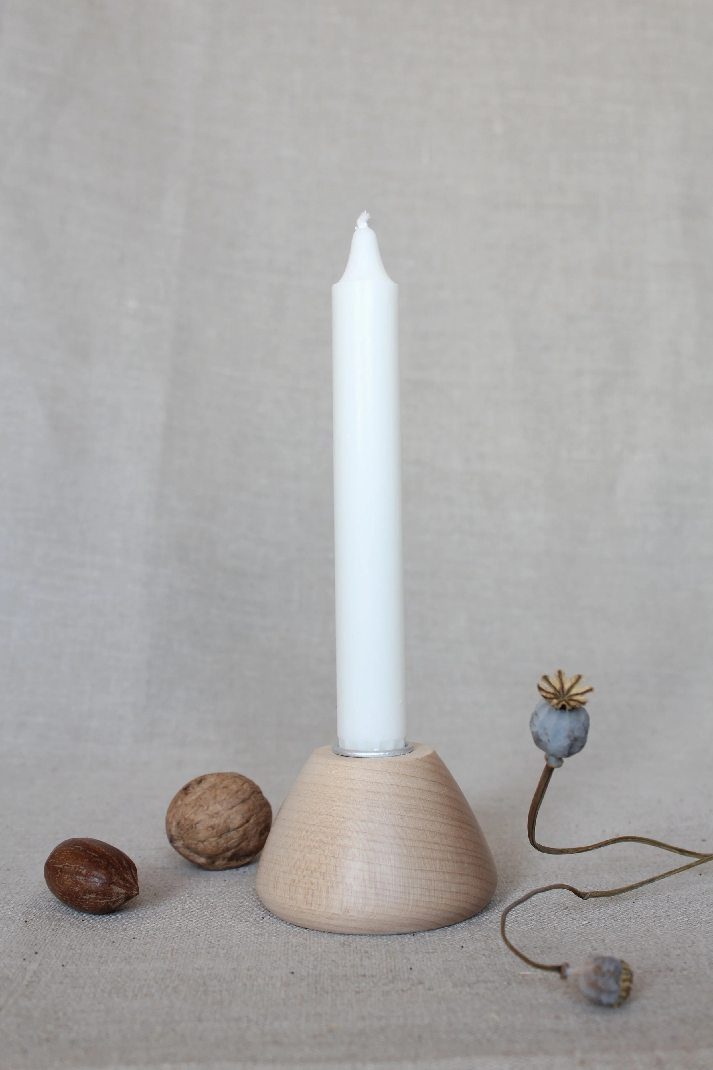
Product Design
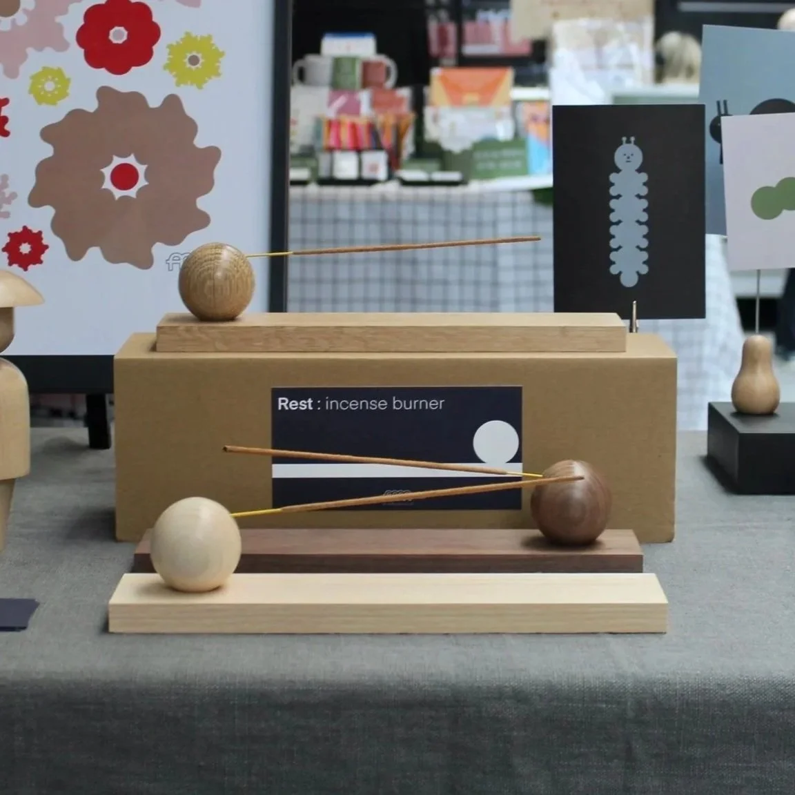
My design process always began with pen and paper, using quick sketches to explore forms and ideas. From there, I developed 3D models to test scale, proportion, and functionality before moving into digital experimentation. Tools like Illustrator and Figma allowed me to refine details and explore colour combinations, ensuring each design balanced playfulness with clarity. This iterative process gave me the flexibility to experiment while maintaining a clear, minimal aesthetic across the full range of products.
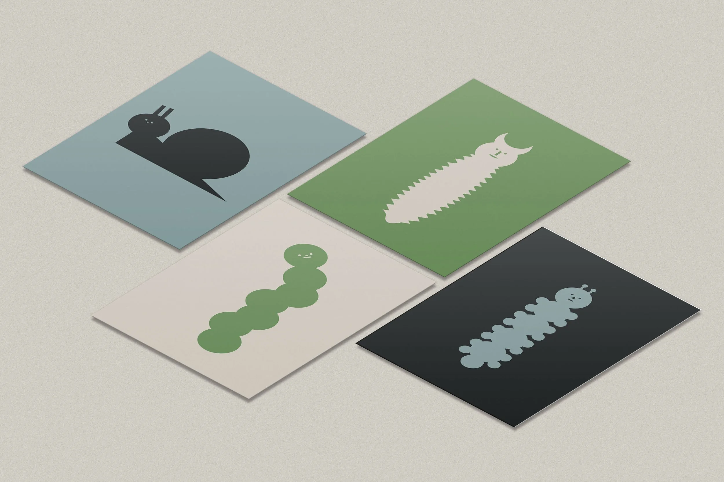
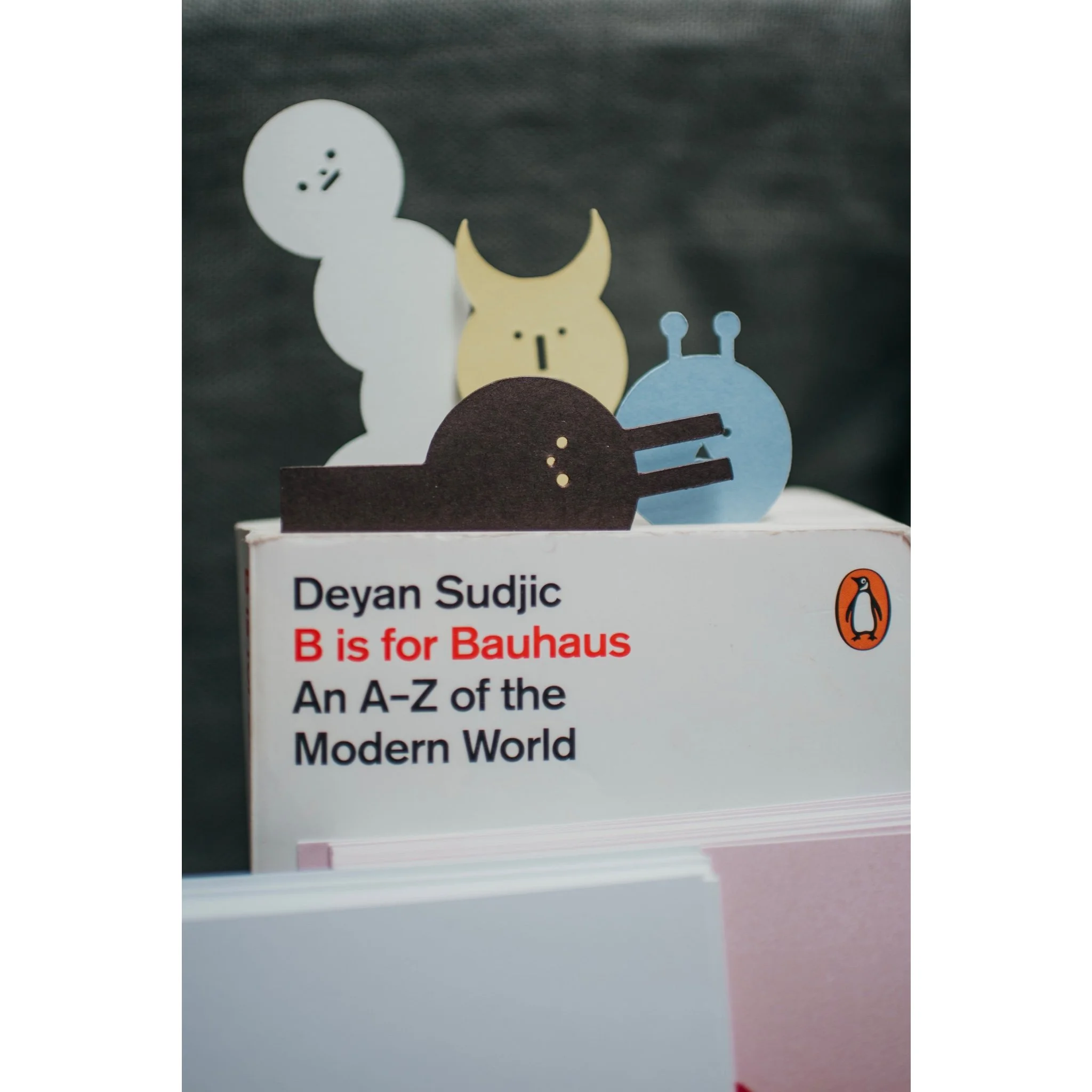
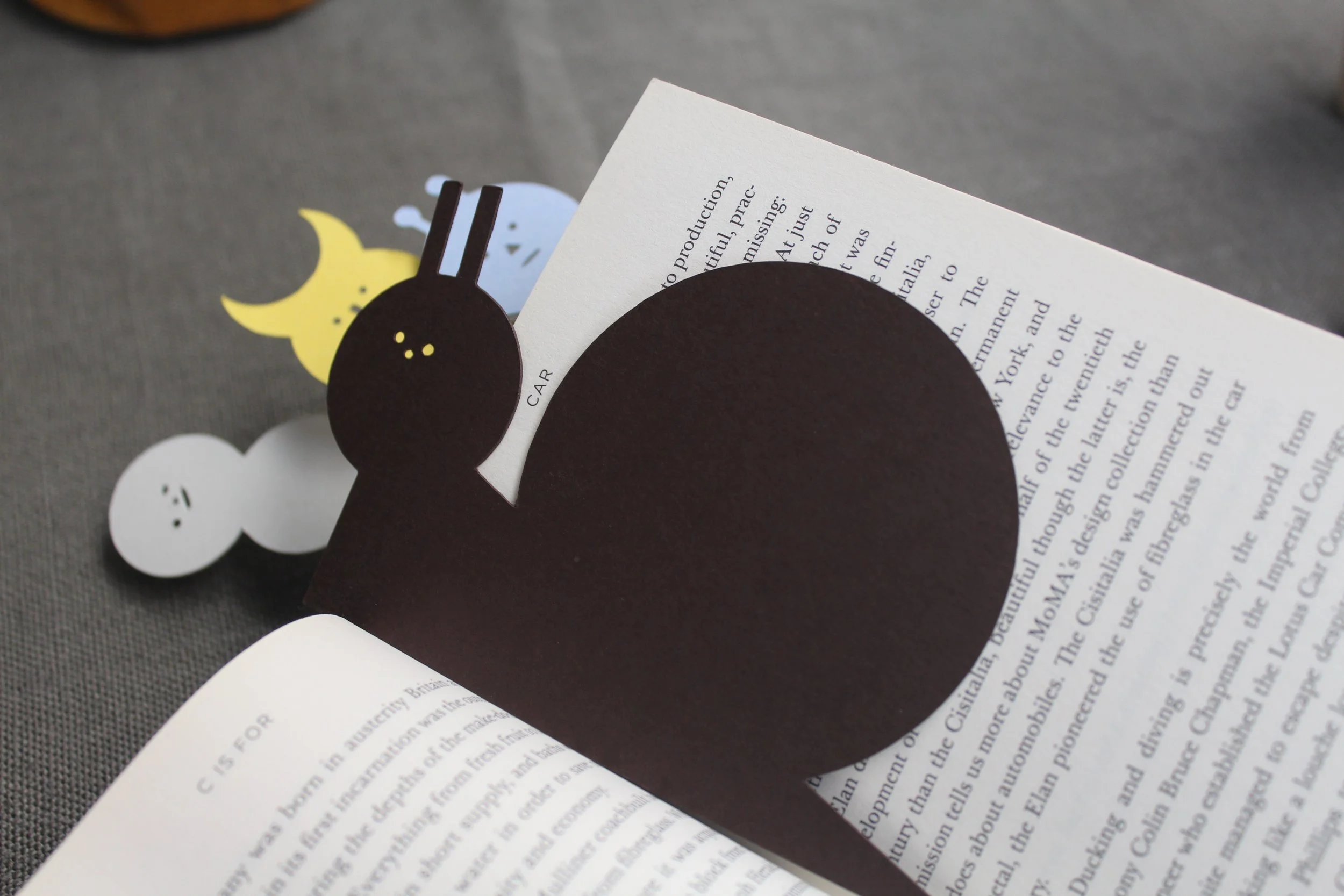
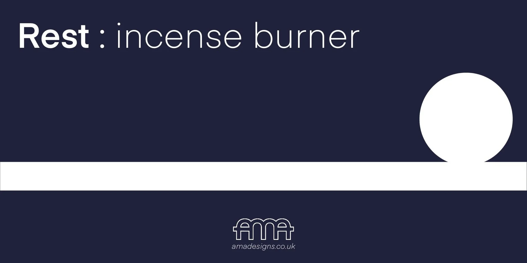
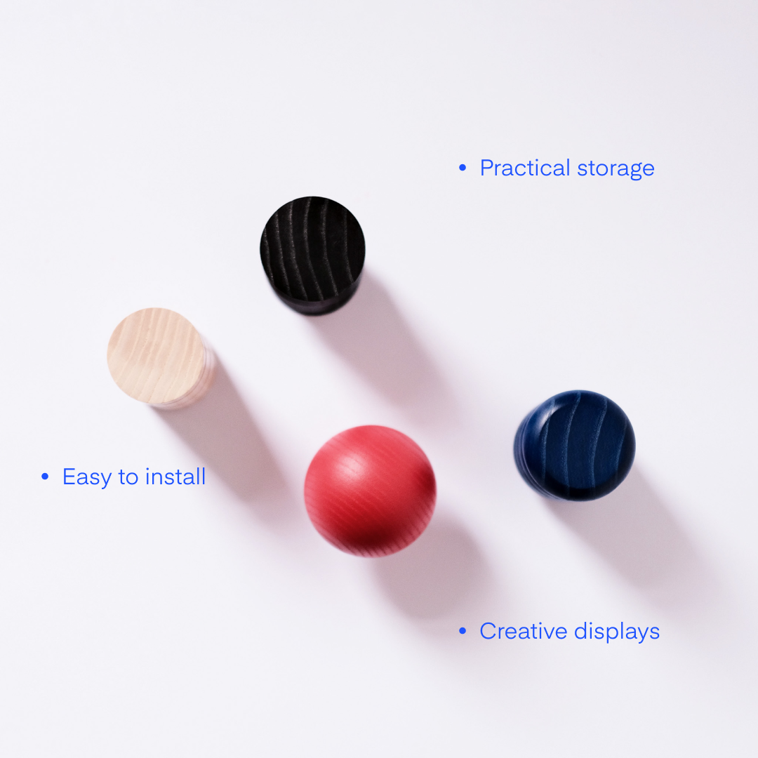
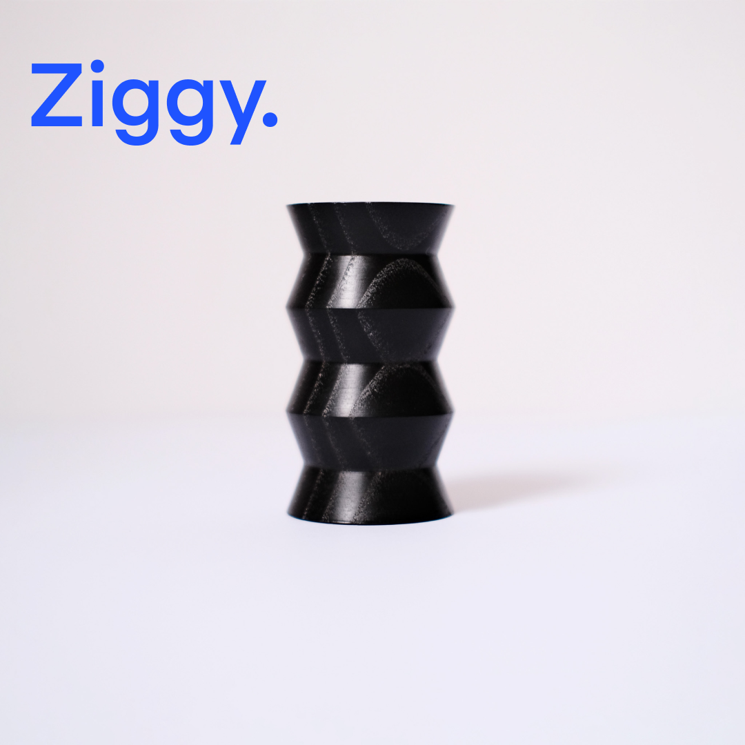
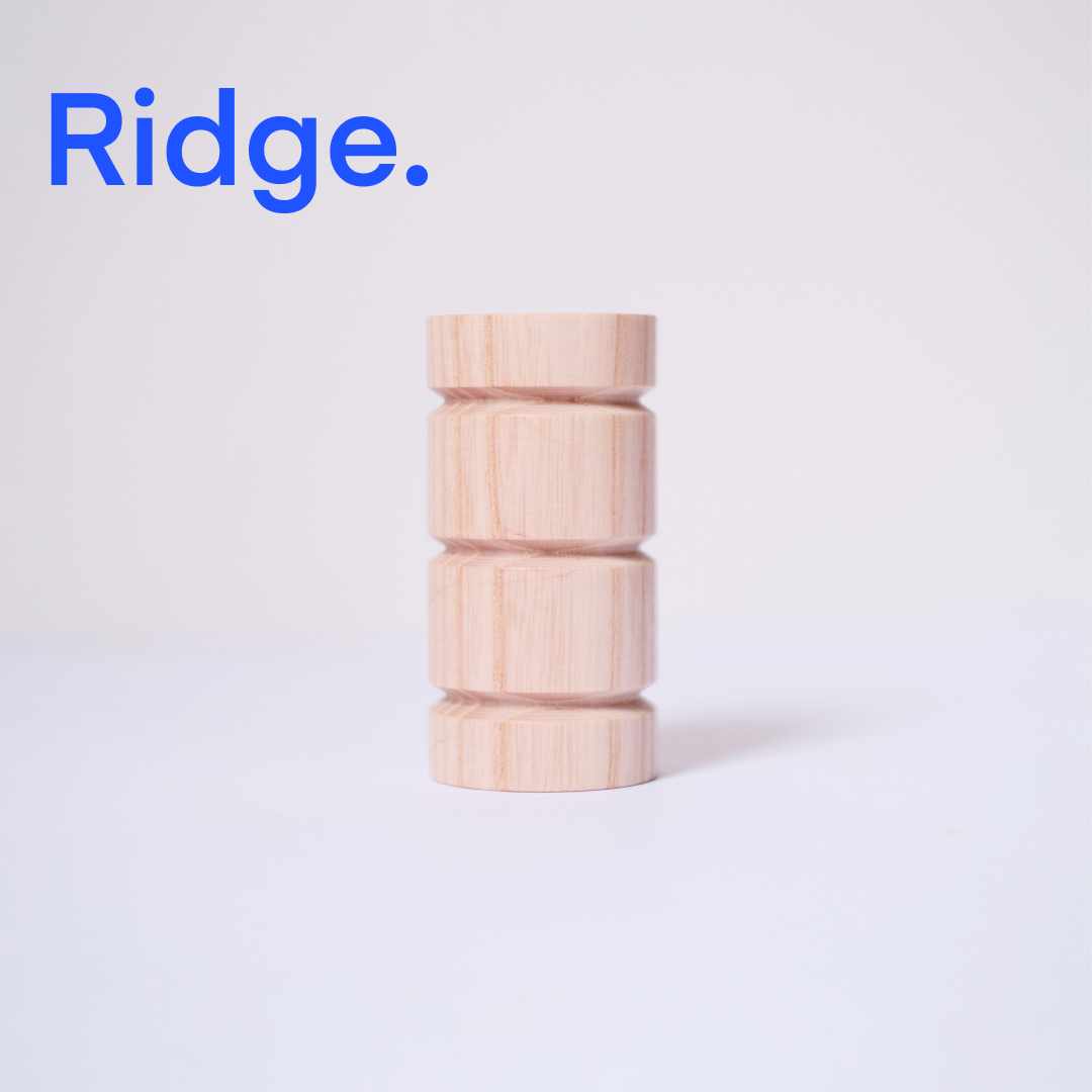
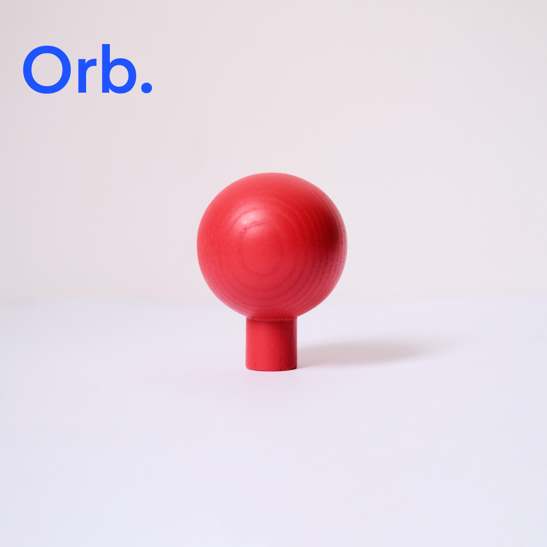
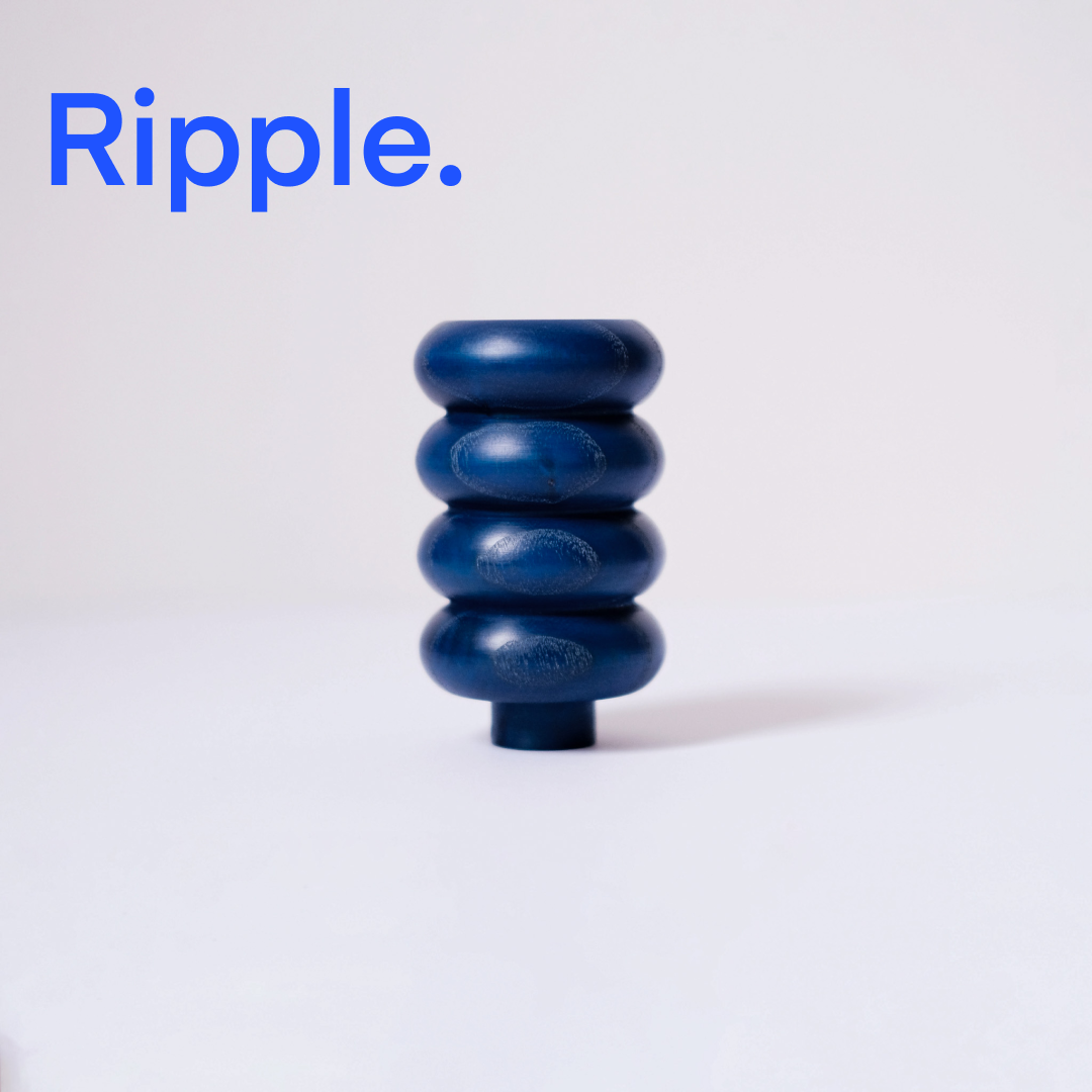
Product Design: Ama Home
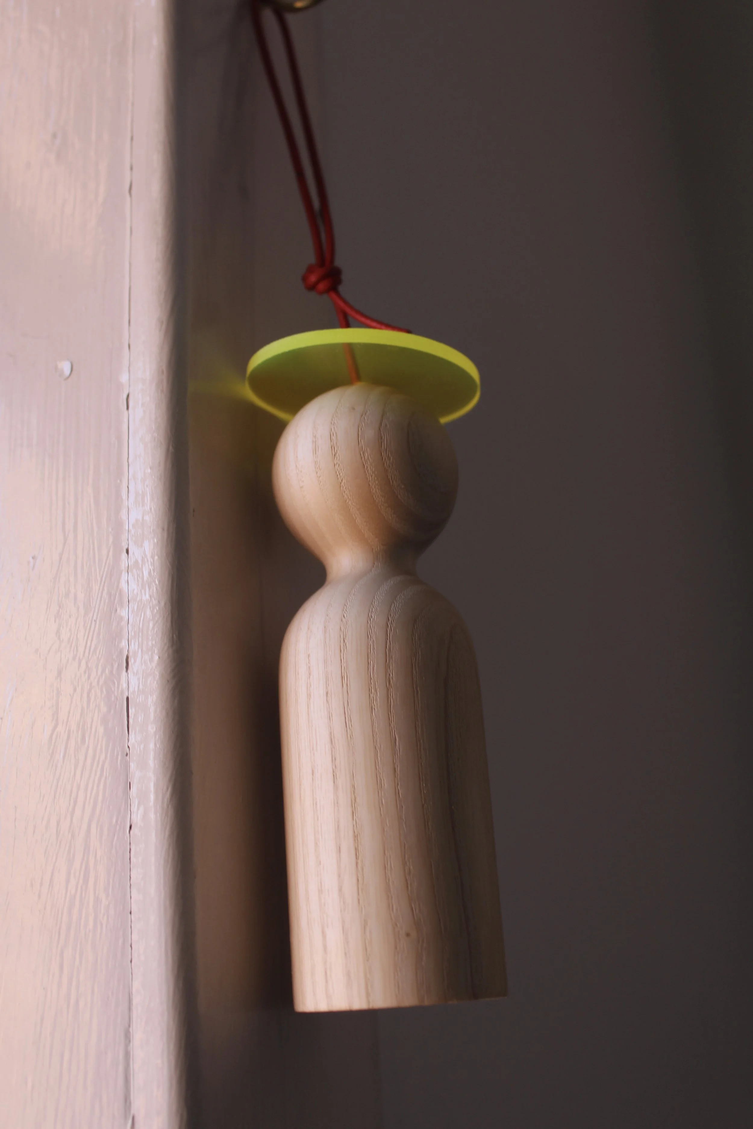
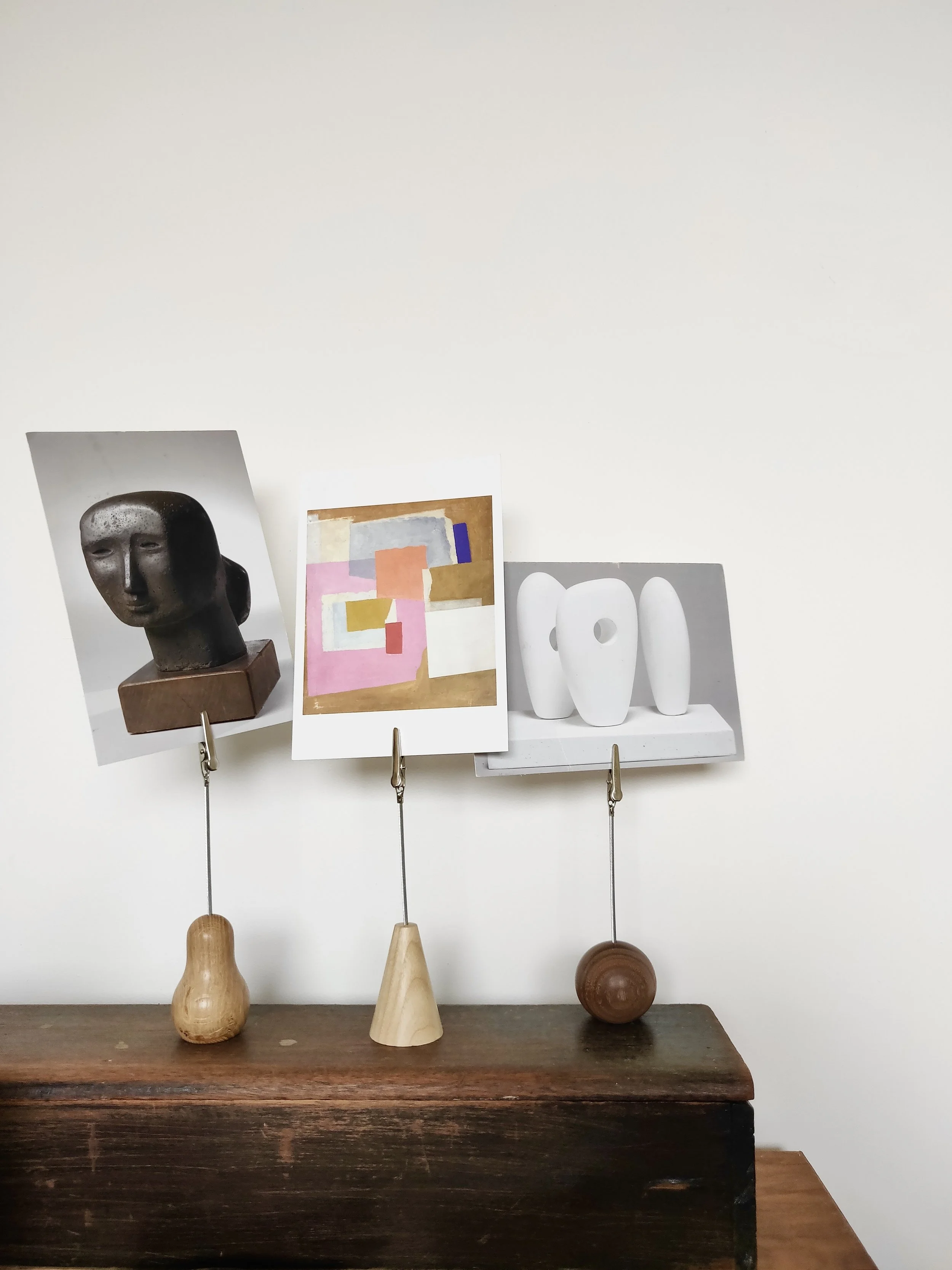


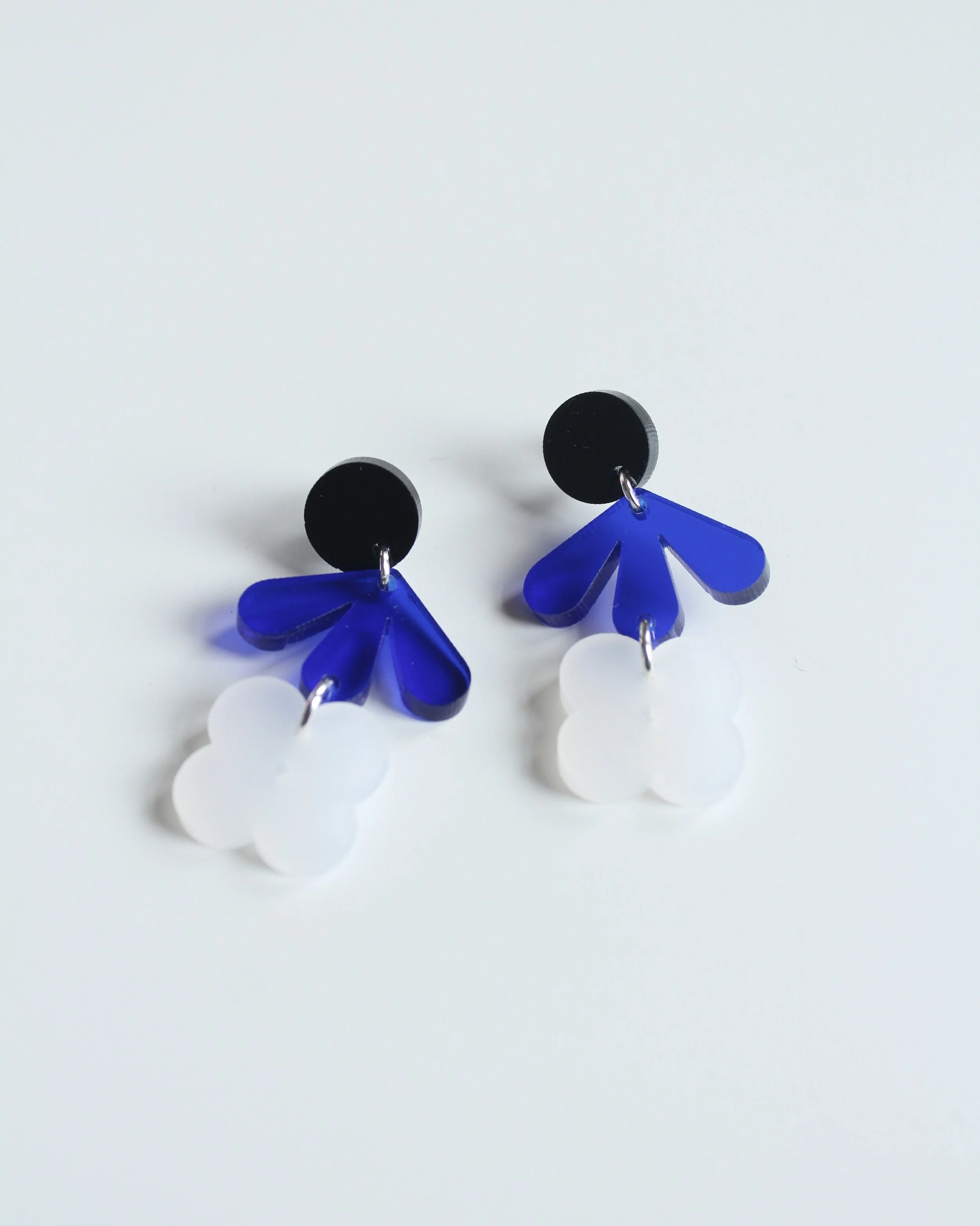
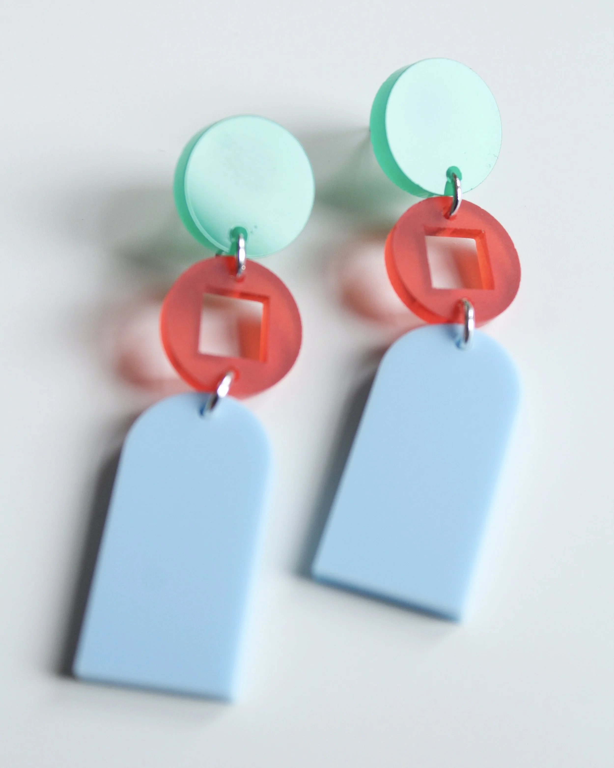
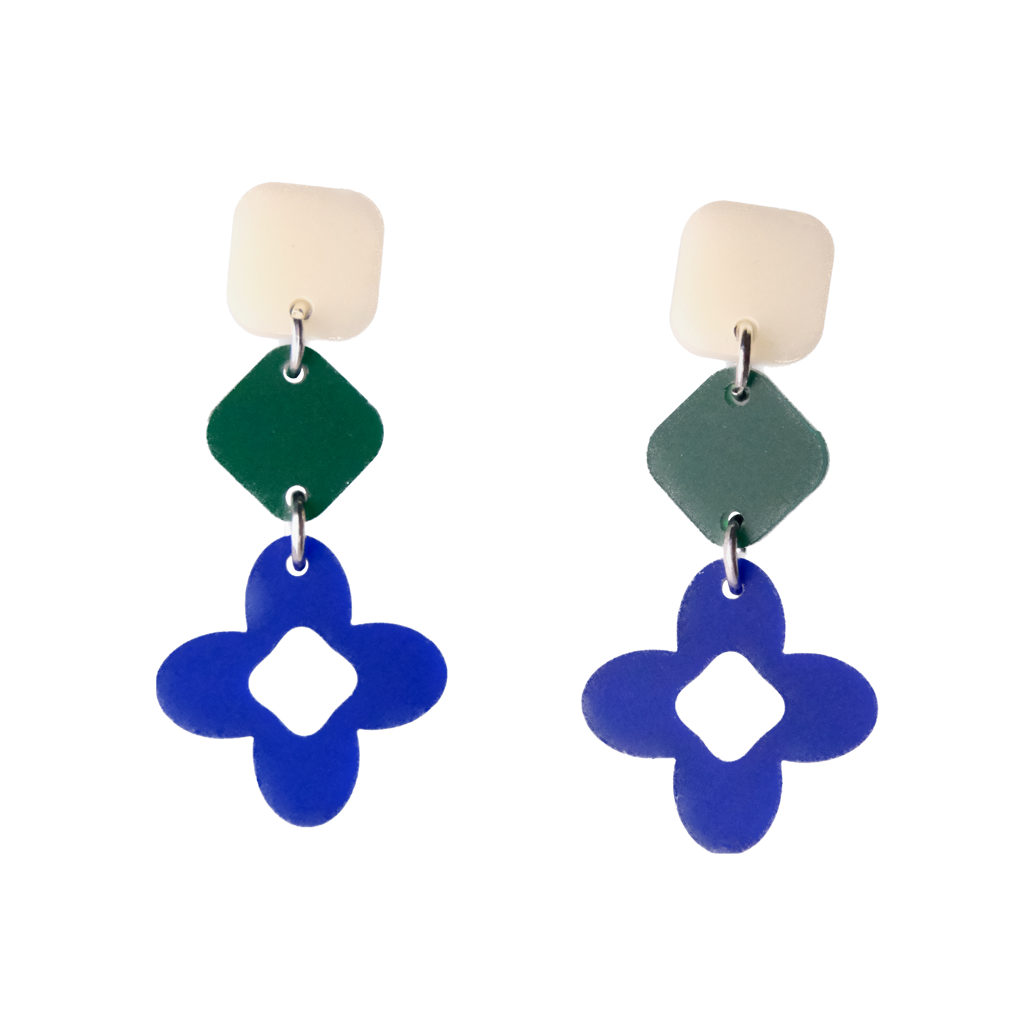
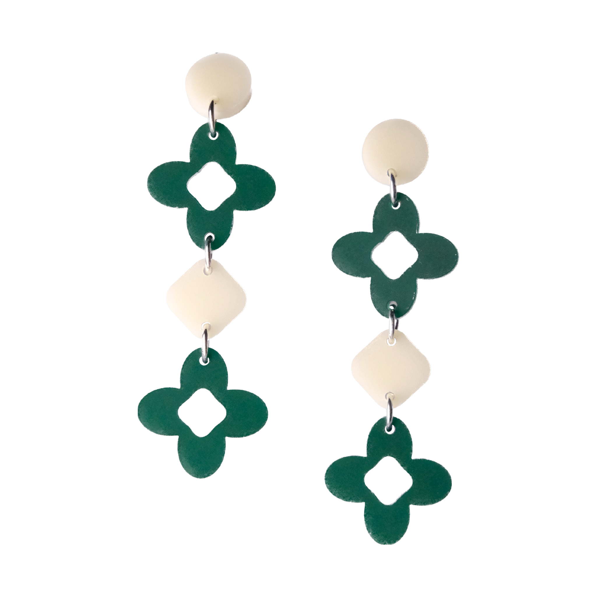
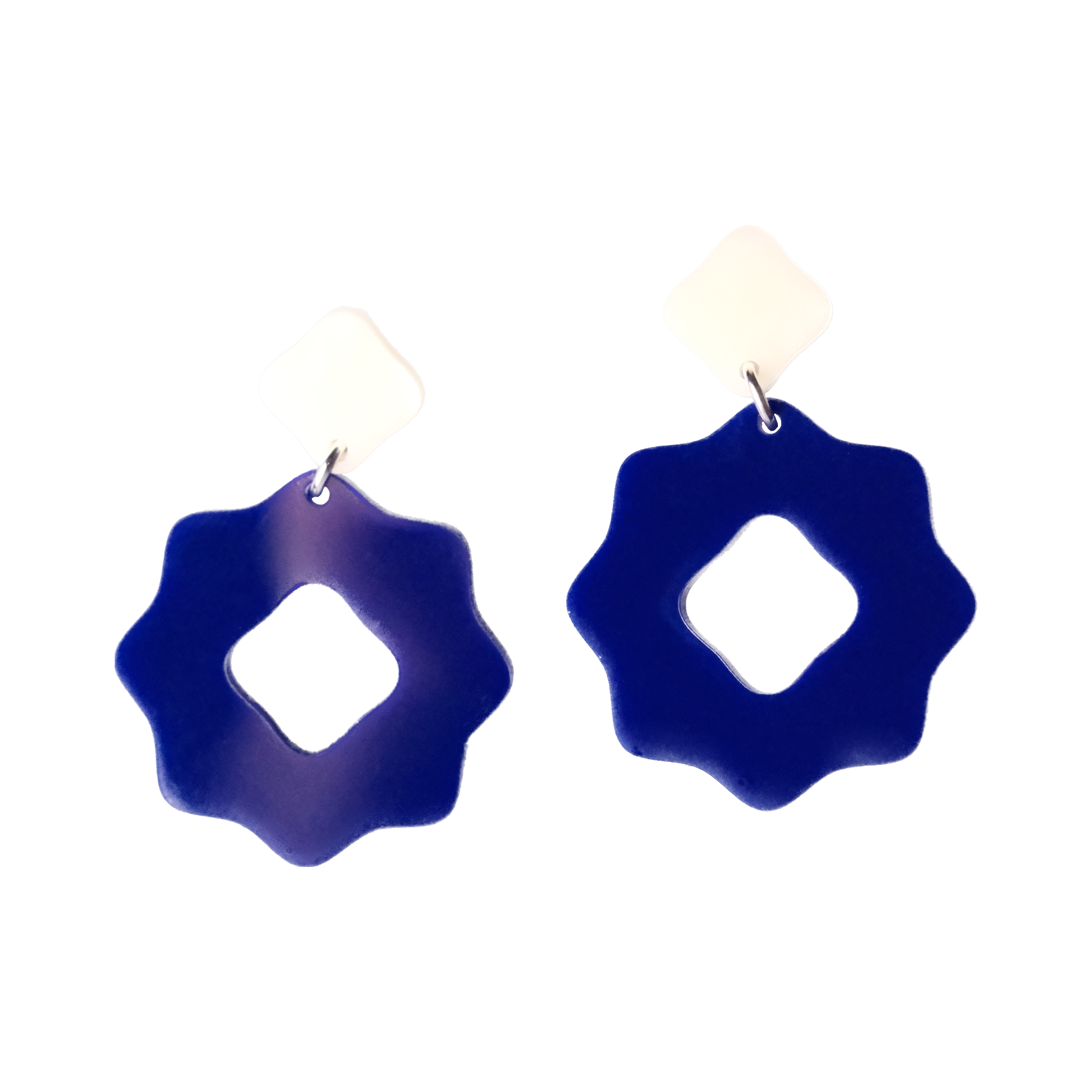
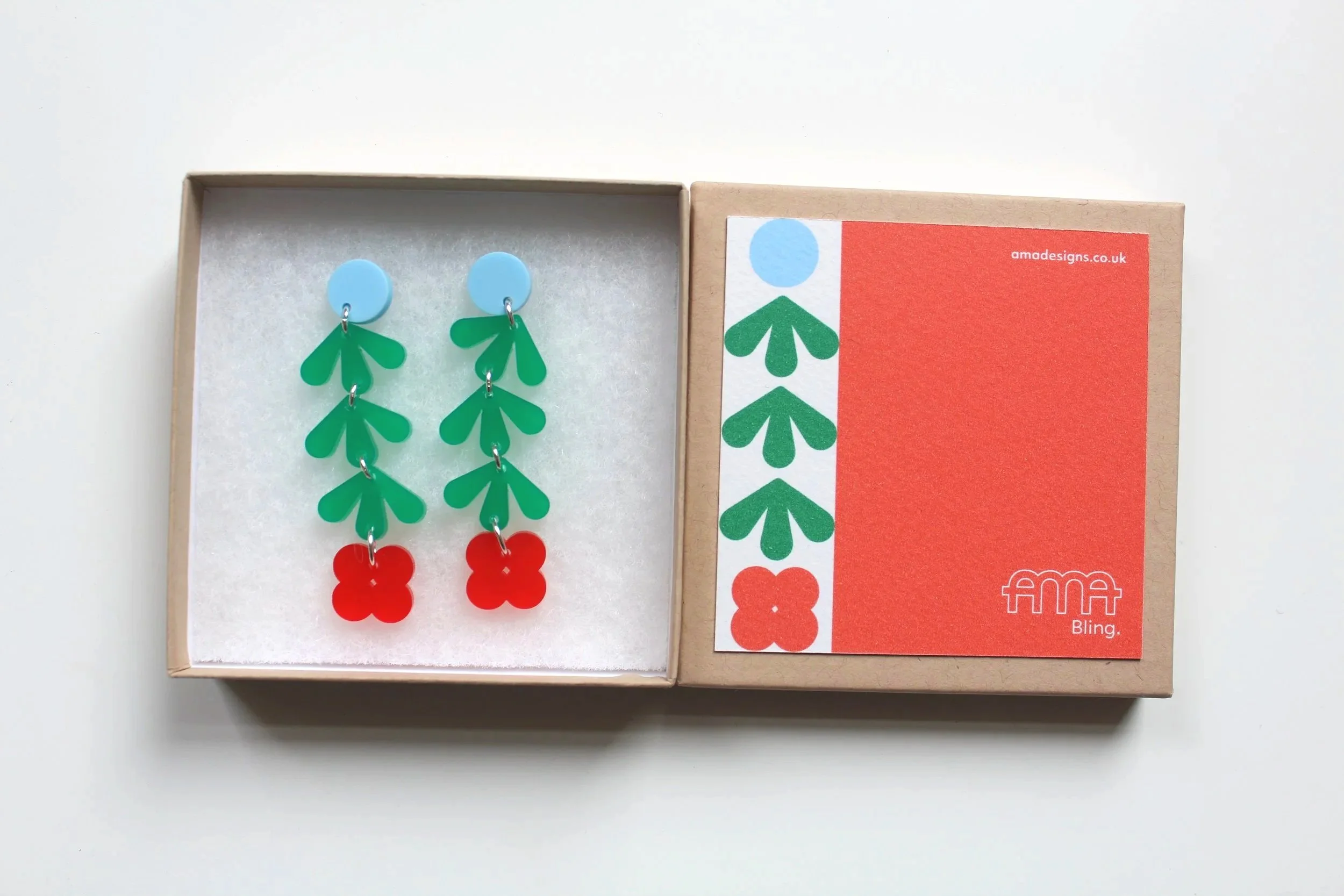
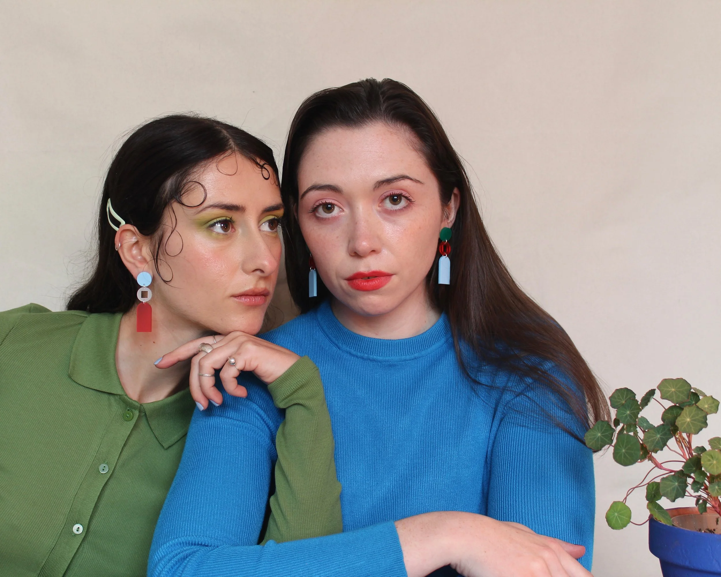
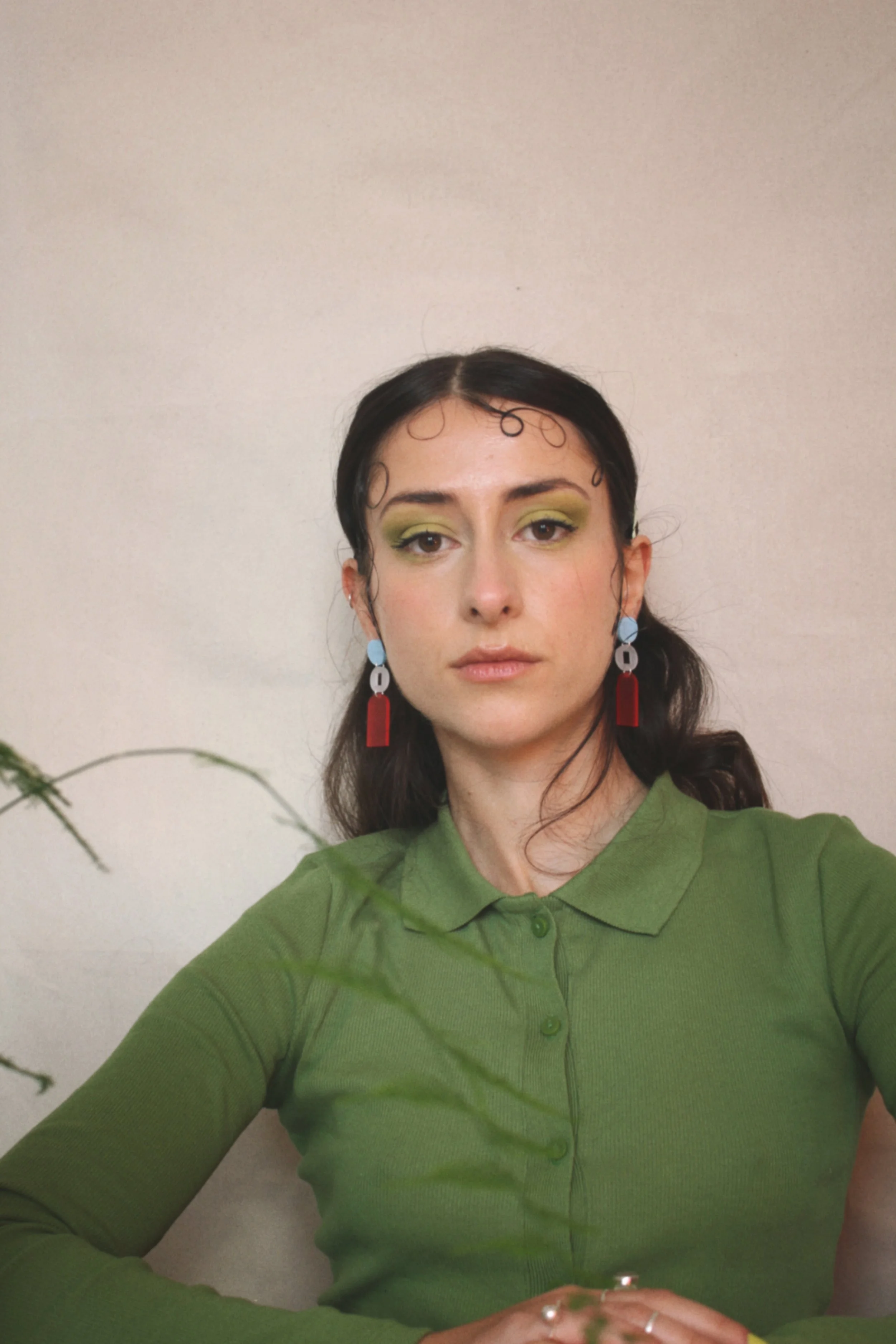
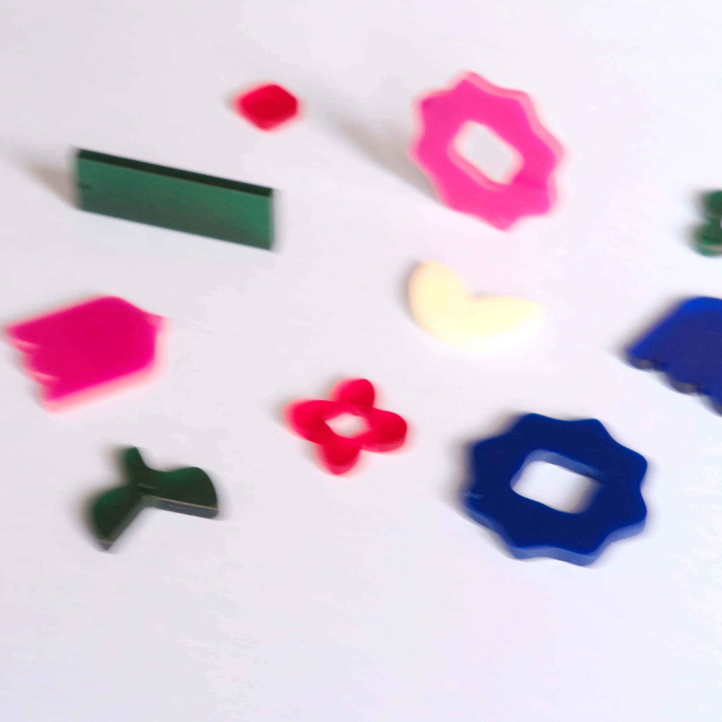
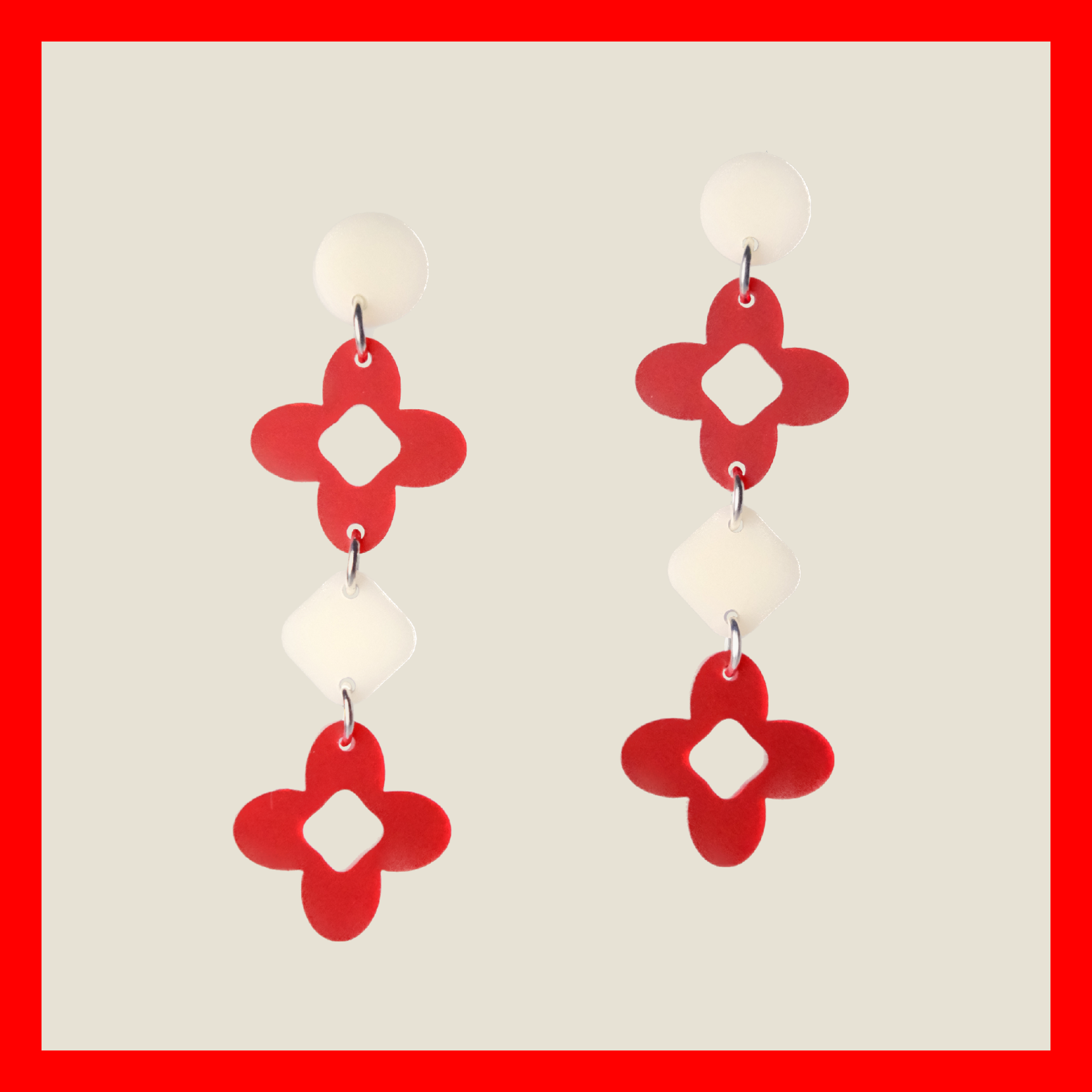
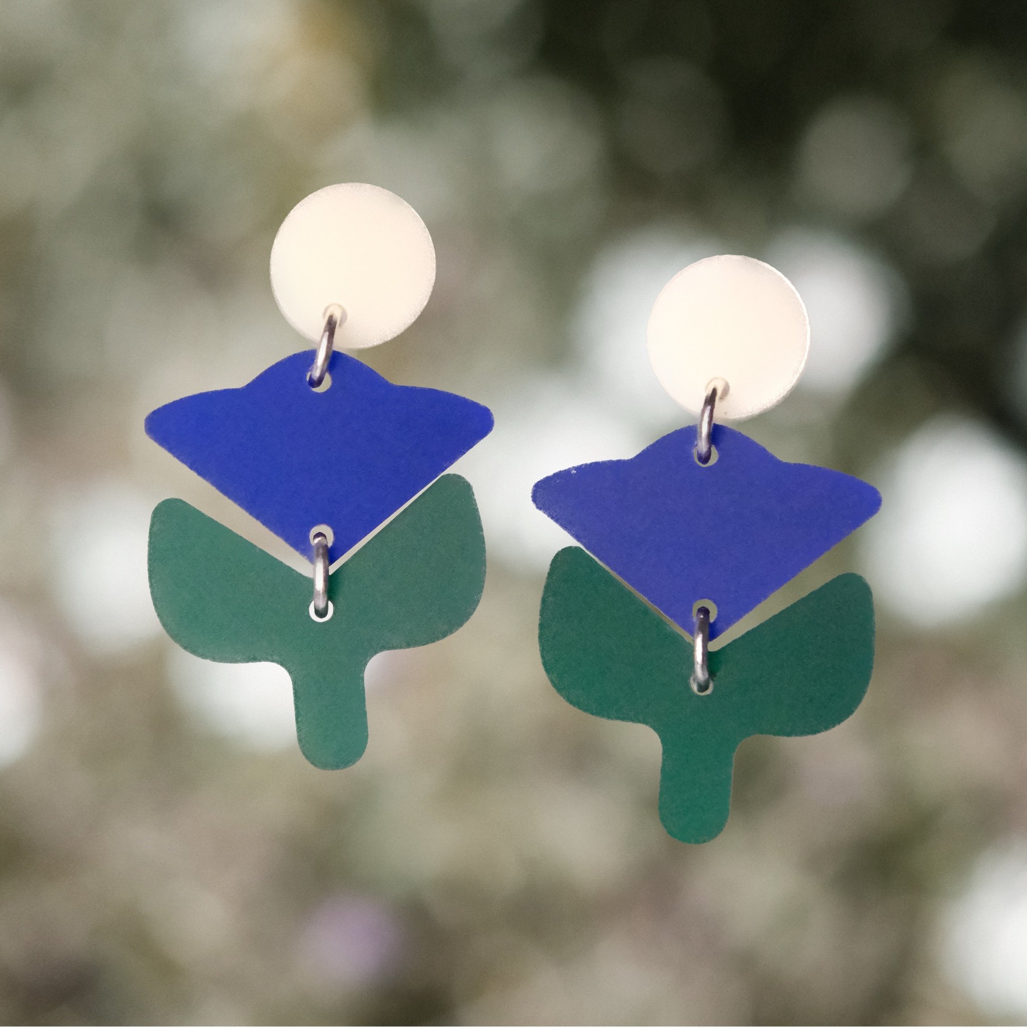
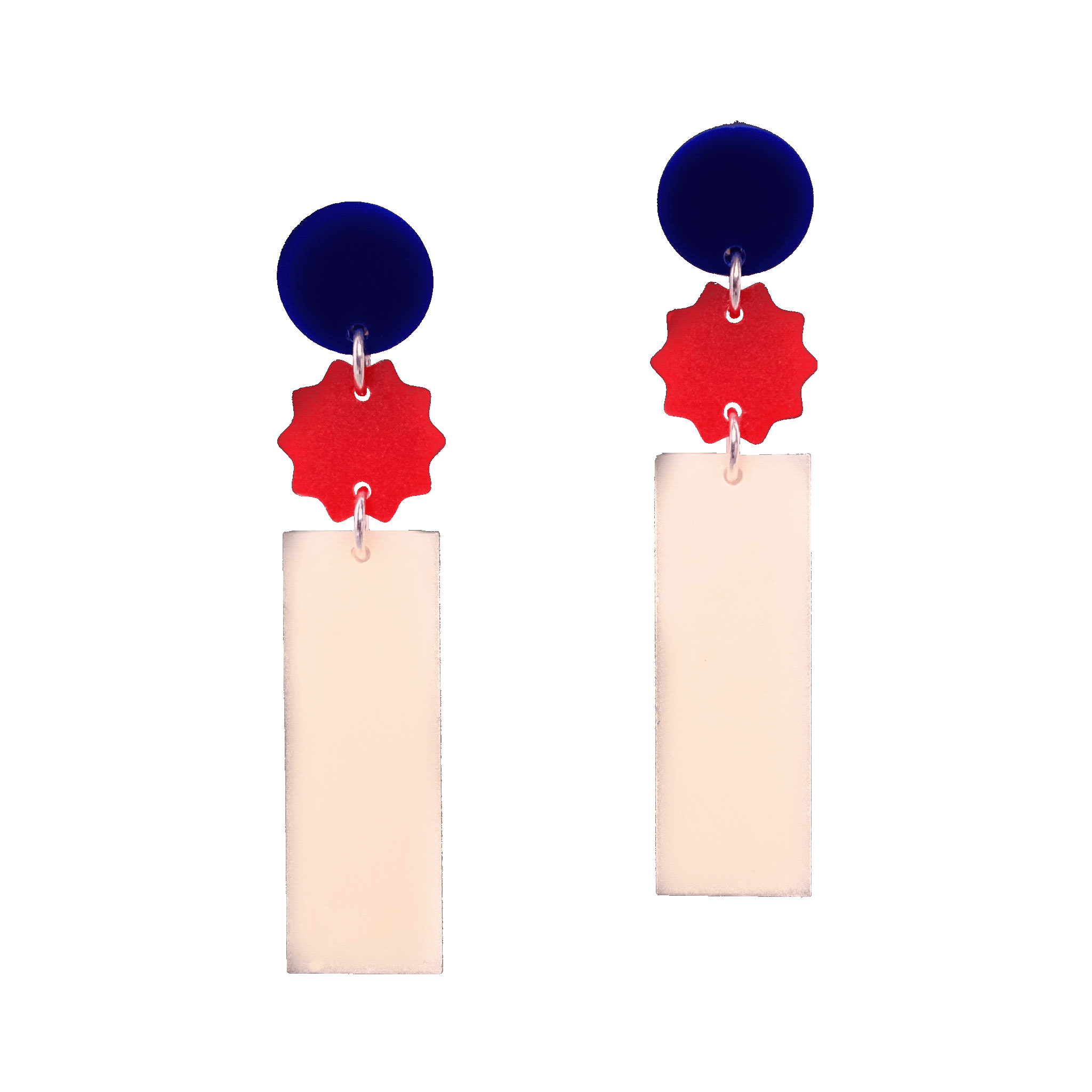
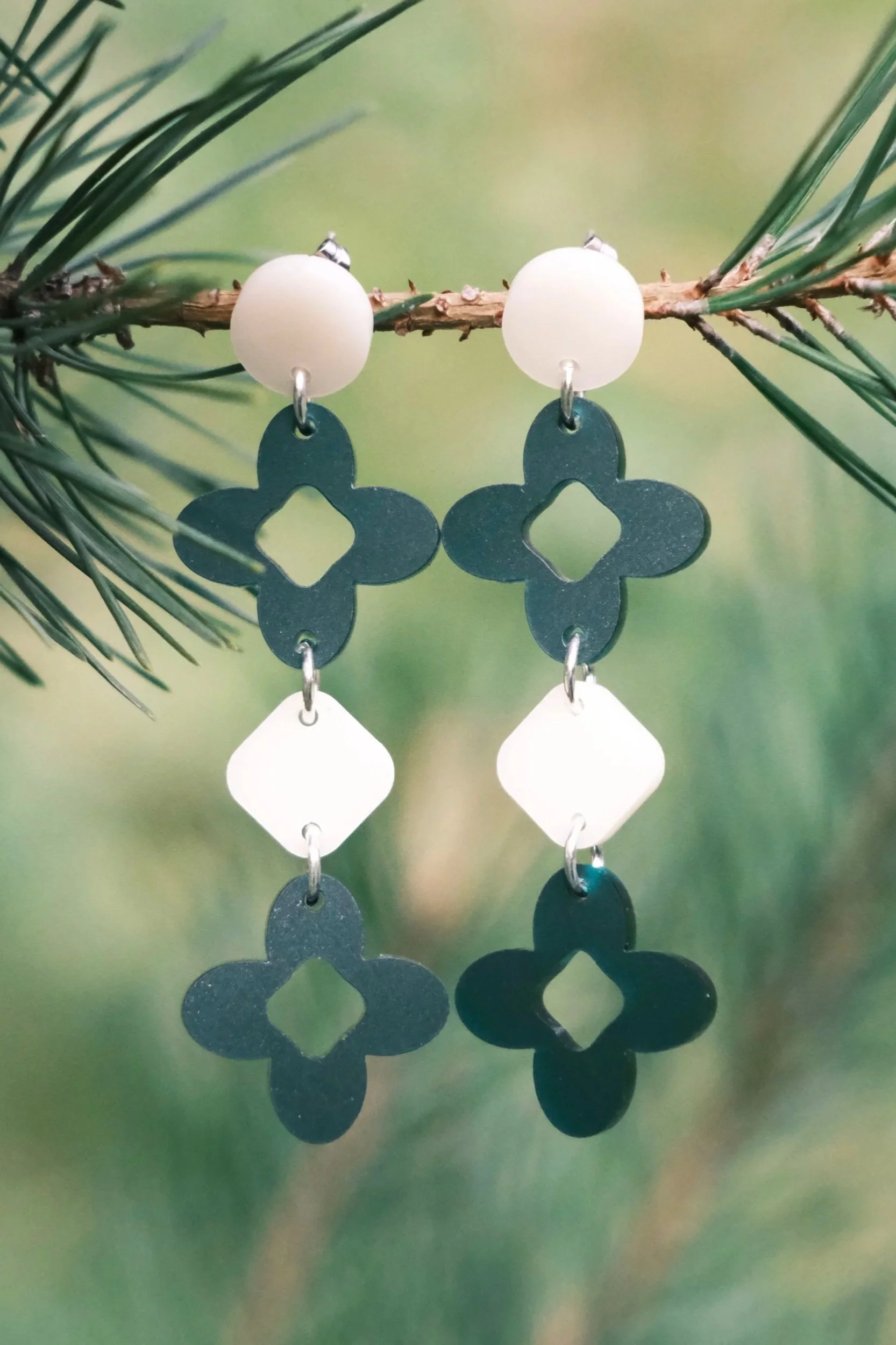
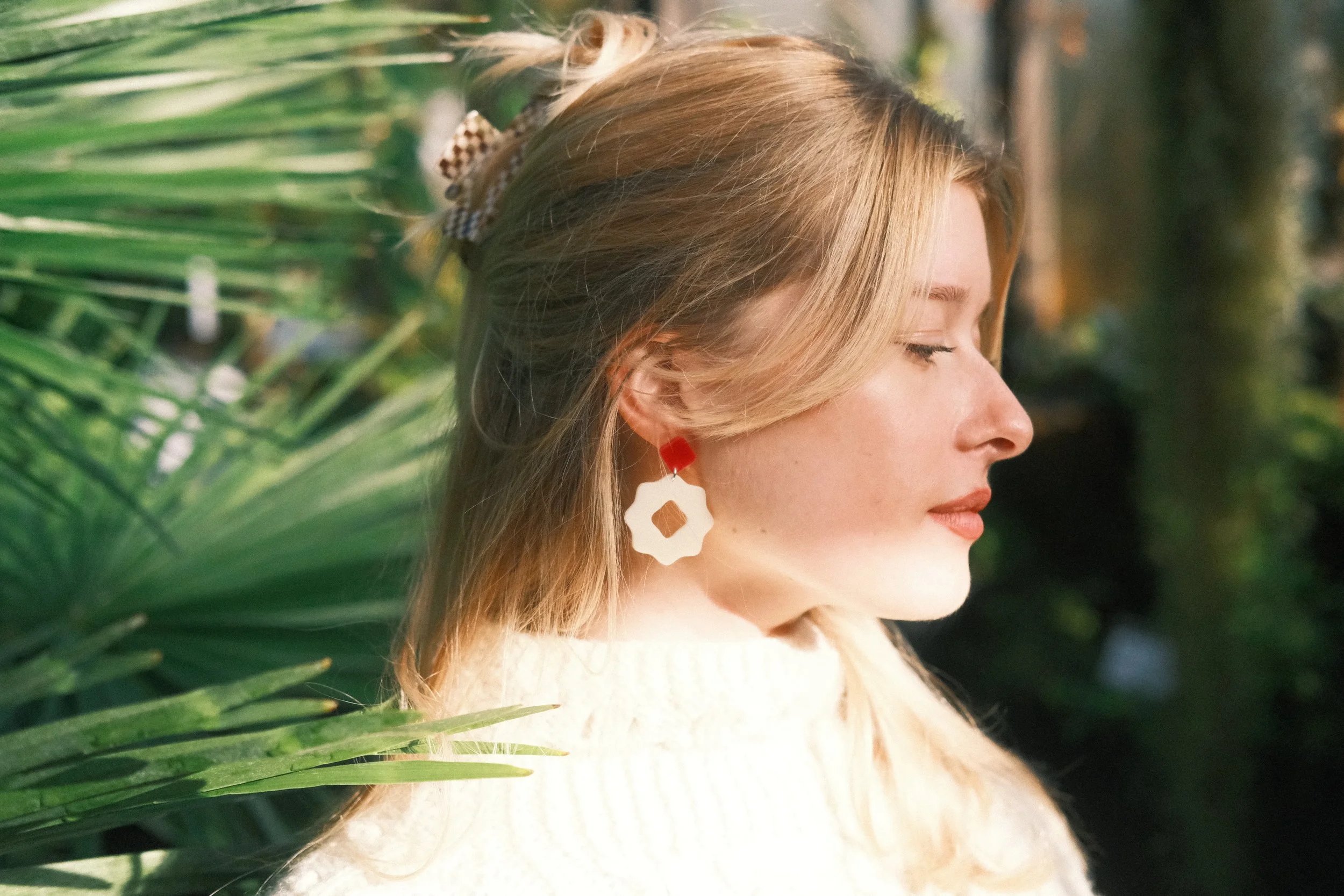
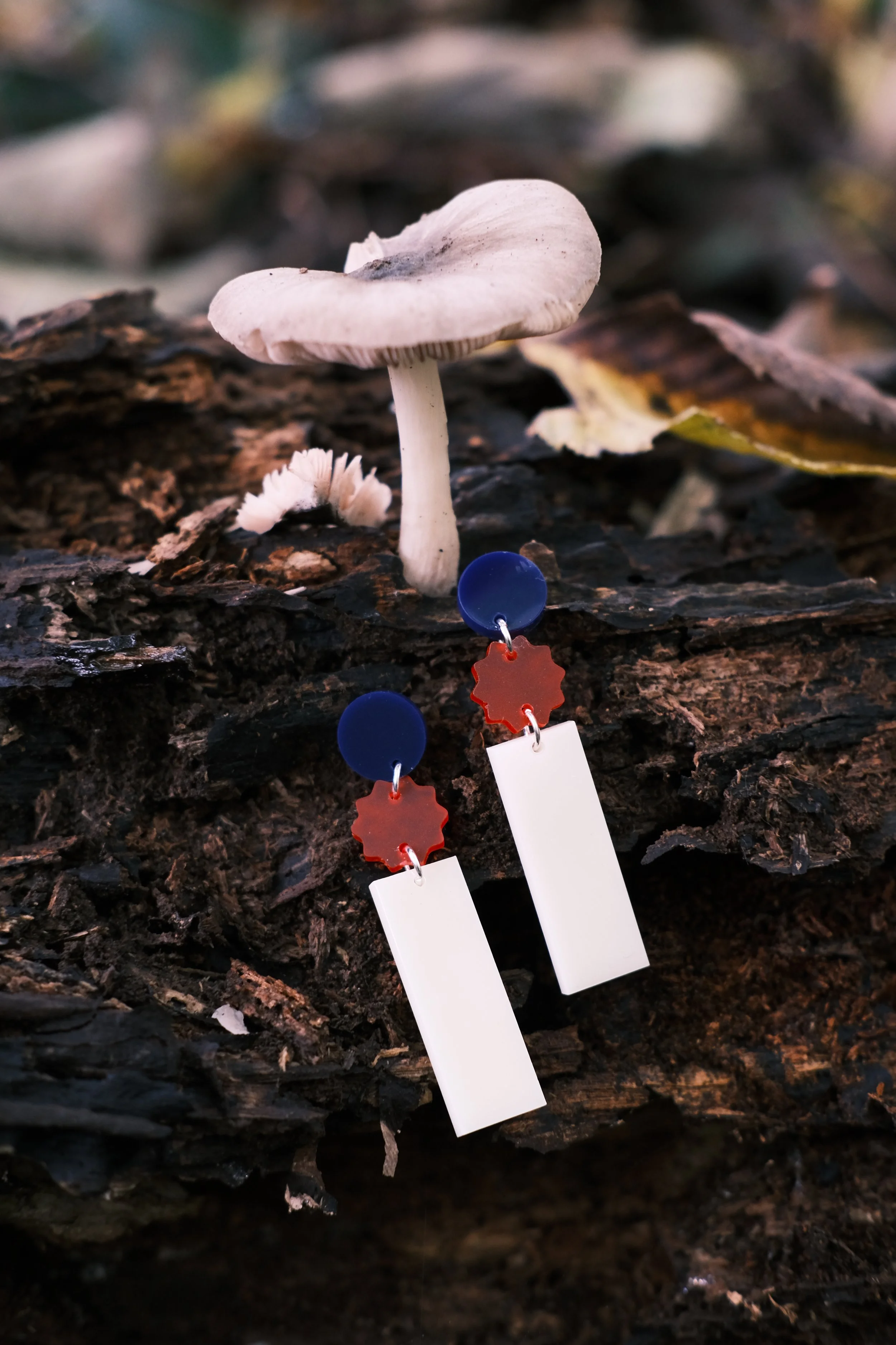
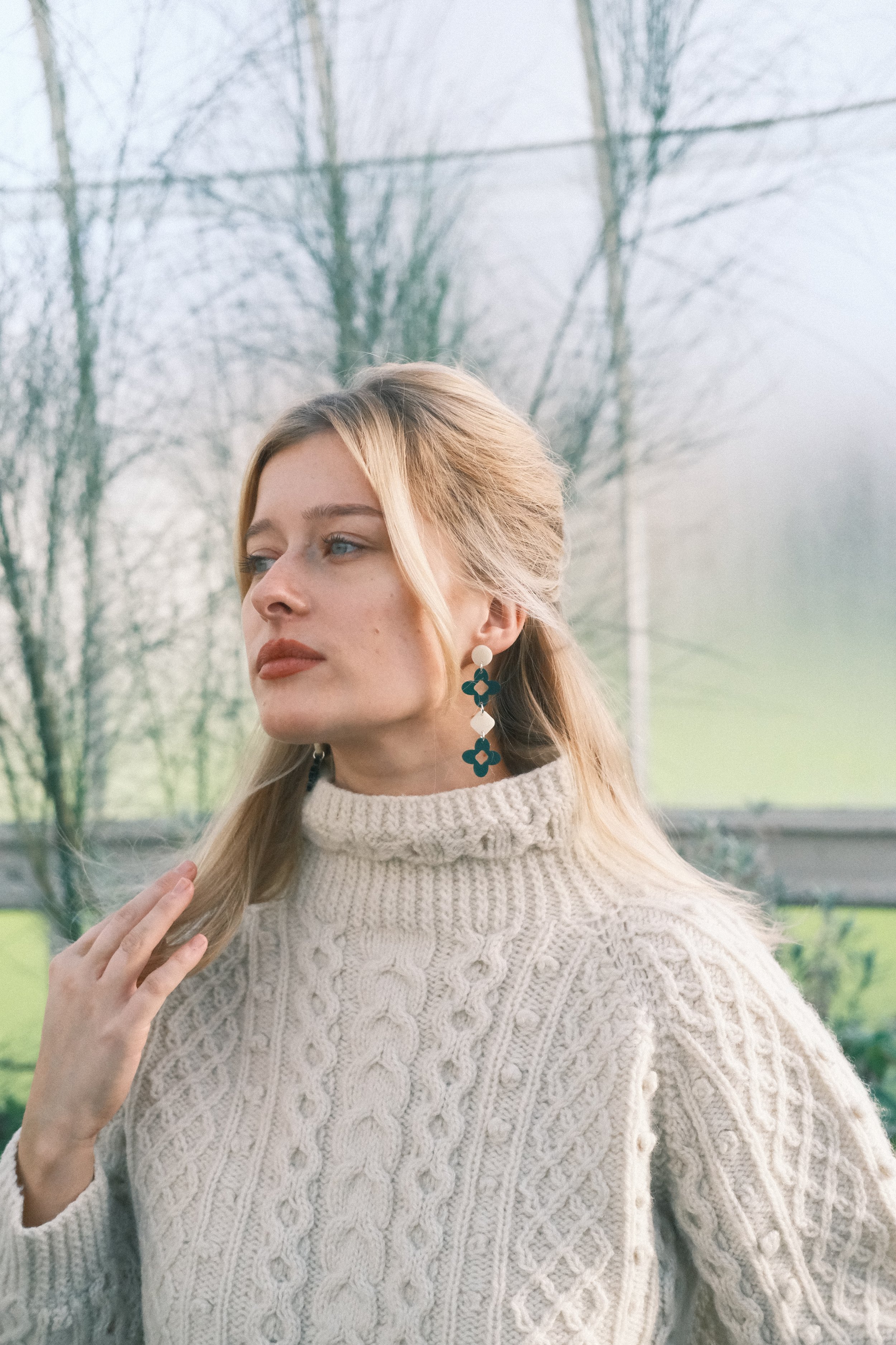
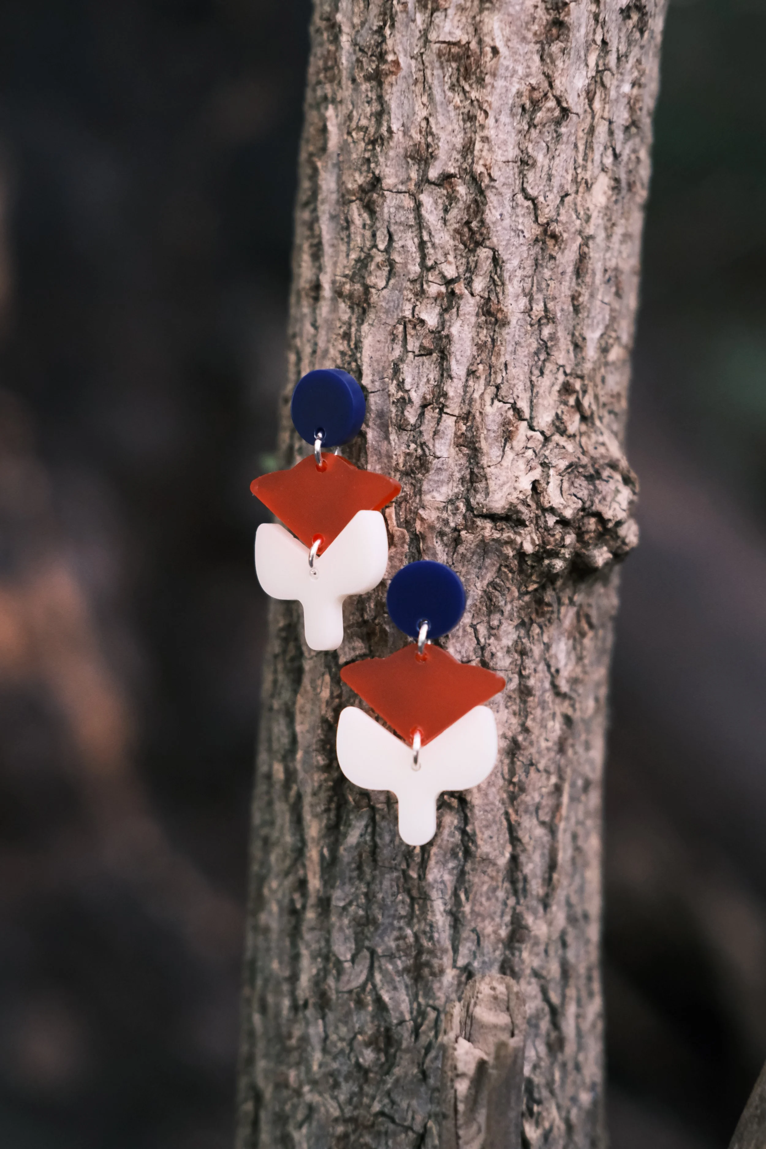
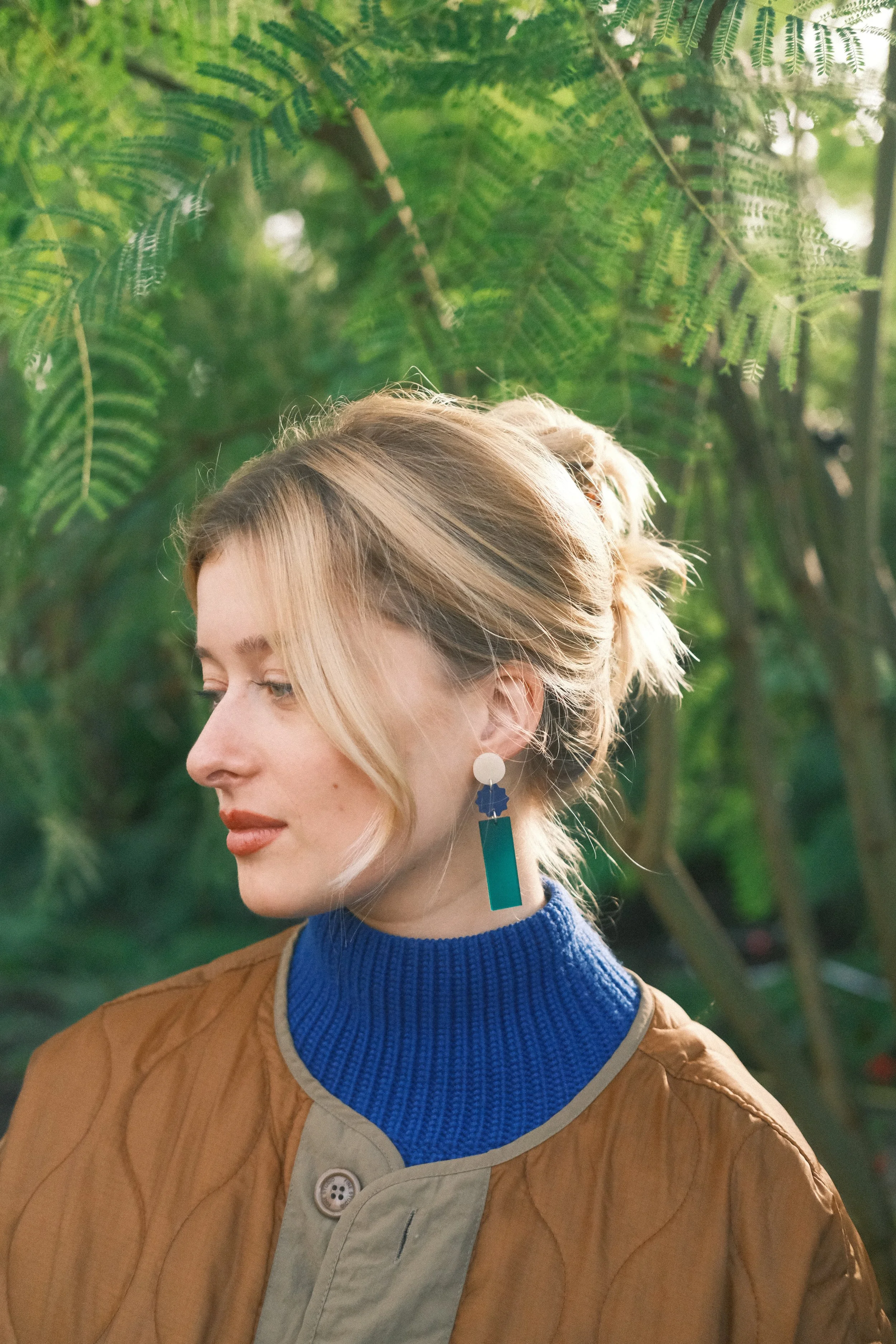
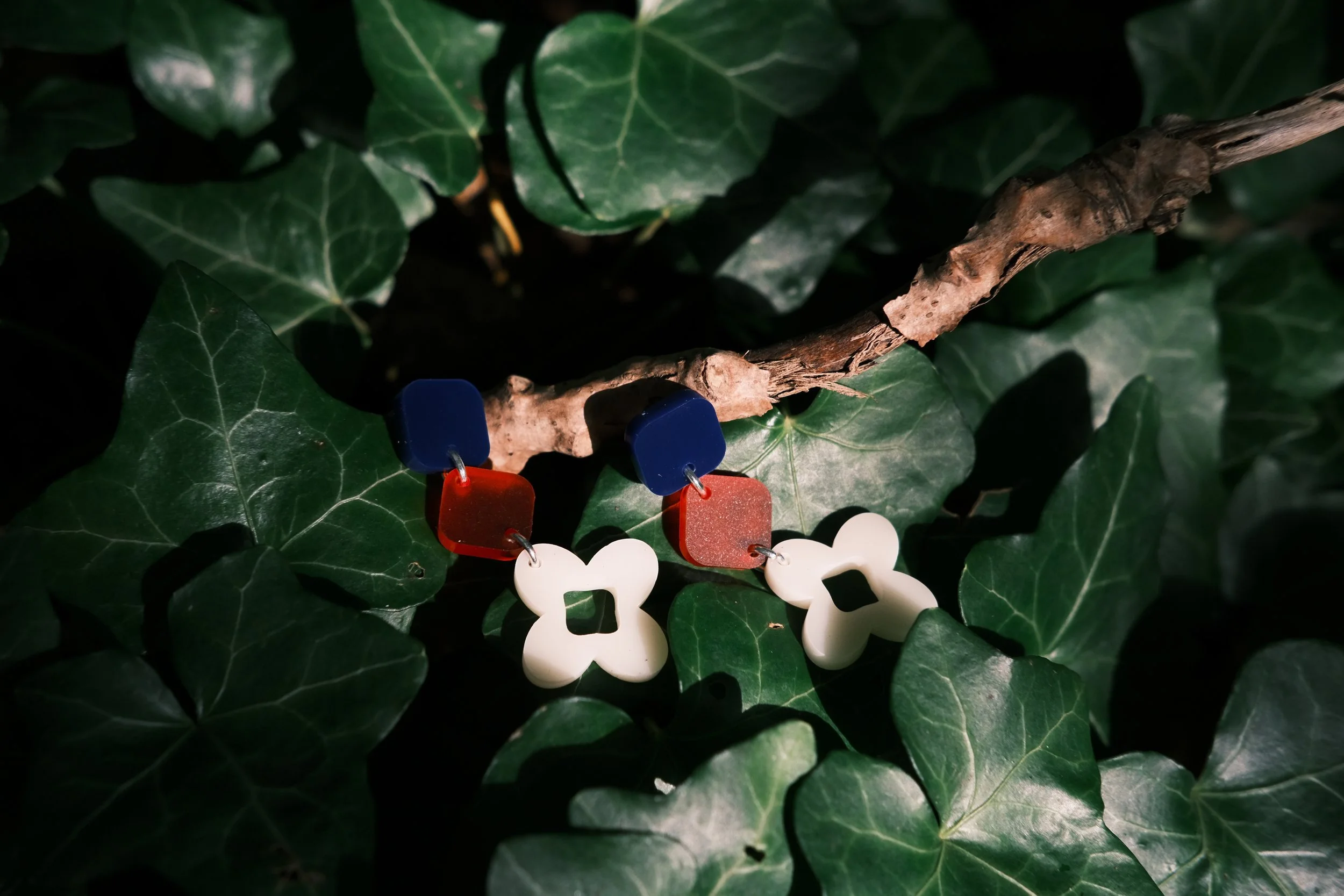
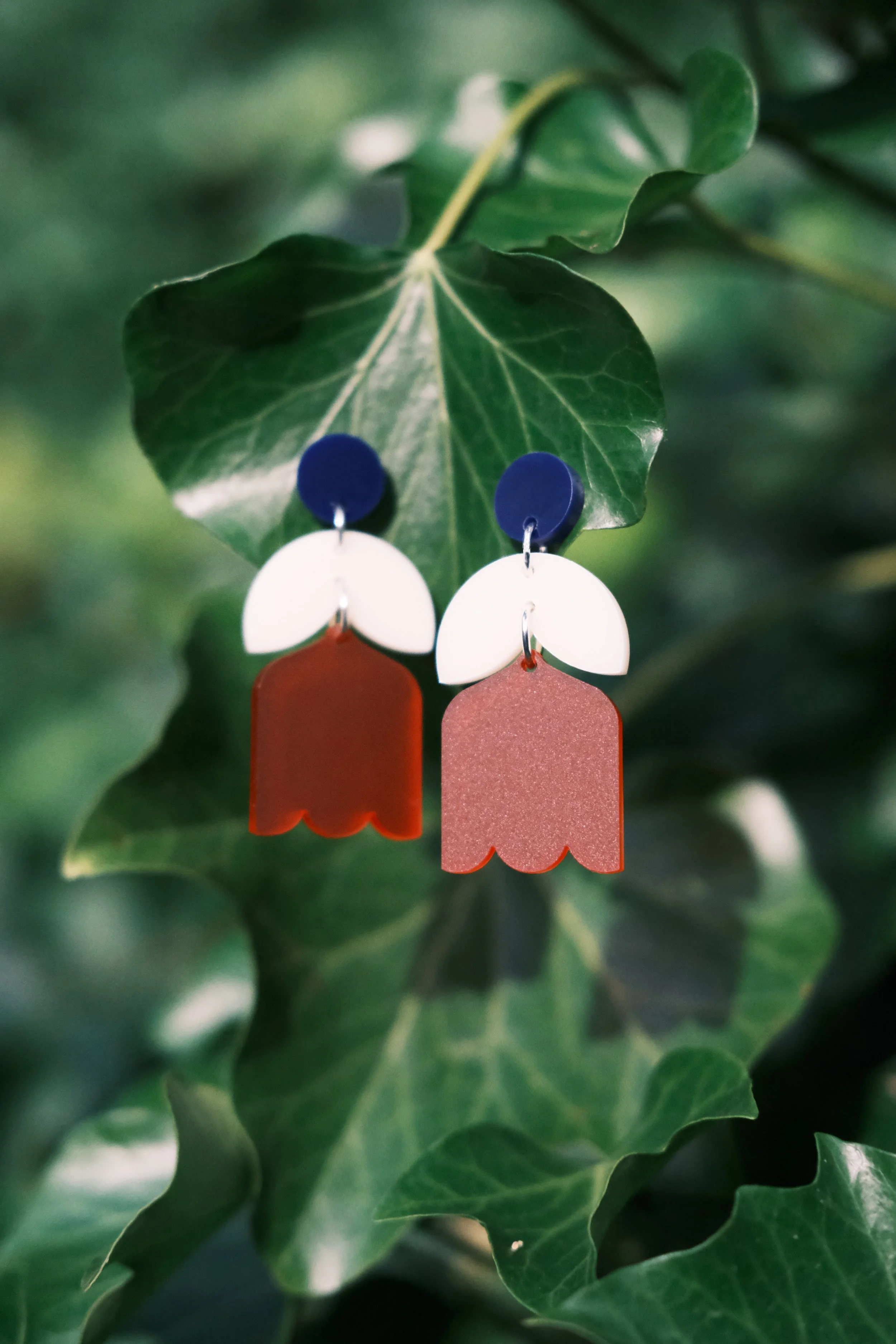
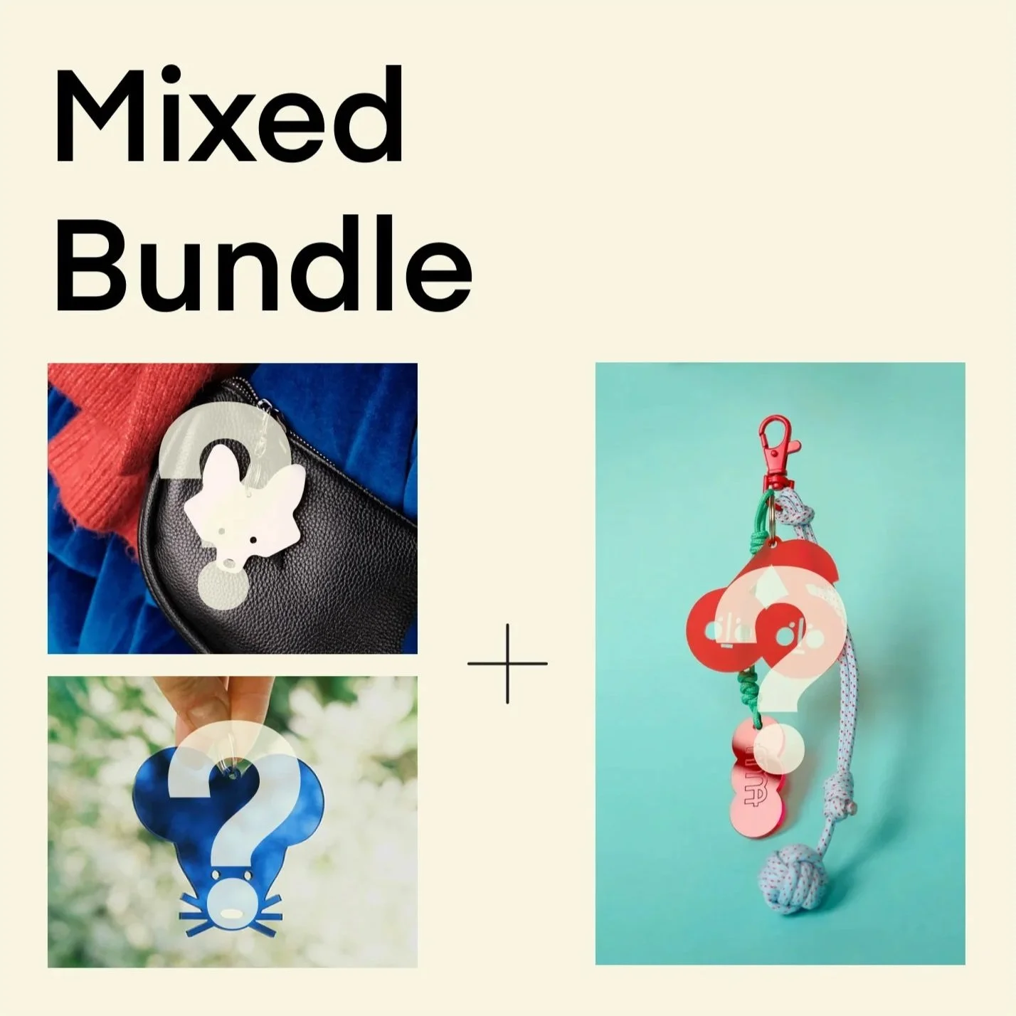
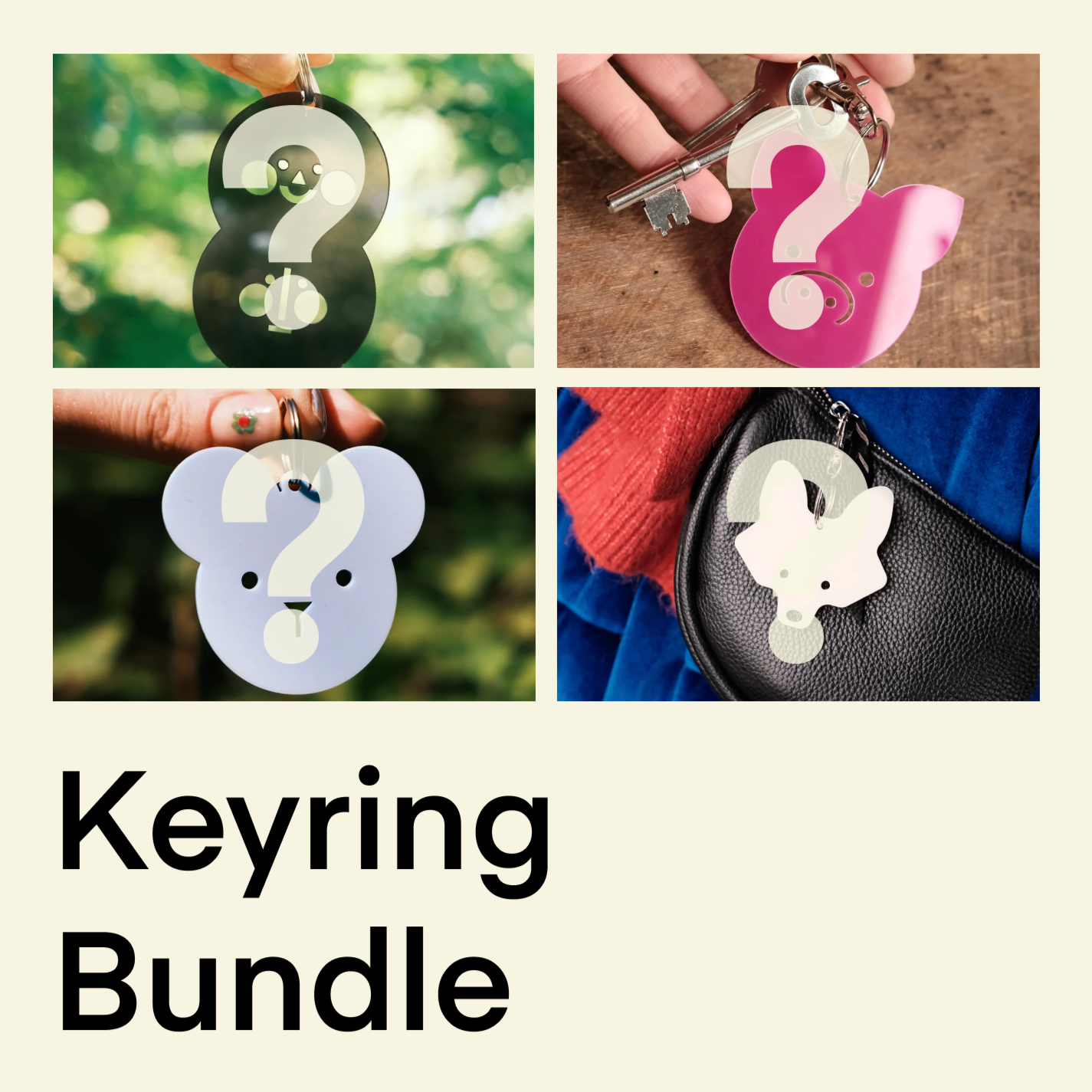
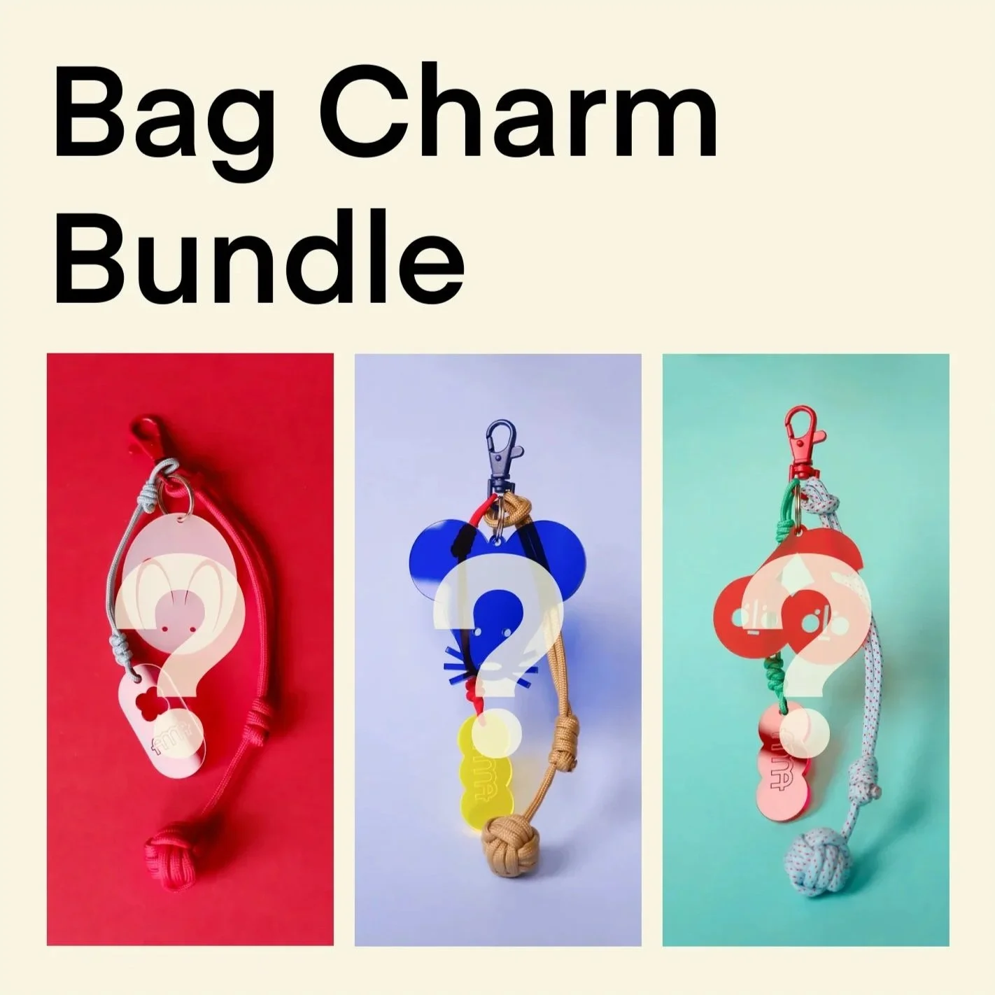
Product Design: Ama Bling


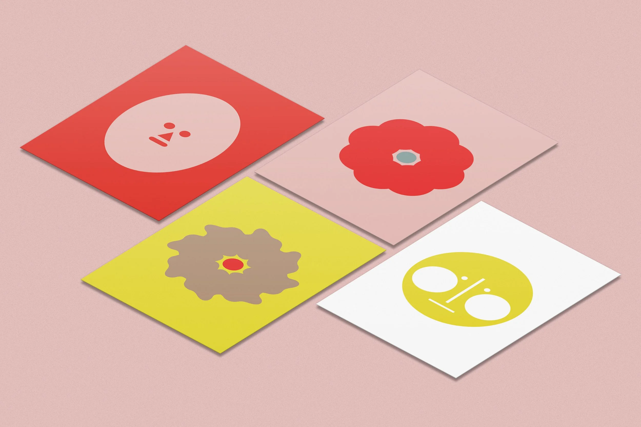
Product Design: Ama Print
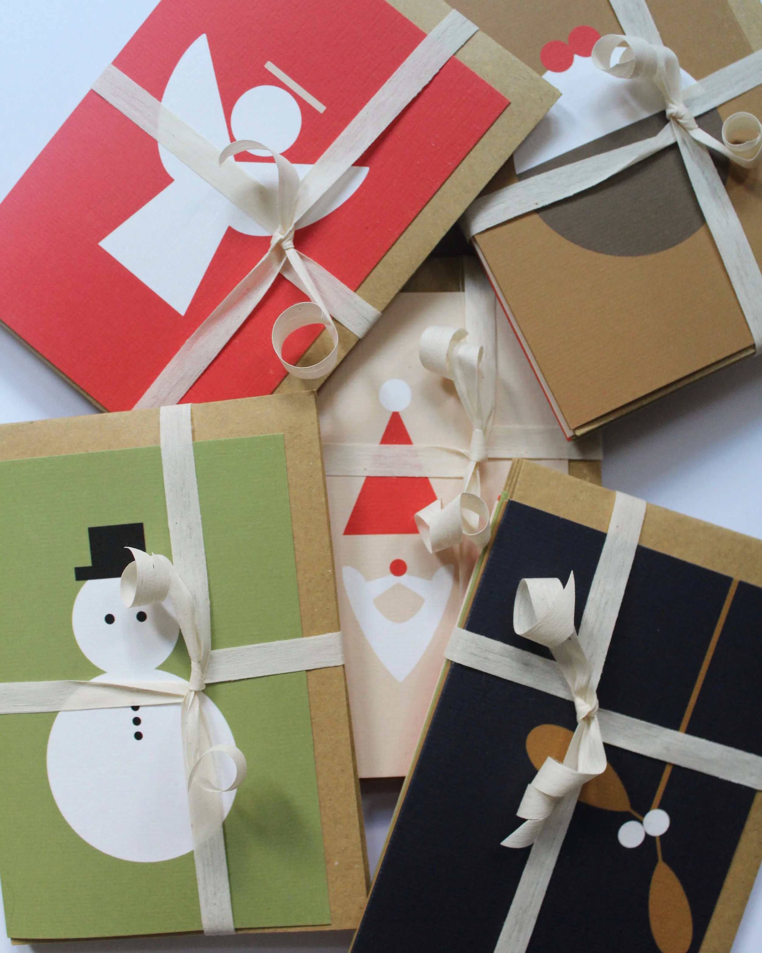
Packaging Design
The packaging for AMA Designs was designed to carry the brand’s minimal yet playful aesthetic into the unboxing experience. Drawing inspiration from vintage product packaging and IKEA’s simple graphic boxes, I created labels that featured bold, stylised illustrations of the products. This approach gave each box a clear identity while keeping the overall system cohesive. Paired with sustainable, practical materials, the packaging reinforced the brand’s focus on simplicity and function while adding a distinctive visual layer that connected the designs to a broader tradition of everyday, well-crafted objects.


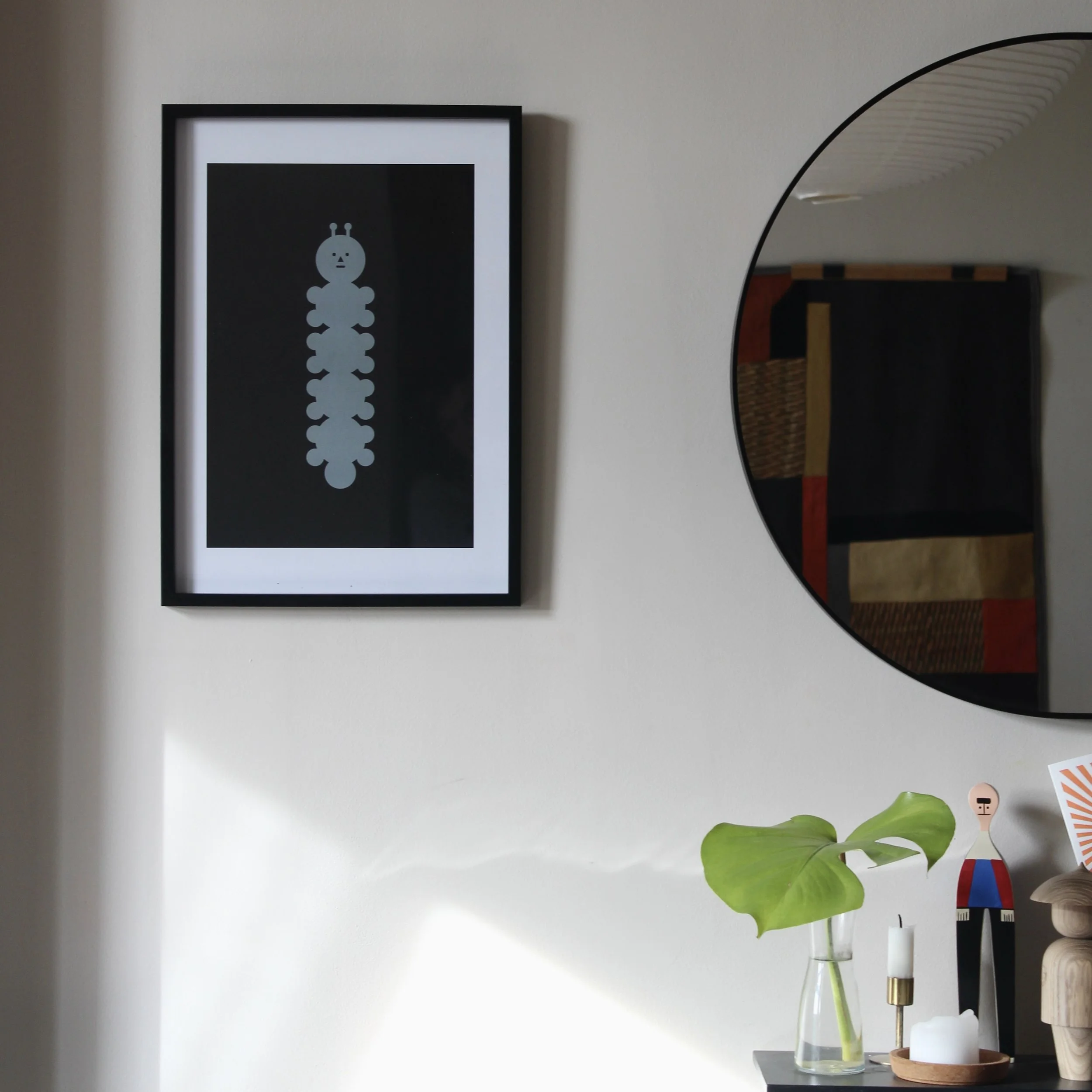
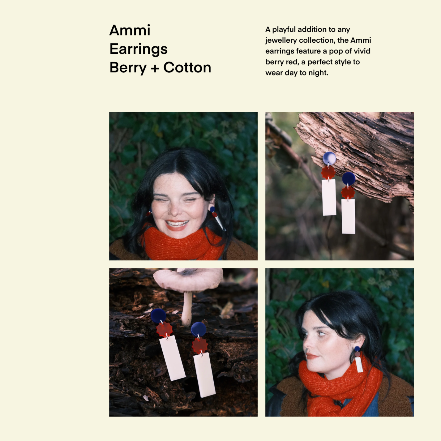
Content, photography and campaigns
To bring AMA Designs to life, I created all of the brand’s content and photography, developing a visual style that highlighted the bold forms and minimal details of the products. Campaigns were designed to be playful yet refined, using carefully styled still life photography and lifestyle shots to place the pieces in context. Through a mix of product-focused imagery, seasonal campaigns, and creative social media content, I built a consistent visual identity that not only showcased the craftsmanship of the designs but also captured the ethos of simplicity, functionality, and modern aesthetics at the heart of the brand.


Brand Partnerships
AMA Designs has partnered with other brands to create co-branded products that merge identities in a playful yet minimal way. These collaborations extended the brand’s design language into new contexts, demonstrating its versatility while maintaining a bold, graphic character. Each partnership highlighted the adaptability of AMA Designs, showing how its aesthetic could be reinterpreted through shared creativity and cross-brand dialogue.
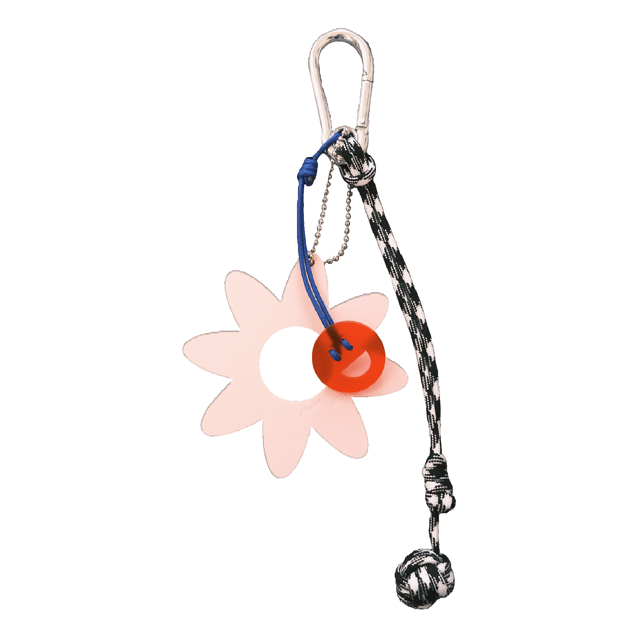
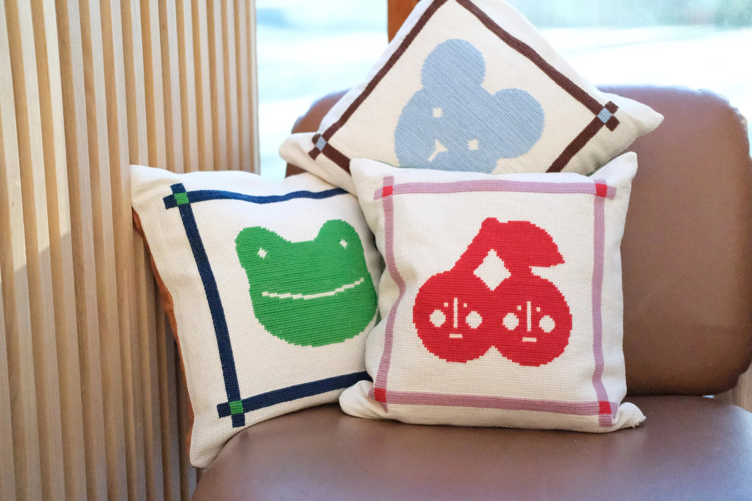
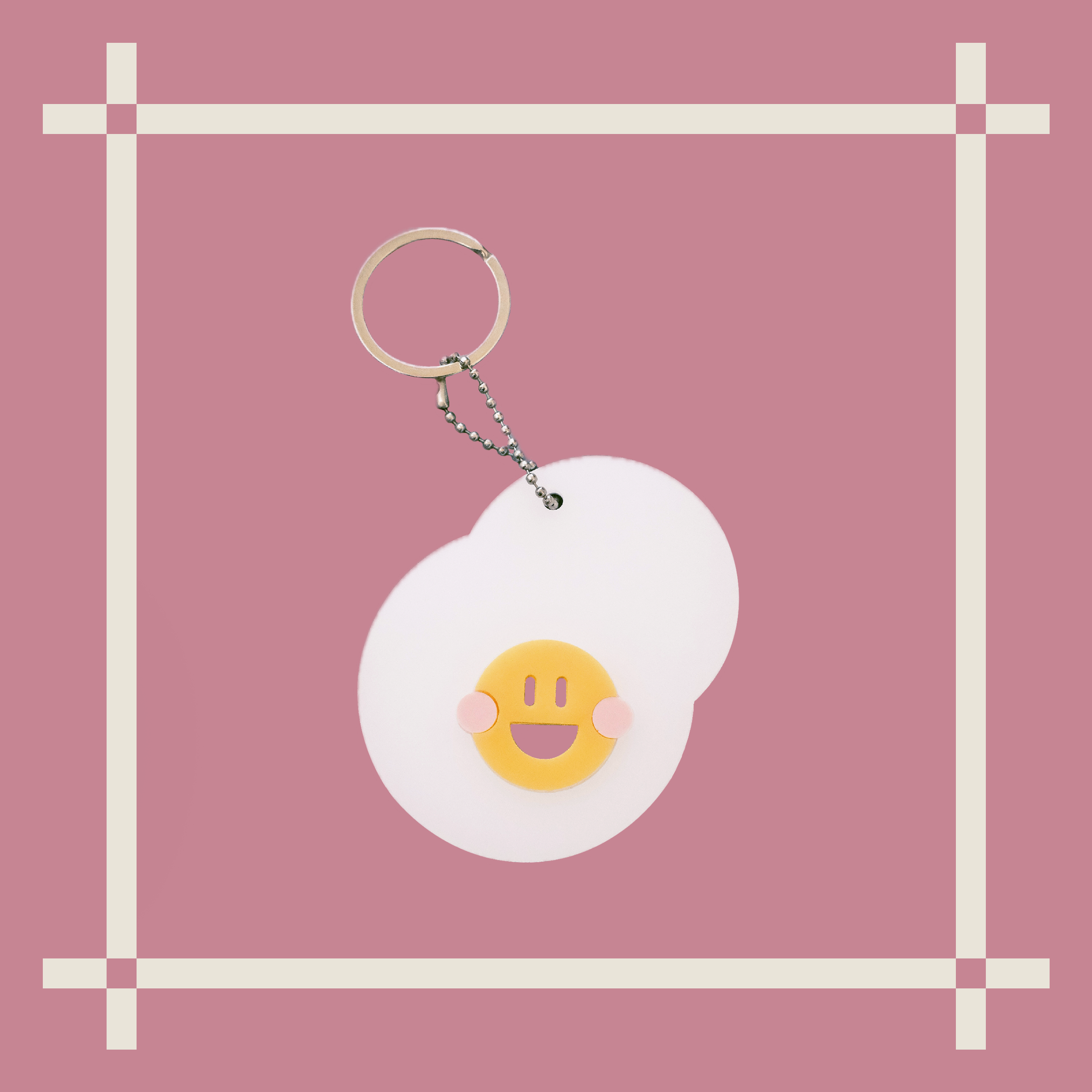
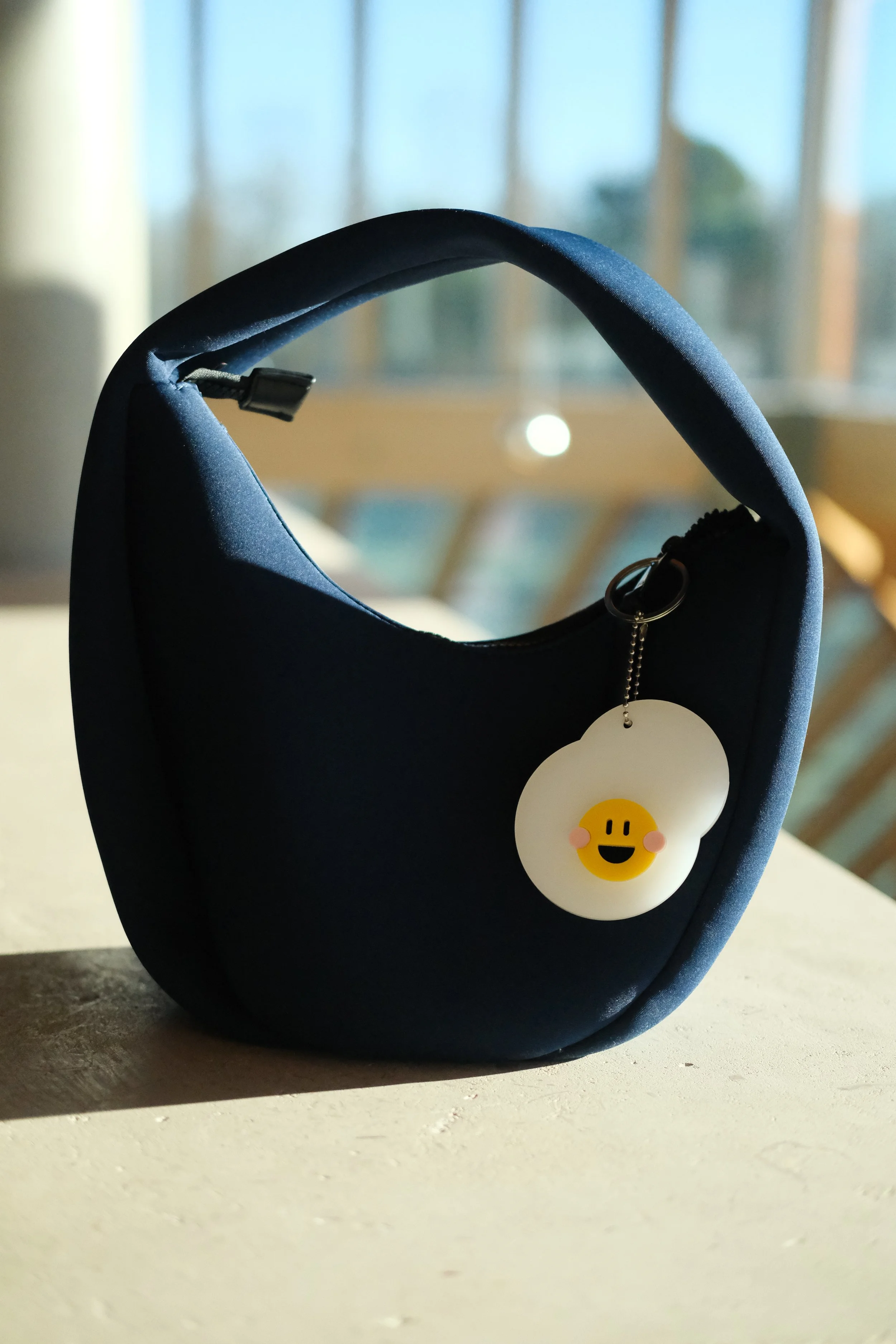
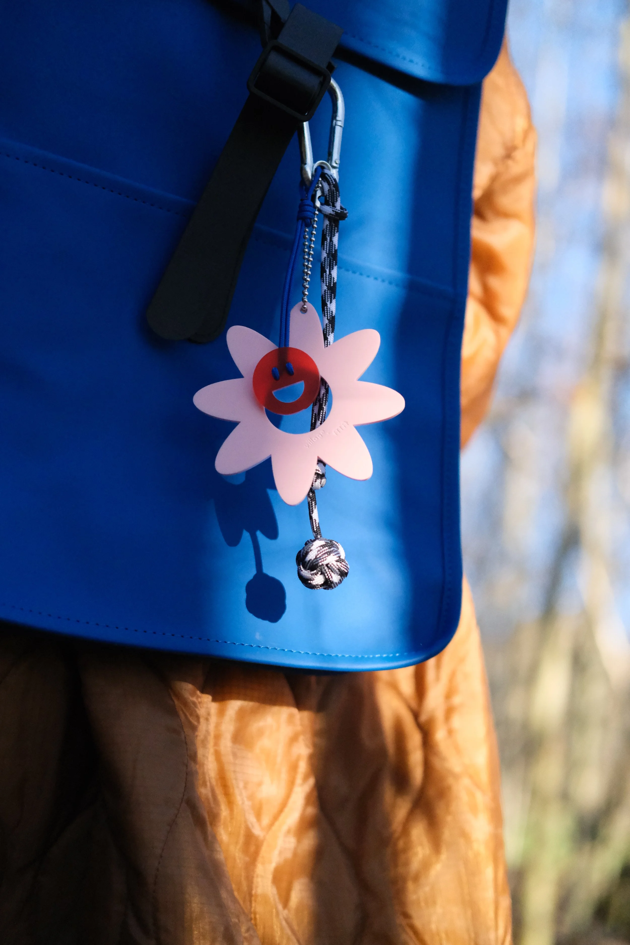
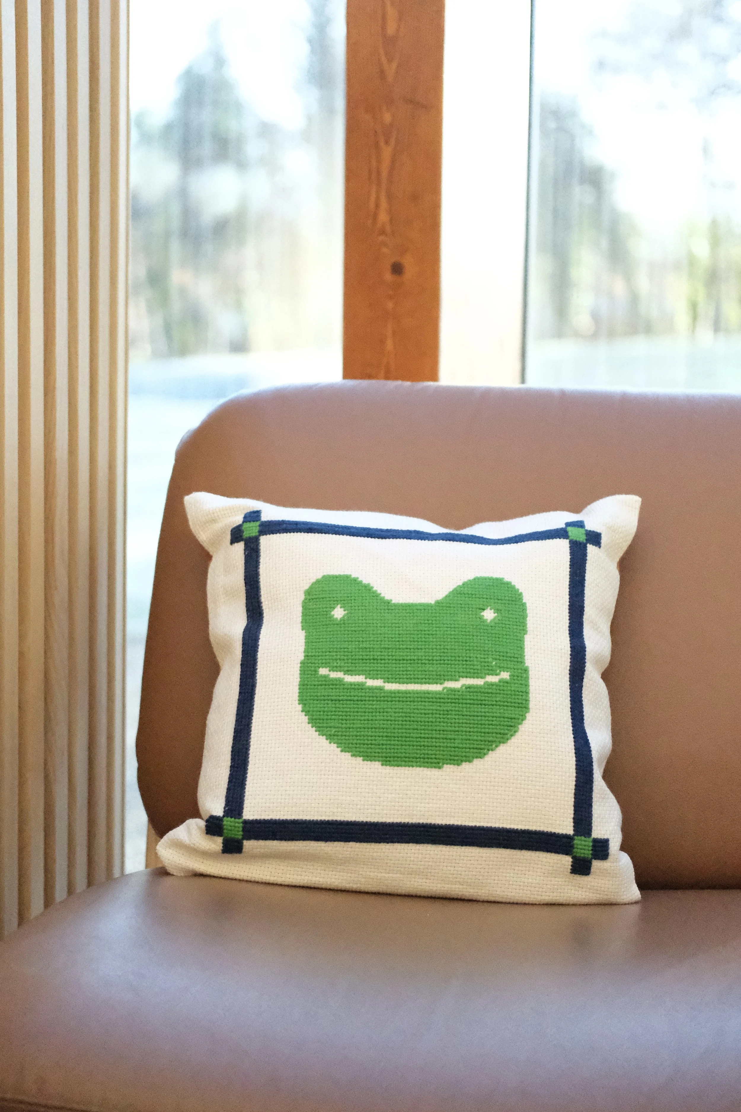
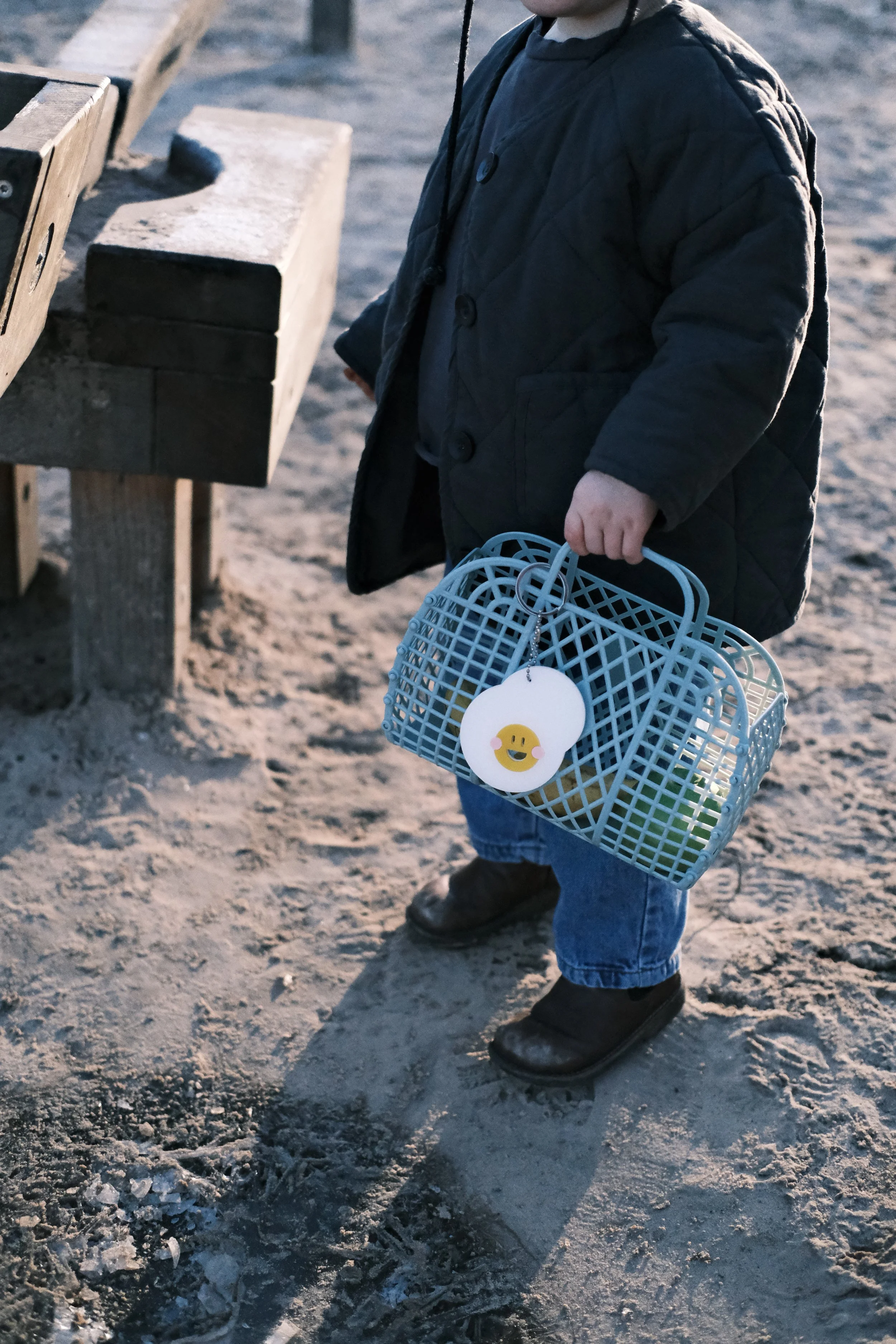
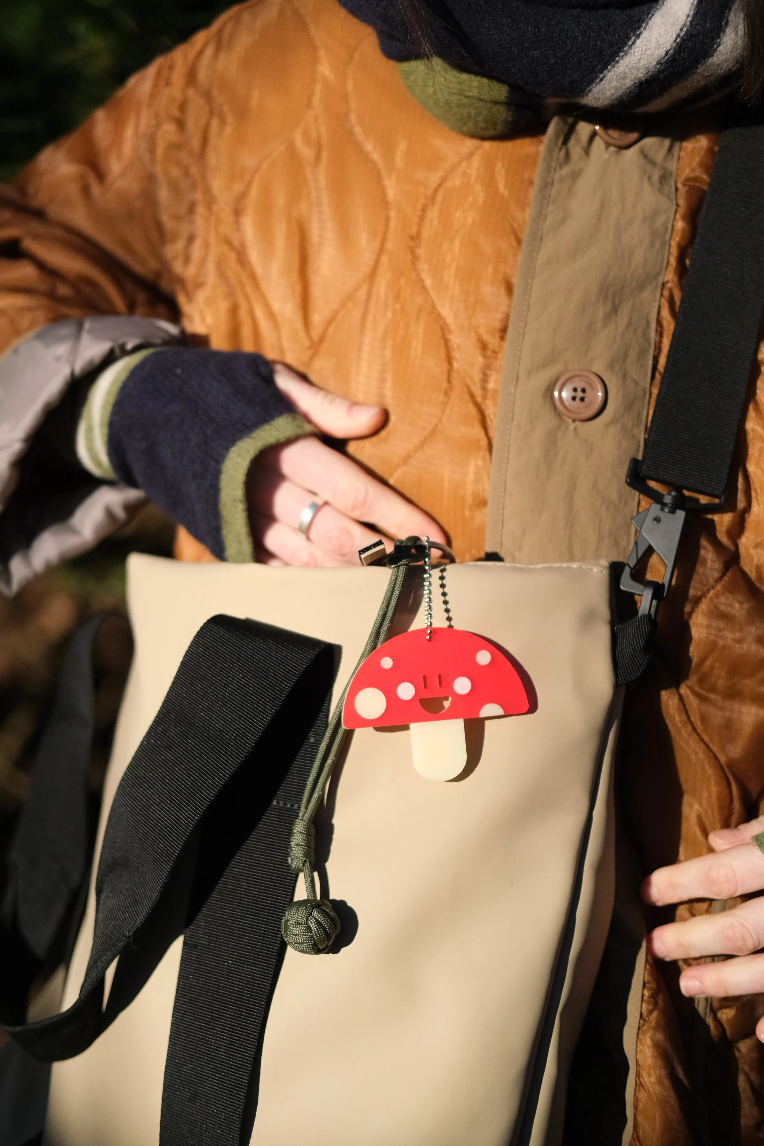
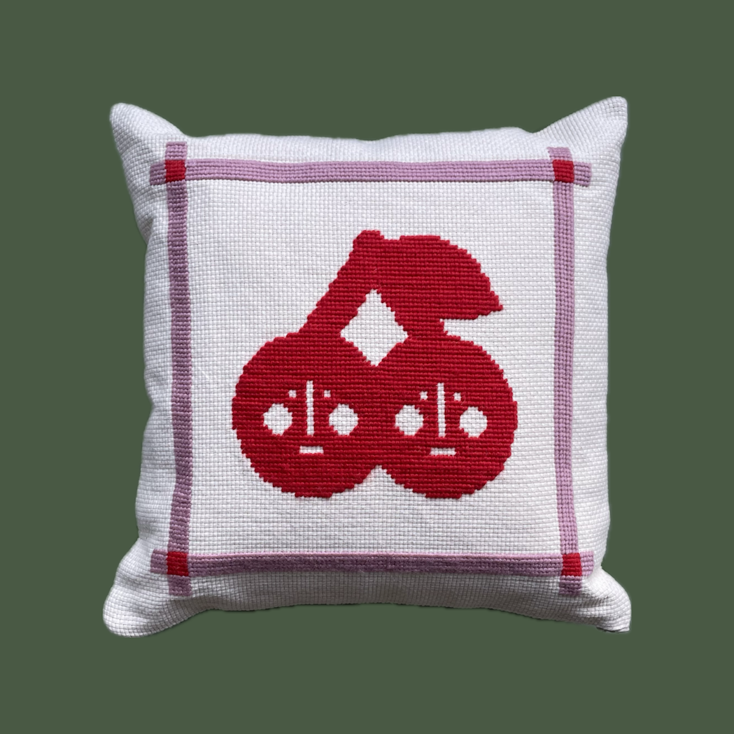
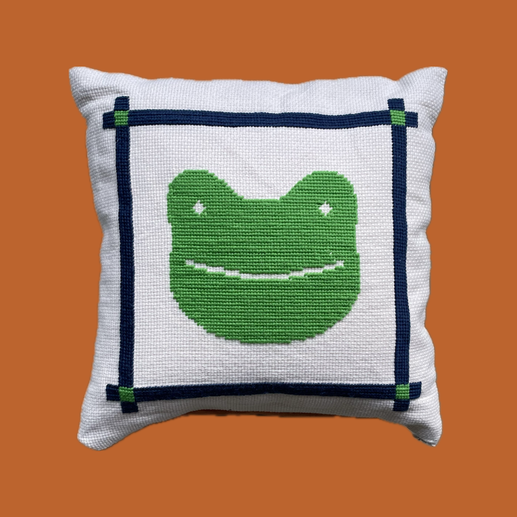
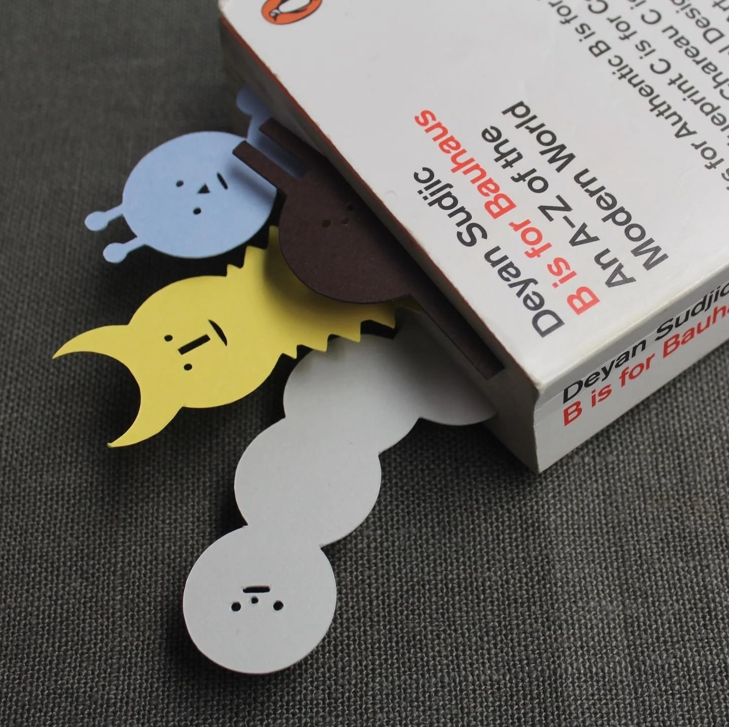
Village Concept Store x Ama
A collaboration with 'Village Concept Store', a fun, family-centered brand. We worked together to produce a range of products that celebrate the magic and joy of childhood whilst speaking to the identity of each of our brands. The products, a re-imagining of Village’s signiature needlepoint cushions and Ama’s playful bag charms, were developed from initial sketches and mood boards to digital drawings and then were finished meticulously by hand. We styled, and directed a photoshoot, to capture the products as we had imagined them to be used, creating a large bank of content for web and socials.