
Project Overview
I designed Pott, a digital banking app concept aimed at making saving and managing money approachable, engaging, and visually distinct. I began by exploring real-world banking interfaces, analyzing competitor apps, and considering how to communicate a friendly, trustworthy brand through visual design.
I developed a cohesive brand identity, including the logo, colour palette, typography, and illustrative elements inspired by the theme of planting and nurturing savings. I then designed nine responsive screens across mobile, tablet, and desktop, including My Accounts, Transactions, and Insights pages. The UI focuses on clarity and usability while using playful, thematic touches to make financial management feel engaging and memorable.
The final designs deliver a credible and cohesive banking experience, balancing functionality with a strong visual identity that reinforces the brand’s personality and communicates growth, clarity, and user confidence.
Brand Identity
Logo design, colour palette, typography, and any illustrative elements.
Brief explanation of why you chose these elements (playful, trustworthy, growth theme).
Optional: show before/after or alternatives if relevant.
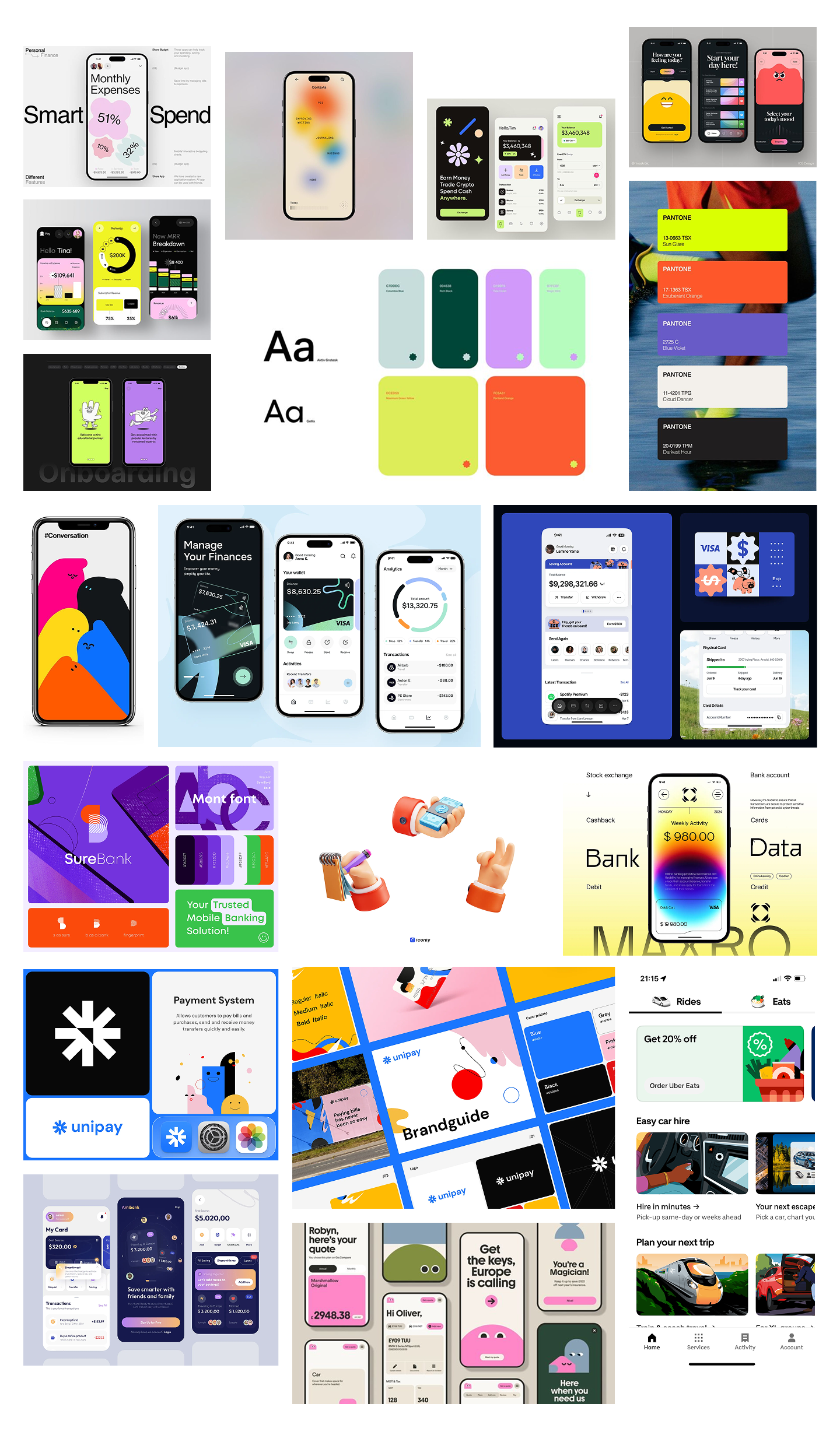
Process / Research
Show how you approached the project:
Competitor analysis, inspiration, or UX research insights (even if high-level)
Key design considerations (usability, clarity, consistency, accessibility)
Visuals: moodboards, style tiles, or sketches if available.
Moodboards
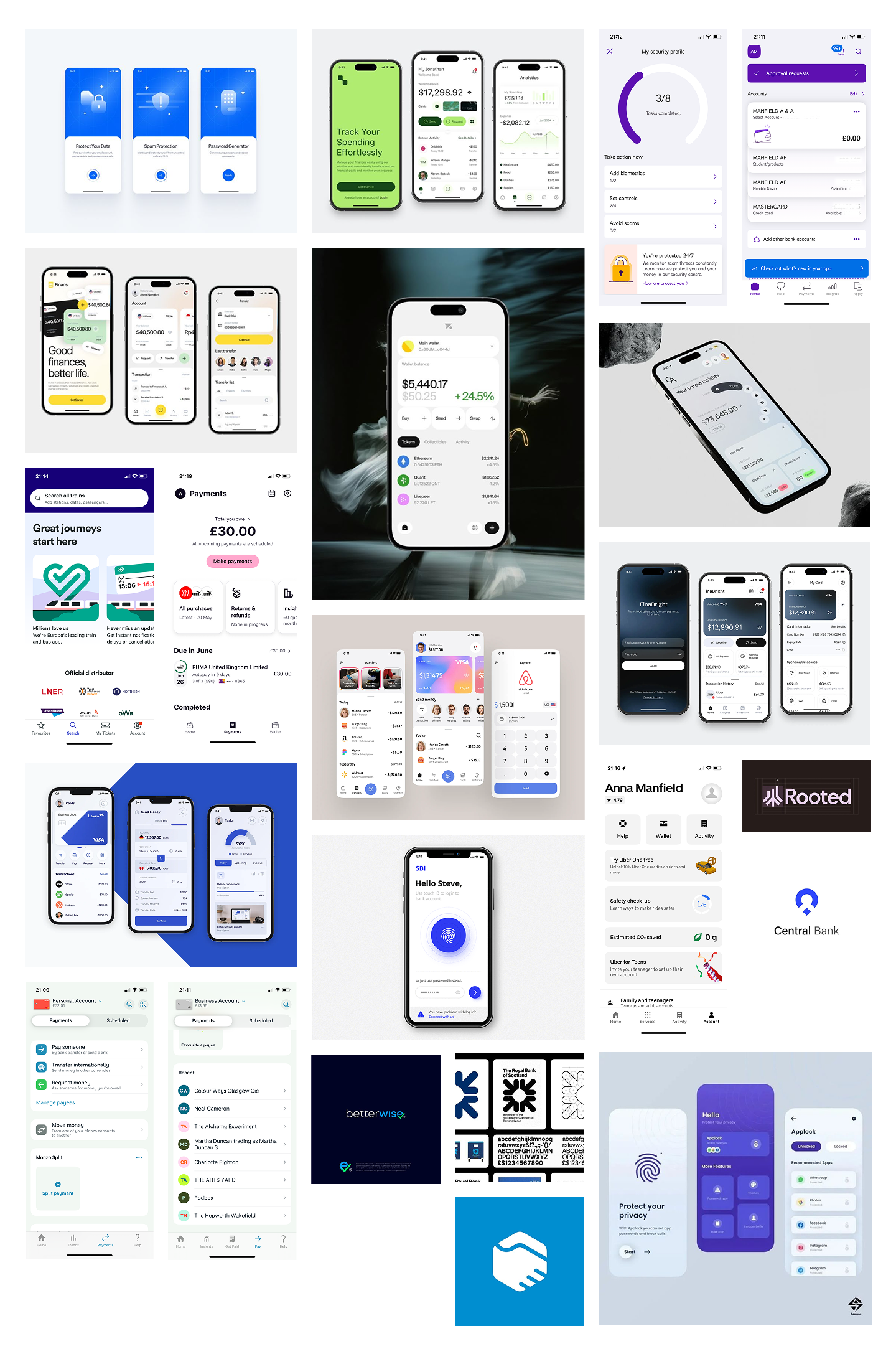
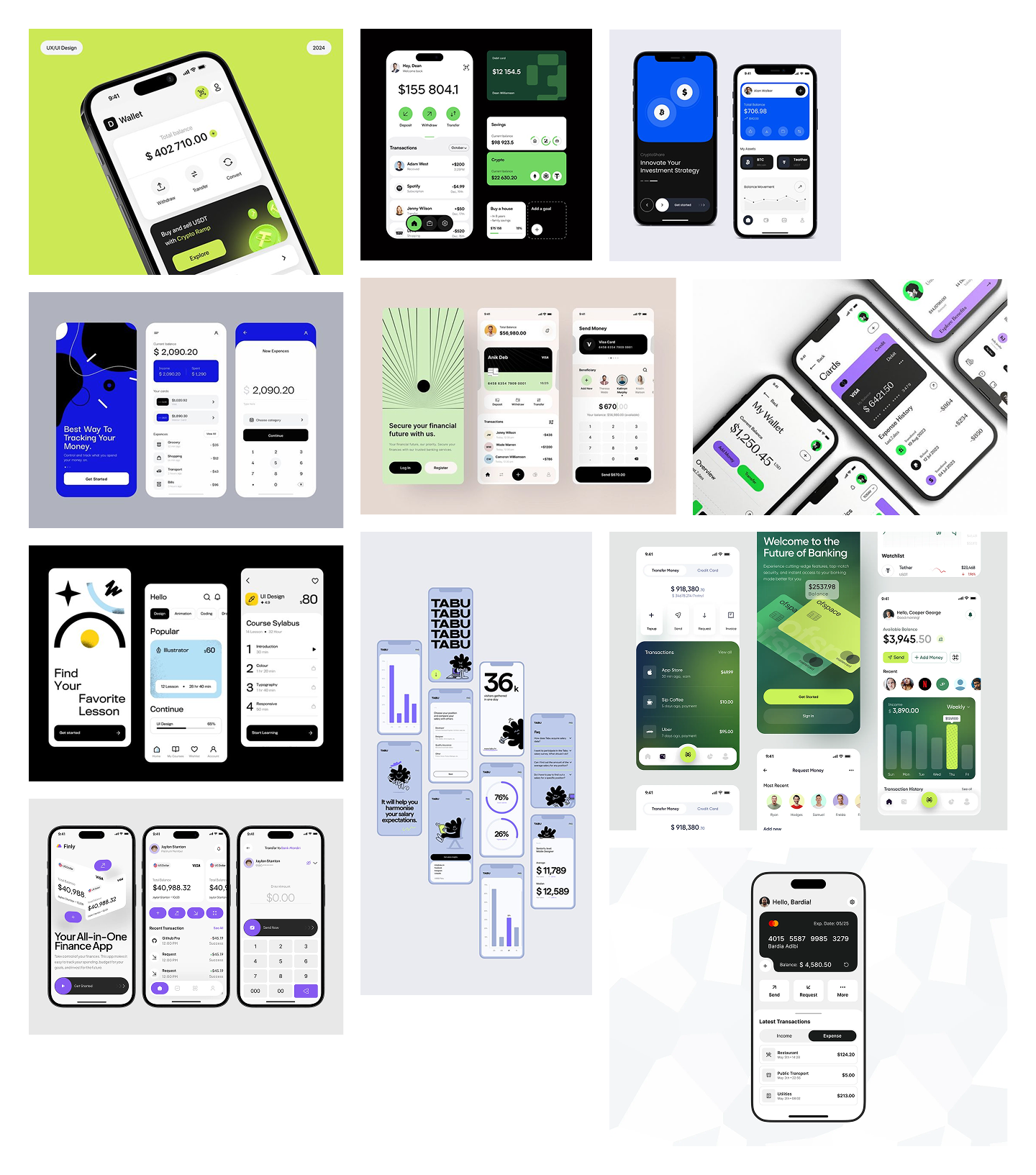
UI Design / Screens
Group by feature or flow, e.g.:
My Accounts (overview)
Transactions (history, filtering)
Insights (charts, spending overview)
Show responsive versions (mobile, tablet, desktop) where relevant.
Include short captions explaining design decisions or rationale, e.g., why you chose certain layouts, chart styles, or interactions.
Highlights / Key Screens
Optional section to zoom in on 2–3 screens that best communicate:
The brand personality
Visual storytelling
Key functionality
Reflection / Learnings
Include your reflection answers:
What went well
What was challenging
What you would do with more time
Helps show critical thinking and design growth.
Takeaways / Outcome
Summarize the impact:
How the UI balances usability and brand
What you learned about integrating brand and interface design
How the project demonstrates your UX/UI capabilities
Optional Extras
Annotated screenshots highlighting key UI decisions
Prototype link or clickable mockups if applicable
Additional illustrations or playful brand elements