ROAM

Self-initiated project designed without stakeholder input or development resources.
Role: UX/UI Designer, Brand Designer
Date: 2025
Tools: Figma, Adobe Photoshop, User Testing
Project Details: I designed a hotel booking platform aimed at simplifying the user experience while highlighting unique hotels known for their design, architecture, and craftsmanship. I started by analyzing competitor platforms, conducting surveys, and holding user interviews to uncover key pain points.
I created intuitive wireframes and refined the interaction design to ensure a seamless, user-friendly booking flow. The final prototype presents a curated experience, using visual storytelling to showcase each hotel’s unique story.
Research
Before designing the ROAM hotel booking platform, I conducted research to understand how users search, find, and book hotels online. The goal was to identify common usability challenges, industry best practices, and opportunities for improvement through different research methods, including;
Competitive Benchmarking – Analyzing recognised hotel booking platforms to evaluate strengths and weaknesses.
Note-Taking – Documenting key insights, pain points, and behaviors from real user experiences.
Usability Testing – Conducting usability test interviews to observe users and learn key insights, pain points and behaviors to inform designs.
1.1 Competitive Benchmarking

Hotel selection process - Airbnb

Hotel selection process - Lastminute.com
Where are they doing well ?
User Engagement & Experience:
Clear, welcoming language and inspiring imagery create a friendly, engaging experience.
Visual aids like maps and image galleries help users navigate and explore options.
Features like saving searches enhance usability.
Transparency & Communication:
Upfront info on policies, offerings, and cancellation details builds trust.
Booking details and payment options are clear, reducing user confusion.
Inspiring & Informative:
Inspiring language, real user photos, and clear reviews build confidence in decisions.
Price comparison and amenity transparency aid decision-making.
Where could they improve ?
First Impressions & Visual Design:
Some homepages are too plain or have too much white space, which feels unengaging.
Low-quality ads disrupt the user flow, and visuals miss opportunities to connect emotionally.
Navigation & Clarity:
Complicated features, unclear CTAs, and confusing search categories hinder clarity.
Too much scrolling and clunky transitions to affiliate sites disrupt the process.
Detailed Information & User Focus:
Not being upfront about fees and policies leads to user frustration later.
Better, more relevant imagery and content could enhance the experience.
Booking Process Friction:
Too many windows and restrictions on changing details post-booking create barriers.
Clunky transitions to affiliate sites disrupt the booking flow.
Key Considerations
Visual Appeal: Strong, attractive imagery plays a crucial role in attracting users, especially when conveying a premium experience. However, the lack of detailed images for rooms and unclear “add-on” offerings could detract from the overall user experience.
Navigation & Clarity: Simplifying navigation, offering clear categories and filtering options, and making the selection process intuitive (e.g., clearer date selection, room choices) would streamline the user journey.
User Expectations & Confidence: Providing users with better clarity throughout the process (e.g., a booking summary & visible maps) can improve their overall experience and boost confidence in their booking decisions.
Avoiding Overwhelm: Users can become frustrated if presented with too many options or unclear calls to action. It’s important to balance providing enough options without overwhelming users at each stage of the journey.
1.2 User testing
I conducted user testing for Lastminute.com and The Doyle Collection to better understand how real users interact with hotel booking platforms and identify pain points in the booking process. Testing these platforms allowed me to gain insights into user preferences, behaviors, and frustrations, helping me refine my own design. By observing how users navigated through search, selection, and booking stages, I was able to pinpoint areas for improvement and ensure that my platform offers a seamless, user-centered experience.

Screenshot from user testing - Lastminute.com
Screenshot from user testing - Doyle Collection
1.3 Note Taking


Screenshots from notes
To capture valuable insights from usability testing, I conducted structured note-taking while observing participants interact with two different hotel booking platforms. The goal was to document user behaviors, pain points, and positive interactions to inform design decisions and create a smooth, intuitive booking experience.
Key Positive insights
Visual Appeal & Imagery: Both participants appreciated the high-quality, attractive images on the homepage, especially with The Doyle Collection, where the luxurious aesthetic was noted as superior. They were drawn to the images and felt they conveyed a high-end experience.
Search Functionality: Both participants successfully used the search bar to find properties quickly, particularly appreciating features like filtering for beach properties or adults-only options.
Room Details: Participants valued the presence of real user photos and reviews, which contributed to a more authentic and relatable experience when selecting rooms.
Clear Cost & Add-ons: They appreciated being upfront about costs, cancellation policies, and the ability to add-on services like breakfast and other extras. This transparency provided clarity during the booking process.
Pain Points & Frustrations
Navigation Issues: Both users struggled with confusing navigation, such as the drop-down menus and room selection pages. For example, one user was confused by the geography options on Barcello.com, while another couldn’t find nearby beach options easily on The Doyle Collection. They wanted more intuitive navigation and clear prompts.
Date Selection: The calendar date selection process caused frustration. Both participants found the systems clunky and unclear, with one user even considering abandoning the site due to frustration with the interface.
Unclear Add-ons: Participants were confused by ‘add-ons’ section, especially with offerings like a "double bed" add-on or breakfast, as they weren’t clear whether it was included or needed to be selected separately. Users also felt overwhelmed by the sheer number of add-ons offered during the booking process.
Checkout Uncertainty: Both users felt uncertain about their booking details at checkout, as they were not provided with a summary of their choices before finalizing the booking. They wanted more transparency to ensure they were confident in their decisions.
Key Considerations
Visual Appeal: Strong, attractive imagery plays a crucial role in attracting users, especially when conveying a premium experience. However, the lack of detailed images for rooms and unclear “add-on” offerings could detract from the overall user experience.
Navigation & Clarity: Simplifying navigation, offering clear categories and filtering options, and making the selection process intuitive (e.g., clearer date selection, room choices) would streamline the user journey.
User Expectations & Confidence: Providing users with better clarity throughout the process (e.g., a booking summary & visible maps) can improve their overall experience and boost confidence in their booking decisions.
Avoiding Overwhelm: Users can become frustrated if presented with too many options or unclear calls to action. It’s important to balance providing enough options without overwhelming users at each stage of the journey.
2. Analysis
After gathering research insights, I analyzed patterns, behaviors, and pain points to inform the design process. I organized the findings into an Affinity Diagram to categorize key themes and created a Customer Journey Map to visualize user interactions, frustrations, and opportunities for improvement. These analyses helped shape a more user-centered and intuitive approach to the hotel booking experience.
2.1 Affinity Diagram

Affinity diagram - Collate notes

Affinity Diagram - Rough groupings

Affinity Diagram - Final groupings
2.2 Customer Journey Map

Screenshot of customer journey map
Key Pain Points & Frustrations
Confusing Search and Navigation:
Users struggled with filtering locations and navigating between pages, making it hard to find desired options.Inefficient Date Selection:
The calendar interface was frustrating, with users struggling to change dates and navigate between months.Unclear Information:
Room details were vague, and the overwhelming number of add-ons caused confusion about what's included (e.g., breakfast).Complicated Booking Flow:
Long loading times, lack of booking summaries, and unclear pricing and add-ons created uncertainty.Overwhelming Add-Ons:
Too many unclear add-ons were displayed too early, with no easy way to compare or filter them.Poor Room Selection Images:
Room photos lacked detail, making it difficult to compare options or understand room features and size.Missing Tools for Ease of Use:
Users wanted options to save favourites, filter room types, and quickly compare room features to save time.
Considerations & Next Steps:
Based on these pain points, I will focus on simplifying the search and navigation, streamlining the booking flow, improving clarity around room details and add-ons, enhancing visual content, and integrating user-friendly features like filtering and saving favorites to guide the development of a more intuitive and seamless hotel booking platform.
3. Design
After gathering all these insights, I brought them to life in a working prototype. I began by sketching out a flow diagram to map the user journey and ensure the experience felt smooth and intuitive. Next, I created hand-drawn interaction designs to explore the placement of key elements for maximum impact. Once the main structure was in place, I moved on-to wireframing and built a clickable prototype with interactive hotspots to further test and refine the overall experience.
3.1 Flow Diagram

Screenshot from flow diagram
Approach & Successes
Due to project constraints, I created a user flow diagram based on the 'happy path'—the ideal journey a user would take to complete a hotel booking without encountering errors or edge cases. This helped prioritise core functionality and streamline the experience from landing on the site to confirming a reservation.
The flow informed the structure of my wireframes and ensured the navigation remained logical and user-centred. A key success was my use of progressive disclosure to prevent cognitive overload, showing users only the information they needed at each step. I also reduced the number of booking stages by removing unnecessary screens, simplifying the process without sacrificing clarity. This resulted in a smoother, more efficient booking experience aligned with user expectations.
For the interaction design phase, I started with hand-sketching to quickly explore and test different layout and interaction ideas. This low-fidelity approach allowed me to experiment with various concepts, refine the user flow, and decide where key elements should be placed without getting bogged down in details. By sketching out different iterations, I was able to gather valuable feedback early on, helping me to shape and streamline the system before moving on to digital wireframes and building the prototype.
3.2 Interaction Design

Screenshot of interaction design
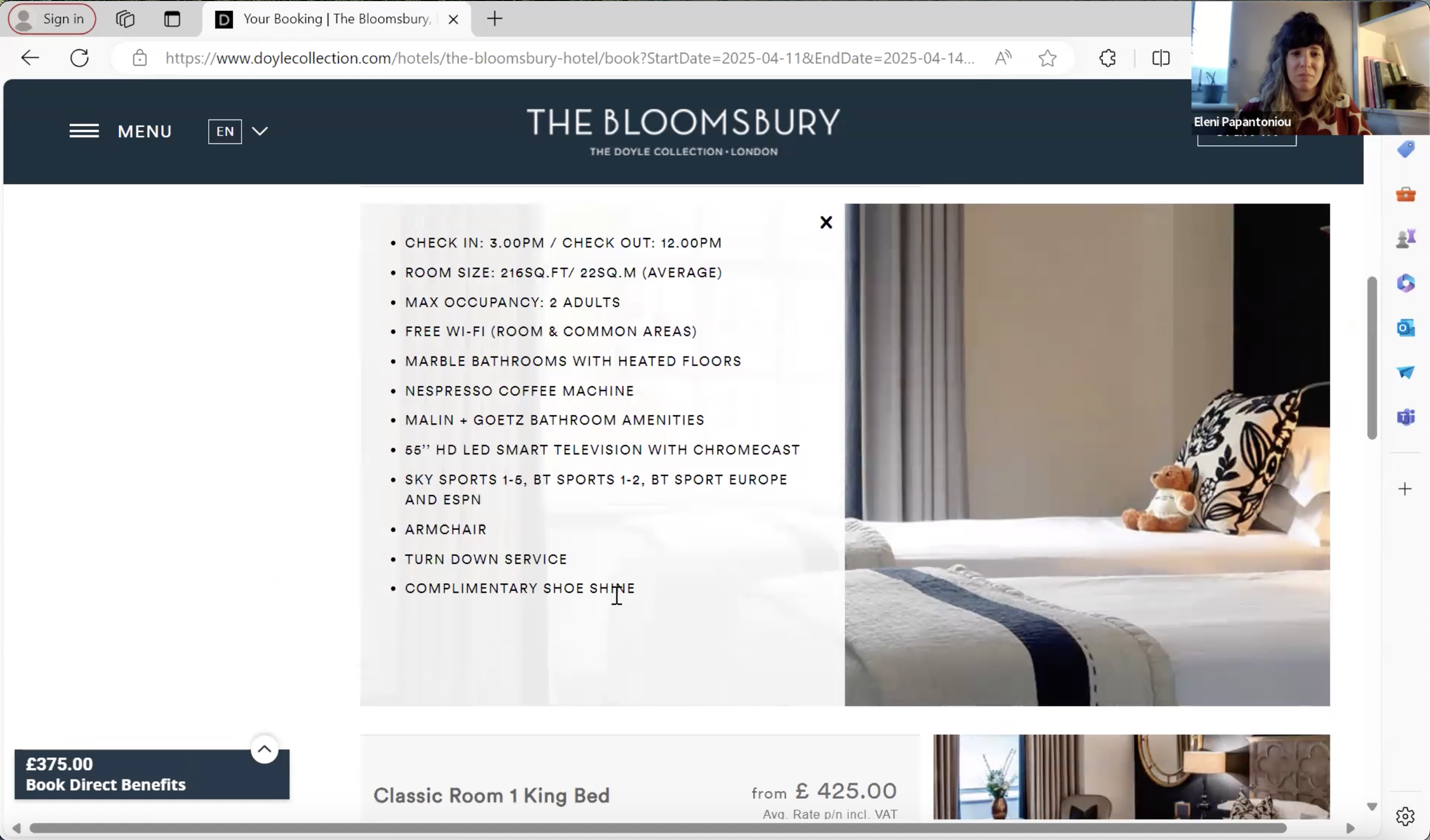
3.3 Prototype!

Screenshot of wireframes in figma with added hotspots
My prototype is a medium-to-high fidelity version of the final desktop app, focusing on a single user "happy path" to ensure a streamlined, intuitive experience. While not all features are fully functional at this stage, the prototype is designed to address the key pain points observed during user testing. My goal was to create a simplified, user-friendly interface that makes the booking process as seamless as possible, reducing friction and enhancing the overall experience for users.
Improvements made
Designed a visually clean and minimal interface, capturing user attention from the home screen without overwhelming them with excessive ads or information.

3. Added personalized filtering options for hotel searches and reviews, enabling users to tailor results to their preferences and speed up the booking process.

2. Made pricing and rates fully transparent at every stage of the booking process, eliminating hidden costs and building user trust.

4. Clarified hotel location details by highlighting proximity to landmarks and transport links, helping users make quicker, more informed booking decisions.

Further Improvements;
Removed overwhelming add-ons from the booking flow, instead offering them after the booking is complete to reduce cognitive load.
Included time-saving features like a heart icon to save hotels to a favorites list for easy access later.
Streamlined the search process by avoiding overly complex search features, making it faster and easier for users to find hotels.
Simplified the layout of room details, allowing users to scan and compare options more efficiently.
Designed a visually clean and minimal interface, capturing user attention from the home screen without overwhelming them with excessive ads or information.
Presented hotel and room information clearly and concisely to reduce confusion and frustration during browsing.
4. Annotations & Handover
I created clear, detailed prototype annotations to support a smooth design-to-development handover. Each annotation outlined key functionality, interactions, and user flows, giving developers the context needed to accurately build the product. This reduced ambiguity and helped ensure the final implementation stayed aligned with the intended user experience.
5. Testing & Evaluating
To evaluate the usability of the hotel booking platform, I conducted a heuristic self-assessment alongside user testing. This helped identify potential usability issues early, based on established UX principles. I then gathered feedback through usability testing with target users, allowing me to validate design decisions and uncover real-world pain points. Insights from both methods informed iterative improvements, resulting in a more intuitive, accessible, and user-friendly experience.
5.1 Usability testing
User testing of the prototype provided valuable insights that informed further refinements to improve the overall experience. some of the key take-aways were;
Users struggled to quickly compare hotel features, revealing a need for clearer formatting of amenities and facilities, such as using a grid or table layout.
Participants found long blocks of content overwhelming, suggesting that splitting About, Location, and Facilities into separate tabs would ease navigation.
Several users lost track of their place during booking, highlighting the value of a persistent progress summary to improve orientation.
The separation of contact and payment steps felt unnecessarily long, prompting a recommendation to combine them for a smoother experience.
Users were unsure why they had to message their host before confirming a booking, indicating this step would feel more natural later in the process.
Additional user testing will be conducted to further refine and validate the booking process. And refinements to the prototype will take place once more usability testing has been completed.
5.2 🔍 Usability Heuristic Evaluation (self assessed)
✅ 8/10 heuristics fully satisfied
➕ 2/10 partially satisfied
(Based on Nielsen’s 10 Usability Heuristics for User Interface Design)
1. Visibility of System Status
🟡 Mostly satisfied.
The site provides feedback, but adding visible loading states during searches would improve clarity.
2. Match Between System and the Real World
✅ Satisfied.
Uses familiar terms like “Check-in,” “Room Type,” and “Guest Info” aligned with hotel booking conventions.
3. User Control and Freedom
✅ Satisfied.
Users can easily go back and change dates or preferences without restarting the search.
4. Consistency and Standards
✅ Satisfied.
Visual elements and navigation are consistent and follow familiar web conventions.
5. Error Prevention
✅ Satisfied.
Good form validation. Could improve by marking required fields more clearly.
6. Recognition Rather Than Recall
✅ Satisfied.
Filters like dates and location are retained across pages, reducing memory load.
7. Flexibility and Efficiency of Use
✅ Satisfied.
Usable for both new and returning users. Saved preferences would enhance this.
8. Aesthetic and Minimalist Design
✅ Satisfied.
Clean layout with clear hierarchy and focused call-to-actions.
9. Help Users Recognise, Diagnose, and Recover from Errors
🟡 Partially satisfied.
Error messages exist but could be clearer, especially for payment issues.
10. Help and Documentation
🟡 Partially satisfied.
No visible FAQ/help section. Adding this could increase user confidence.
4. Mobile App & Brand Opportunities

While I focused on a desktop path for this prototype, I also created mock-ups to show how the sleek, user-centric design and smooth flow could seamlessly translate to a mobile app. My aim was to ensure that the mobile experience would be just as intuitive, visually appealing, and easy to navigate, making it a desirable option for users who prefer booking on the go. These mock-ups reflect the core principles of the desktop version, ensuring consistency while optimizing the experience for smaller screens.

Roam’s brand identity has strong potential for commercial application across a range of physical and print touchpoints. Branded items like do not disturb door hangers and tote bags can extend the guest experience beyond digital, offering both functional and memorable brand interactions. Opportunities also include in-flight magazine features, travel guides, or branded stationery, each reinforcing Roam’s presence as a curated, design-led travel platform. These extensions not only enhance brand recognition but also create new avenues for storytelling and audience engagement in real-world contexts.