
Project Overview
Martha & Moose is a family-run pet treat brand founded in 2018, producing handmade, natural products in their Hertfordshire bakery. Rooted in values of quality and accessibility, the brand evolved from their long-standing sister company, The Granary Store.
I conducted a full audit of the existing website to identify usability, accessibility, and content issues. Based on these findings, I redesigned key pages to improve visual hierarchy, product clarity, and brand storytelling, while optimising the experience across both desktop and mobile.
Using custom CSS alongside Squarespace, I fine-tuned layout, styling, and brand consistency beyond the platform’s default capabilities. The result is a more engaging, accessible website that better reflects the brand’s values and supports a clearer customer journey.
The problem
The existing website made it difficult for users to quickly understand the product offering, navigate key pages, and feel confident engaging with the brand. Issues with hierarchy, accessibility, and content clarity reduced usability and missed opportunities for conversion and storytelling.
Key challenges
Weak visual hierarchy made navigation and priorities unclear
Products lacked clear affordances and scannable information
Accessibility issues (contrast, spacing, interactive cues) reduced readability
Brand values and craft were not effectively communicated
Key conversion moments lacked clarity and motivation
Project Goals
Clarify navigation and visual hierarchy so users can quickly understand the product offering and next steps.
Make products and key commercial pages more discoverable and actionable, including Shop, Gift Cards, and Subscriptions.
Communicate brand values and storytelling to build trust, highlight craftsmanship, and create an emotional connection.
Enhance accessibility and usability across desktop and mobile, including clear affordances, contrast, and spacing.
Establish a consistent, scalable UI system that supports future content updates and aligns with the brand identity.
Audit Highlights
Navigation & Hierarchy
Homepage spacing inconsistencies and weak visual hierarchy
Footer typography and layout inconsistencies
Distracting motion elements reducing clarity
Product Presentation
Inconsistent product imagery and cropping
Limited information at a glance, unclear clickability
Inconsistent product titles affecting findability
Accessibility & Usability
Low colour contrast in navigation and content
Decorative elements mimicking links without functionality
Missing interactive cues on key CTAs
Content & Storytelling
About page lacked brand narrative, team visibility, and emotional connection
Low-resolution imagery reduced brand credibility
Limited customer validation (testimonials, social proof)
Conversion Opportunities
Subscription offers were unclear and text-heavy
Gift cards lacked clear purchase path or product interaction
Newsletter lacked clear value proposition
Distracting animated ‘M’ reduces focus
Navigation contrast too low - hard to scan menu
Layout unclear - users unsure where to start

Visual hierarchy weak - primary actions unclear
Subscription offer text-heavy, no CTA emphasis
Users may struggle to understand next step
Inconsistent typography reduces readability
Decorative lines mimic links - misleading
Content hierarchy unclear - hard to find information

No brand storytelling - lacks personality
Value proposition unclear - users may ignore sign-up
CTA not prominent - engagement likely low
Design Approach
I approached the redesign by focusing on clarity, accessibility, and brand storytelling, ensuring key commercial actions were discoverable and visually consistent across all pages.
Design Principles:
Clarity first: simplify hierarchy and prioritise key content
Accessible by default: high contrast, clear typography, and obvious affordances
Brand storytelling: communicate heritage, craft, and personality visually
Action-oriented: make key CTAs prominent and easy to understand
Consistent and scalable: establish a UI system that works across pages
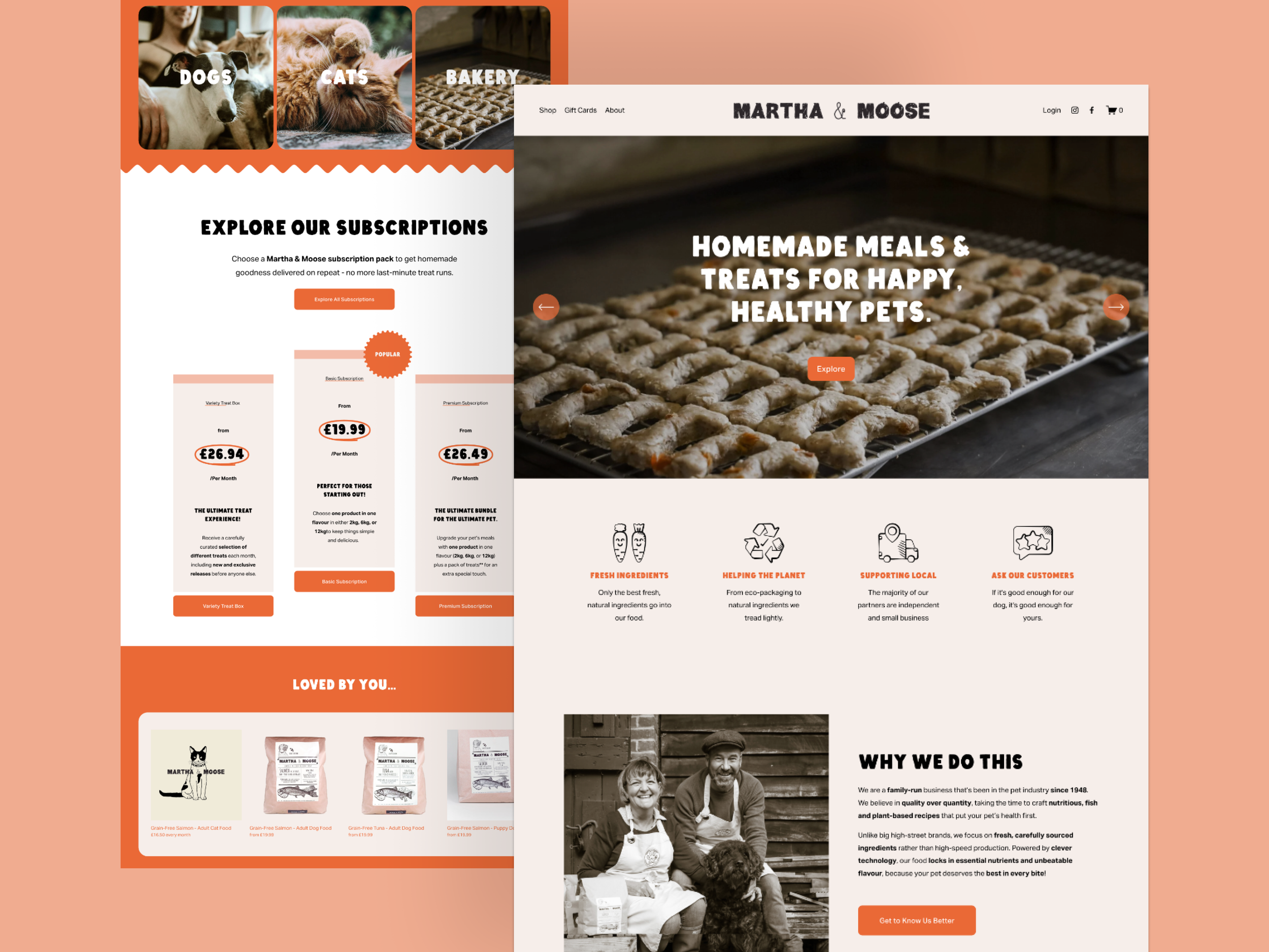
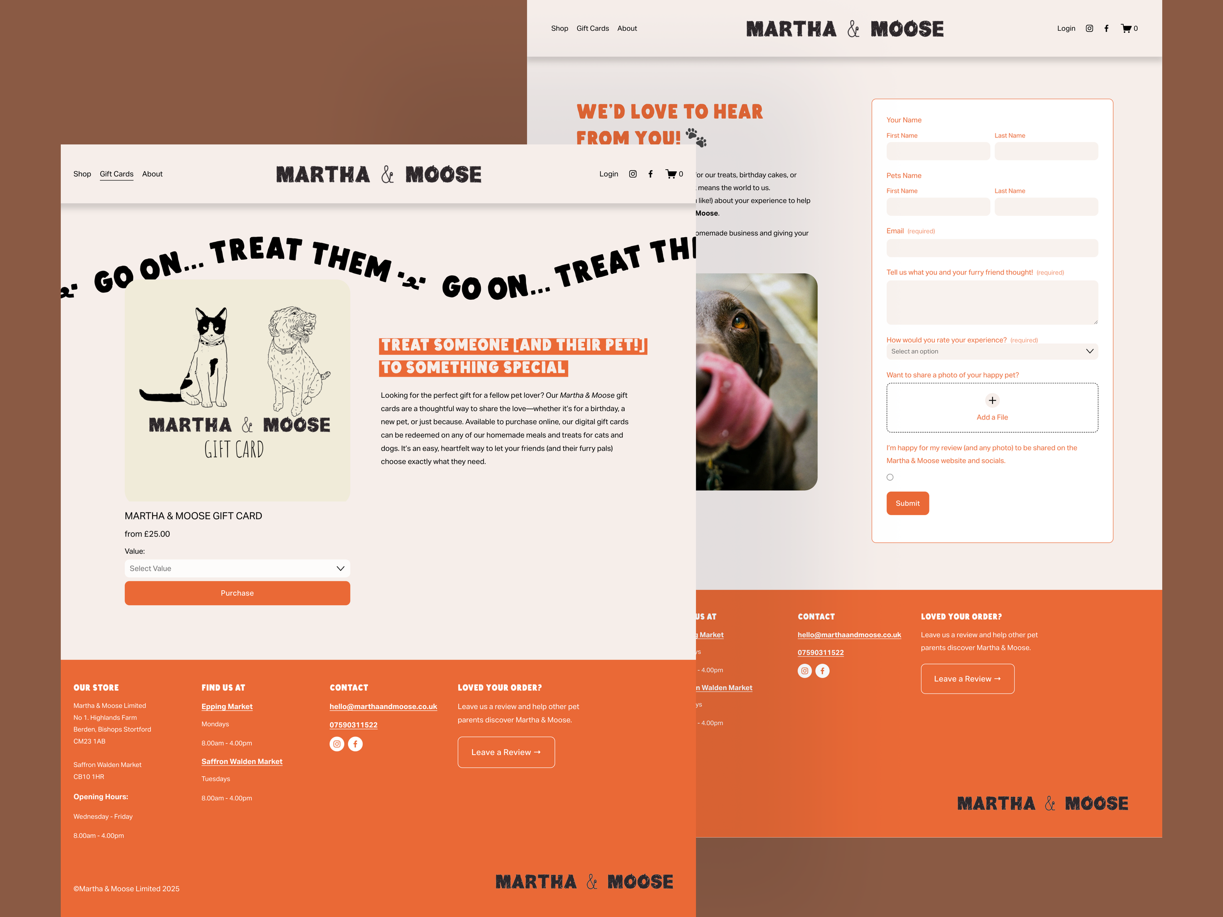
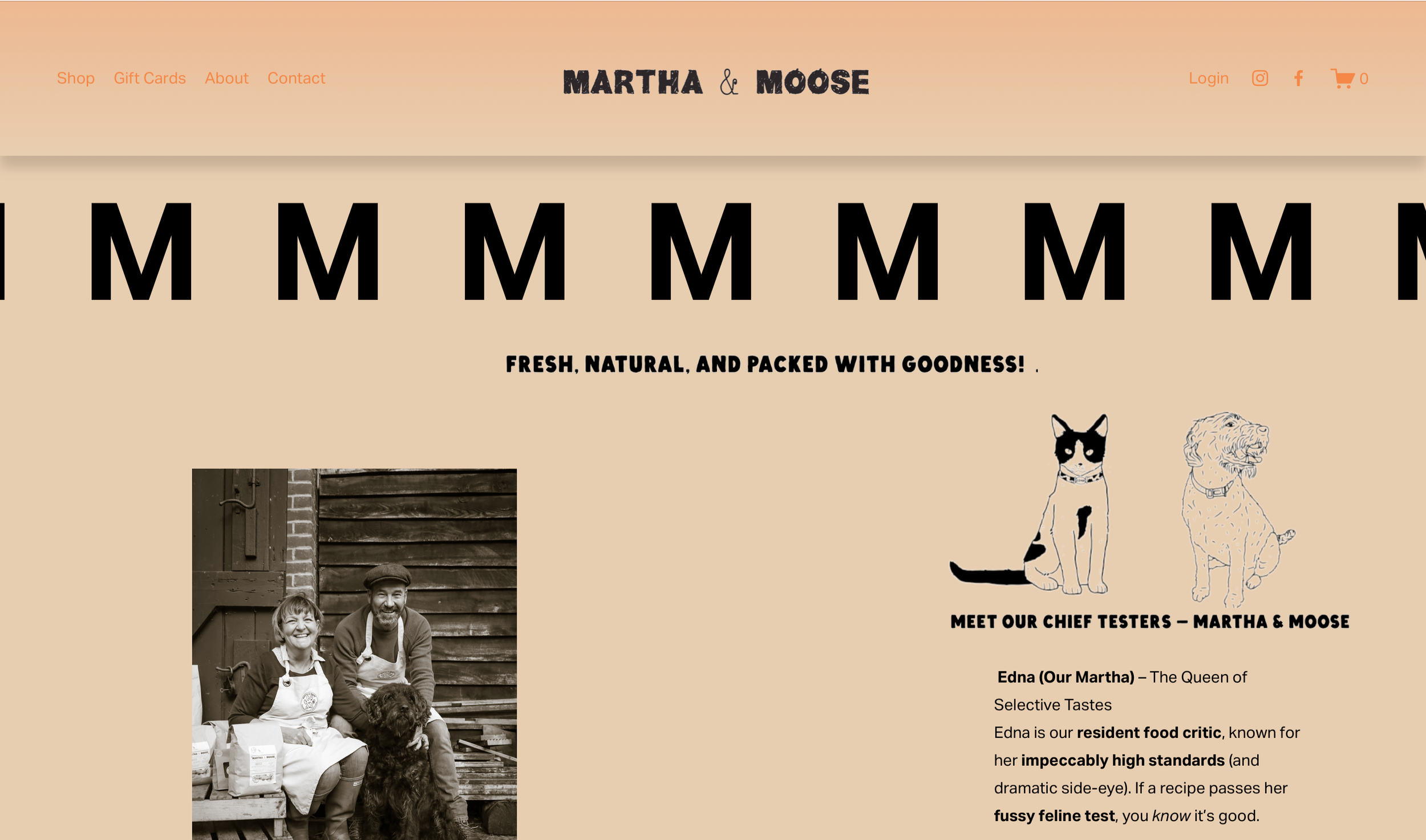
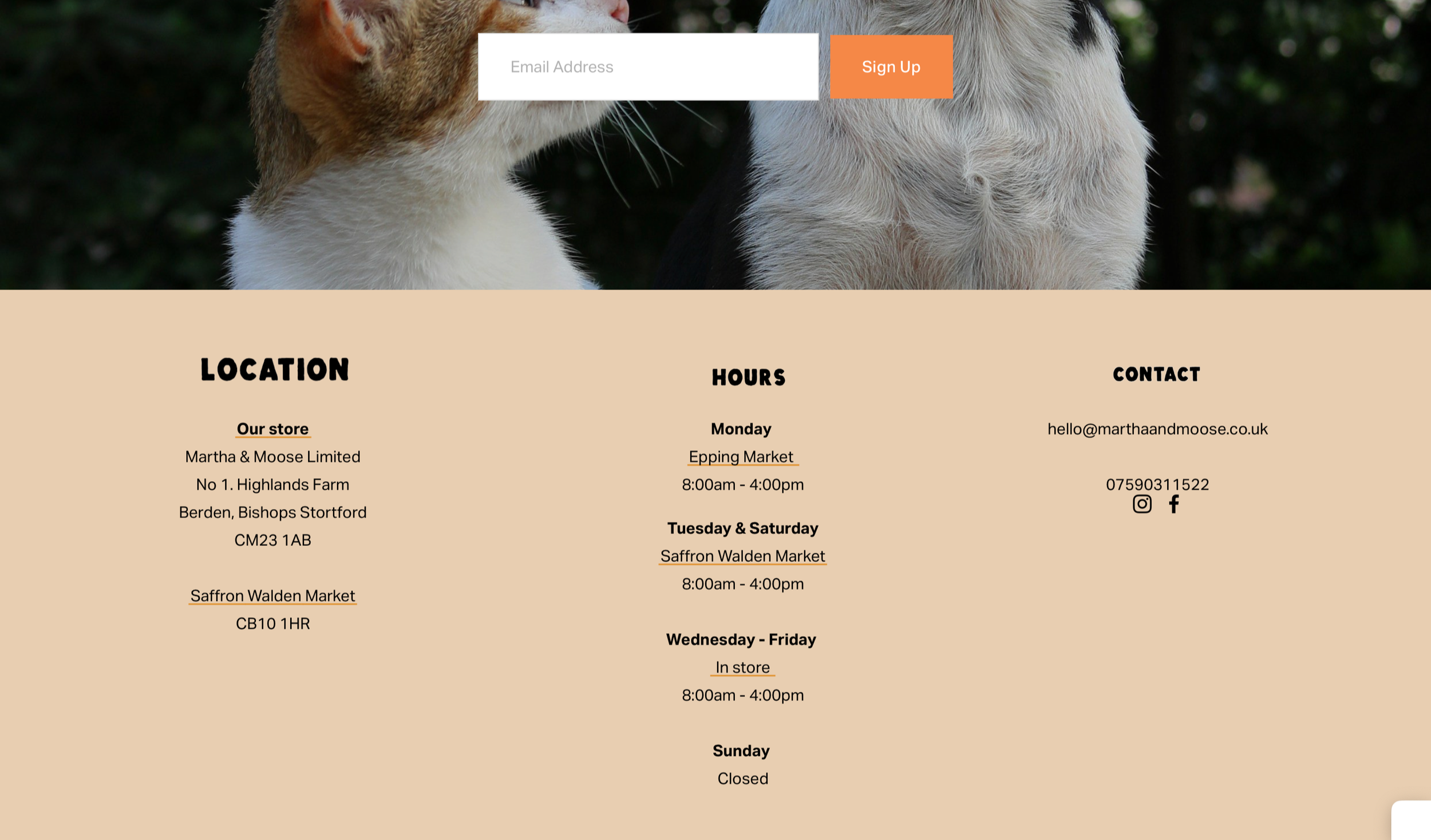
UI Redesign
Homepage (introduction)
clear navigation, no distracting animation, accessible contrast
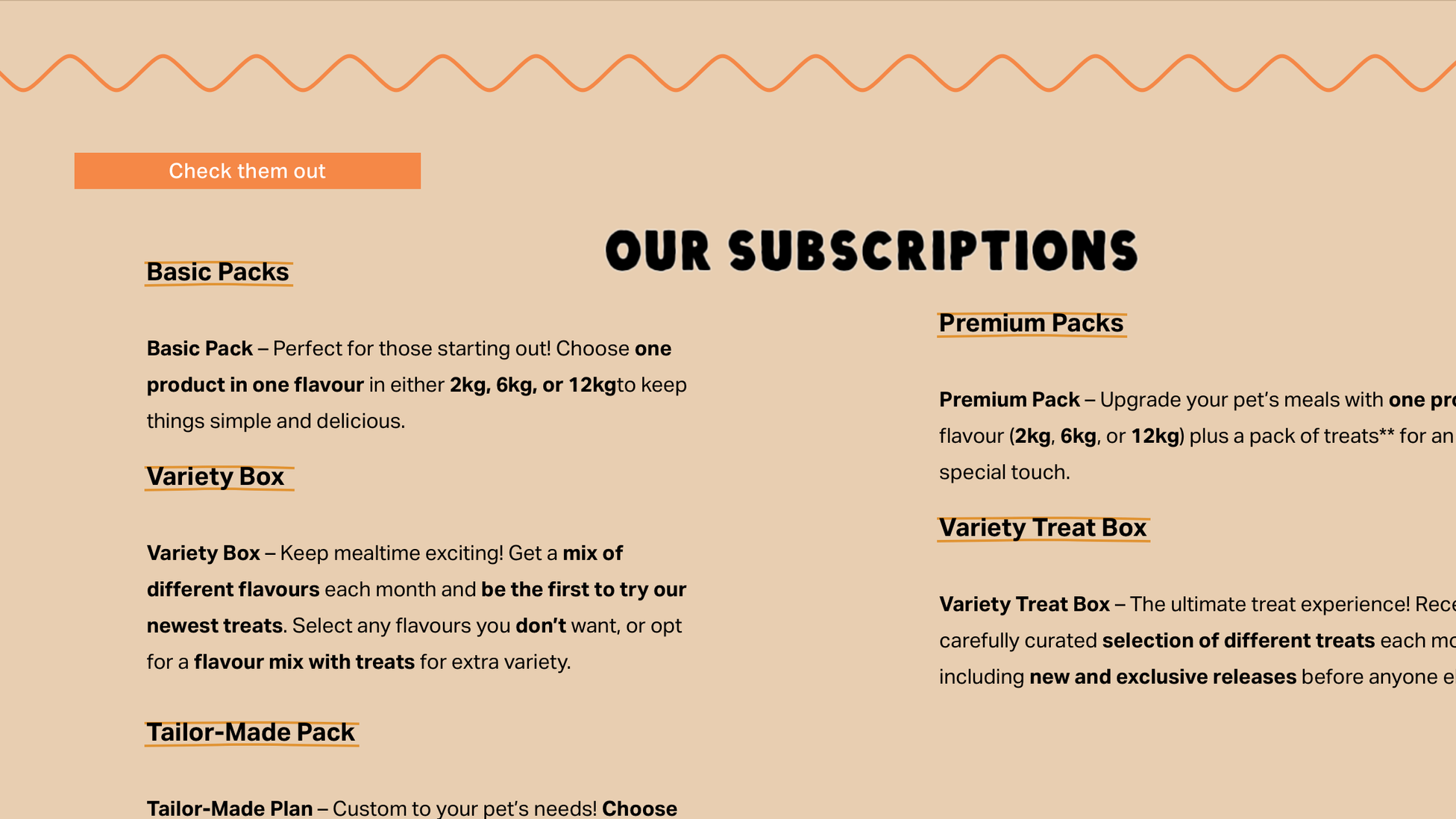
Subscriptions
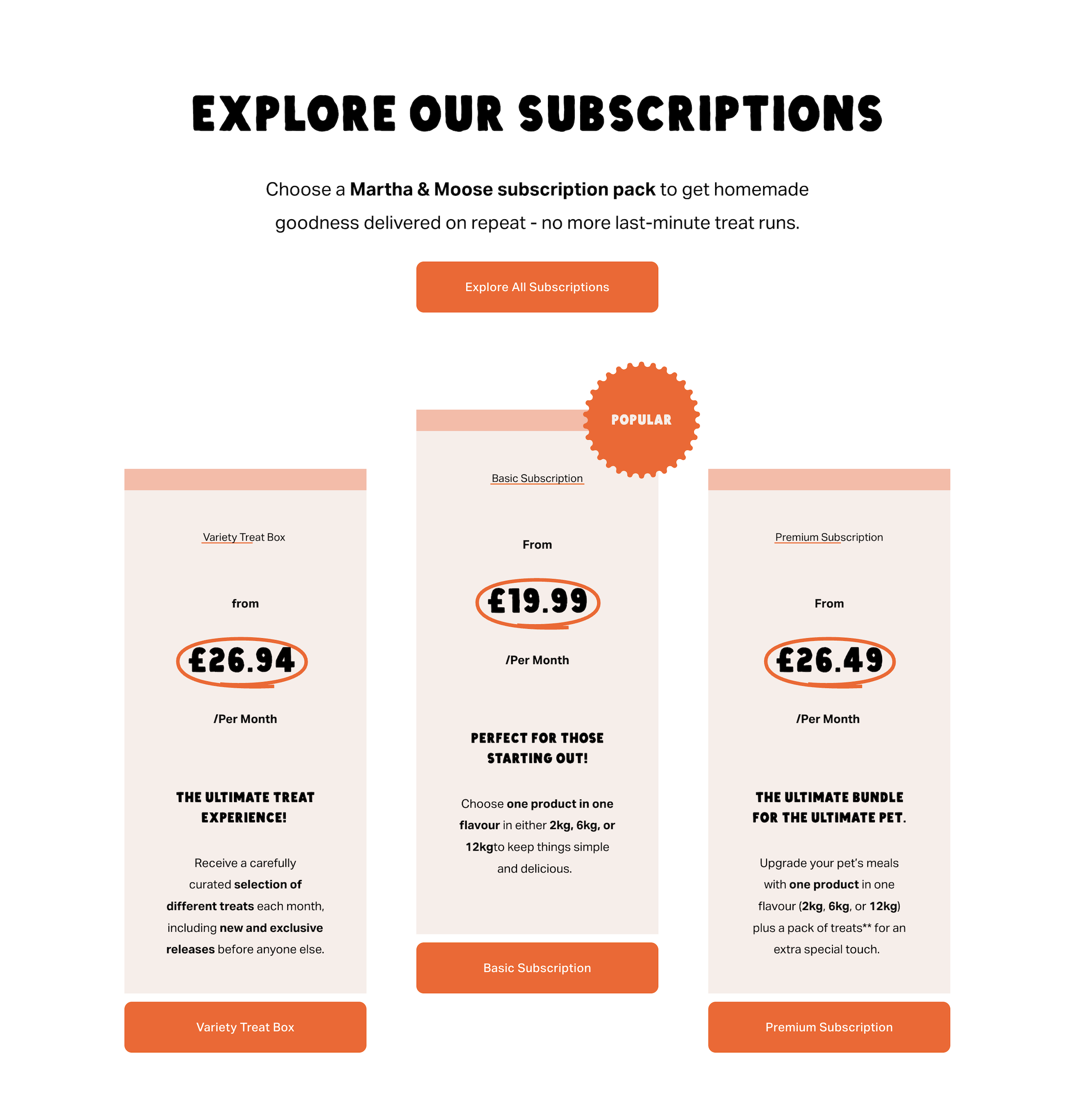
clear hierarchy, prominent CTA, visual cues
Gift Cards Page
Clear purchase path, delivery info, CTA clarity
About Page
Storytelling elements, brand personality, emotional imagery
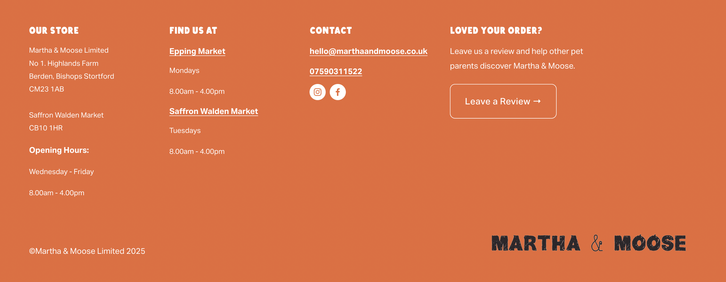
Footer
Consistent typography, hierarchy, clear links
Newsletter
Storytelling elements, brand personality, emotional imagery
Shop Page
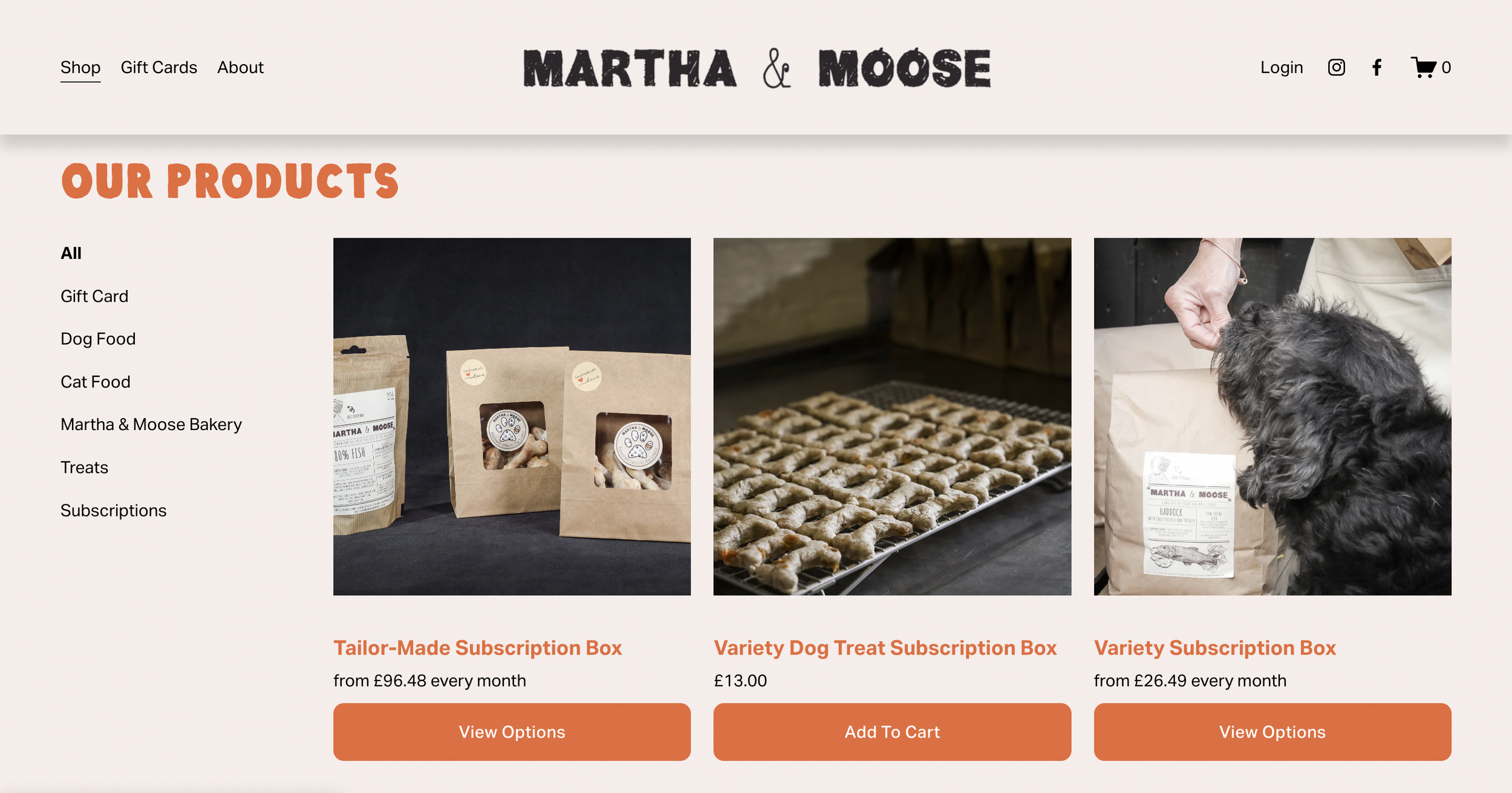
Product titles updated for consistency and improved findability
(Layout structured to accommodate new imagery)
Before → After Comparisons
Homepage (Hero)
Before
Distracting animation reduces focus
Navigation contrast too low for readability
Layout unclear — users unsure where to start
After
Clear hierarchy guides user attention
Accessible contrast improves readability
Primary CTA now prominent for engagement
Homepage (Subscriptions)
Before
Visual hierarchy weak — primary actions unclear
Text-heavy subscription offer lacks CTA emphasis
Important information doesn’t stand out

After
Clear CTA encourages sign-ups
Visual hierarchy prioritizes key information
Layout guides users to next steps
Accessibility Improvements
✅ Improved color contrast
Navigation, buttons, and key text now meet WCAG standards
Users can read content more easily
Before
Low contrast and unclear interactive elements reduced readability and discoverability.
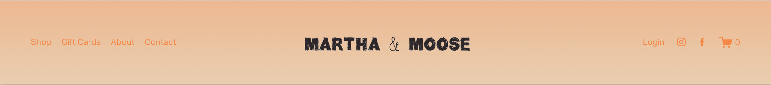
After
Improved contrast and clear hover affordances make navigation readable and actionable for all users.
Hover animation signals interactivity, reinforcing usability and brand personality with wiggling motion referencing a happy dog or wagging tail.

✅ Clear typography and spacing
Consistent headings, spacing, and font sizes for readability
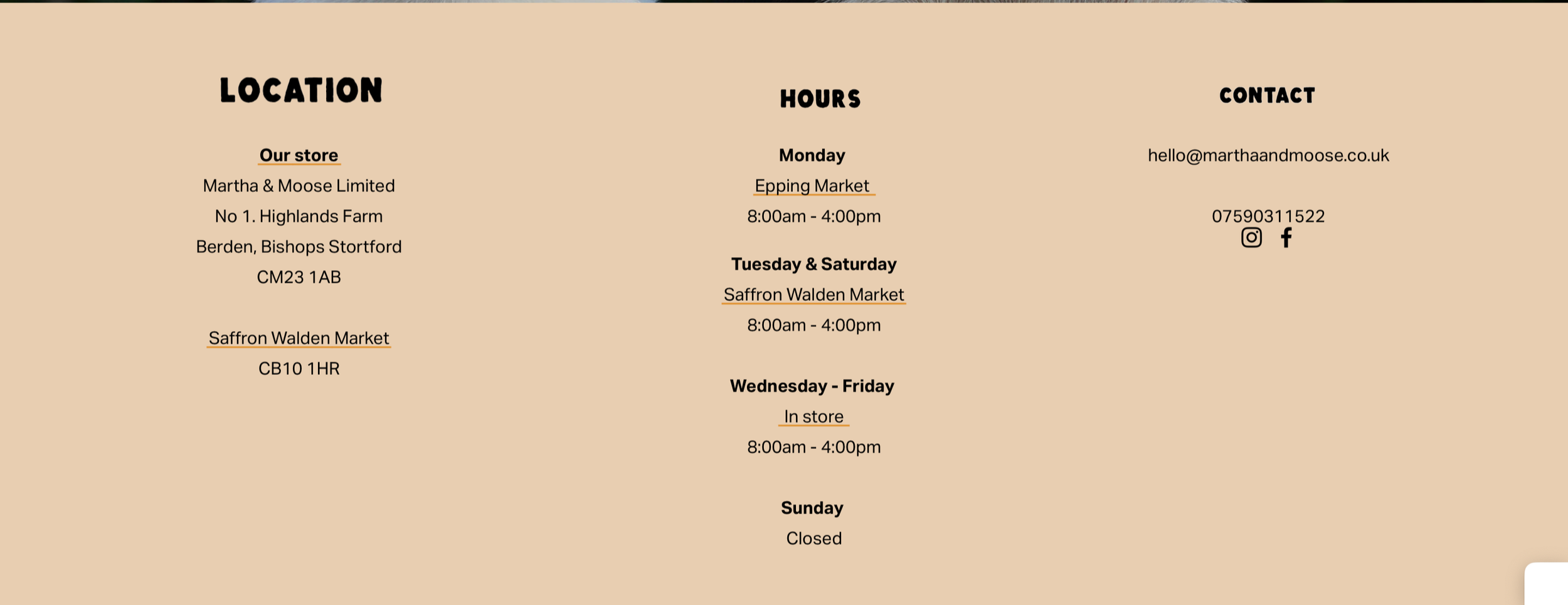
Before
Inconsistent typography, spacing, and headings made the footer hard to scan.
Decorative lines mimicked links, and information grouping was unclear, reducing usability.
After
Consistent headings, spacing, and font sizes improve readability and scanning.
Footer content restructured with clear groupings, and misleading decorative elements were removed to enhance usability.
✅ Clickable elements clearly distinguished
Links, buttons, and CTAs are obvious and follow affordance best practices. Custom CSS hover animation improves affordance and expresses brand character.
Before
Hierarchy unclear - primary actions hard to identify
Text-heavy layout reduces scannability
After
Clear visual hierarchy guides users to key actions
Prominent CTA and structured layout improve engagement and readability
✅ Accessible forms / interactions
Reviews page created to collect user feedback, and gift card page enhanced for clarity and usability and increased conversion.
Reflection and further development
During the project, it was recommended to the client that a refresh of imagery would enhance the visual impact of the site. Further refinements to the branding could also support consistency across pages. These steps would help maintain the improvements in hierarchy, readability, and user engagement achieved in the redesign.