
Ideal Living

Project details: For Ideal Living, a Glasgow-based exhibition that reimagines the traditional showroom by inviting visitors to ‘live’ in the space, I designed and developed a website that served as both a digital hub and an online shop. The site needed to communicate the exhibition’s immersive concept while providing users with clear access to artist information and a seamless way to purchase featured pieces. I was responsible for the full end-to-end design and development, ensuring the brand’s visual identity translated fluidly online. This involved managing and organizing a large volume of content, including detailed artist profiles and item catalogs, to create a cohesive and intuitive user experience.
Date: Oct - Nov 2024
Role: UX/UI Designer & Creative Strategist
Tools: Figma, Cargo, Adobe Photoshop & Lightroom, Jotform
Constraints: Limited research budget and tight timeline
Deliverables: Fully functional live site with content-rich artist pages, shop integration, and brand-aligned design
Process & Approach
Design Strategy & Constraints
With limited time and budget for in-depth user research, I focused on design best practices, heuristic evaluation, and stakeholder collaboration to guide decisions. The goal was to create a digital experience that felt immersive yet easy to navigate, echoing the physical exhibition.
Content Planning & Structure
A major challenge was managing and presenting a large volume of content — including artist bios, product listings, and exhibition information — in a way that felt cohesive and intuitive. I prioritized clear navigation and visual hierarchy to support user exploration without overwhelm.
Brand Translation
I worked closely with the curators to ensure the tone, colour palette, and imagery reflected the in-person experience. Typography and layout choices were inspired by the physical design language of the exhibition space.
Homepage
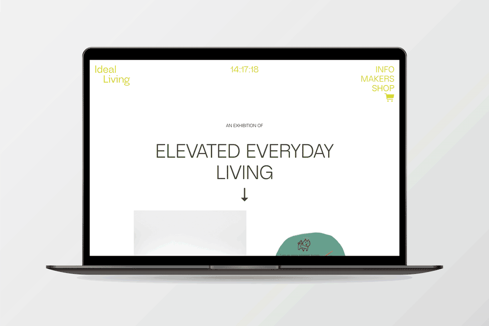
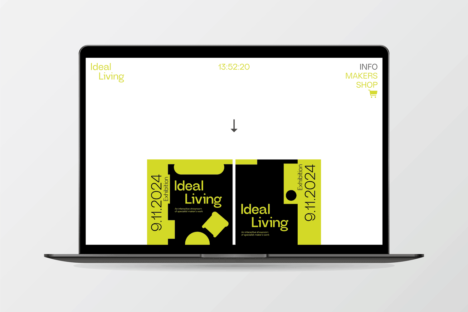
The Home page was designed as a visually impactful entry point that reflects the immersive concept of the exhibition. I made a conscious decision to keep text to a minimum, allowing bold imagery and clean layout to set the tone and atmosphere. This approach encourages users to explore the rest of the site—directing them toward the Shop, Info, and Artist Catalogue pages through clear visual cues and intuitive navigation. The layout balances aesthetic appeal with usability, offering a first impression that is both engaging and purposeful.
Info
The Info page provides users with key context about the exhibition, including its concept, location, and schedule. It was structured for clarity and ease of reading, using strong visual hierarchy and thoughtful spacing to guide users through the content. The design reinforces the tone of the exhibition while maintaining accessibility, ensuring users can quickly understand the purpose and details of the event across all devices.
Shop
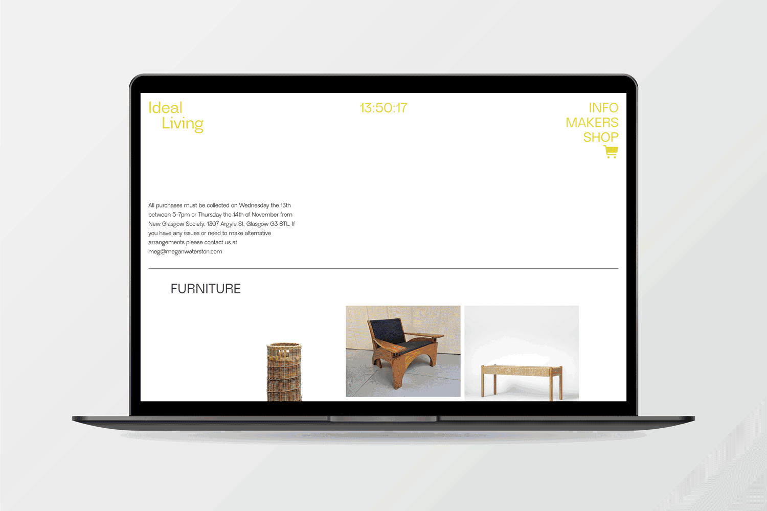
The Shop page was designed to offer a smooth and visually cohesive browsing experience, allowing users to explore and purchase pieces featured in the exhibition. Due to project constraints, product filtering was not included; instead, I focused on creating clear and distinct product categories within a single page layout to support ease of navigation. Consistent item presentation and straightforward calls to action help streamline the shopping experience, while maintaining a clean design that complements the rest of the site.
Artists Catalogue
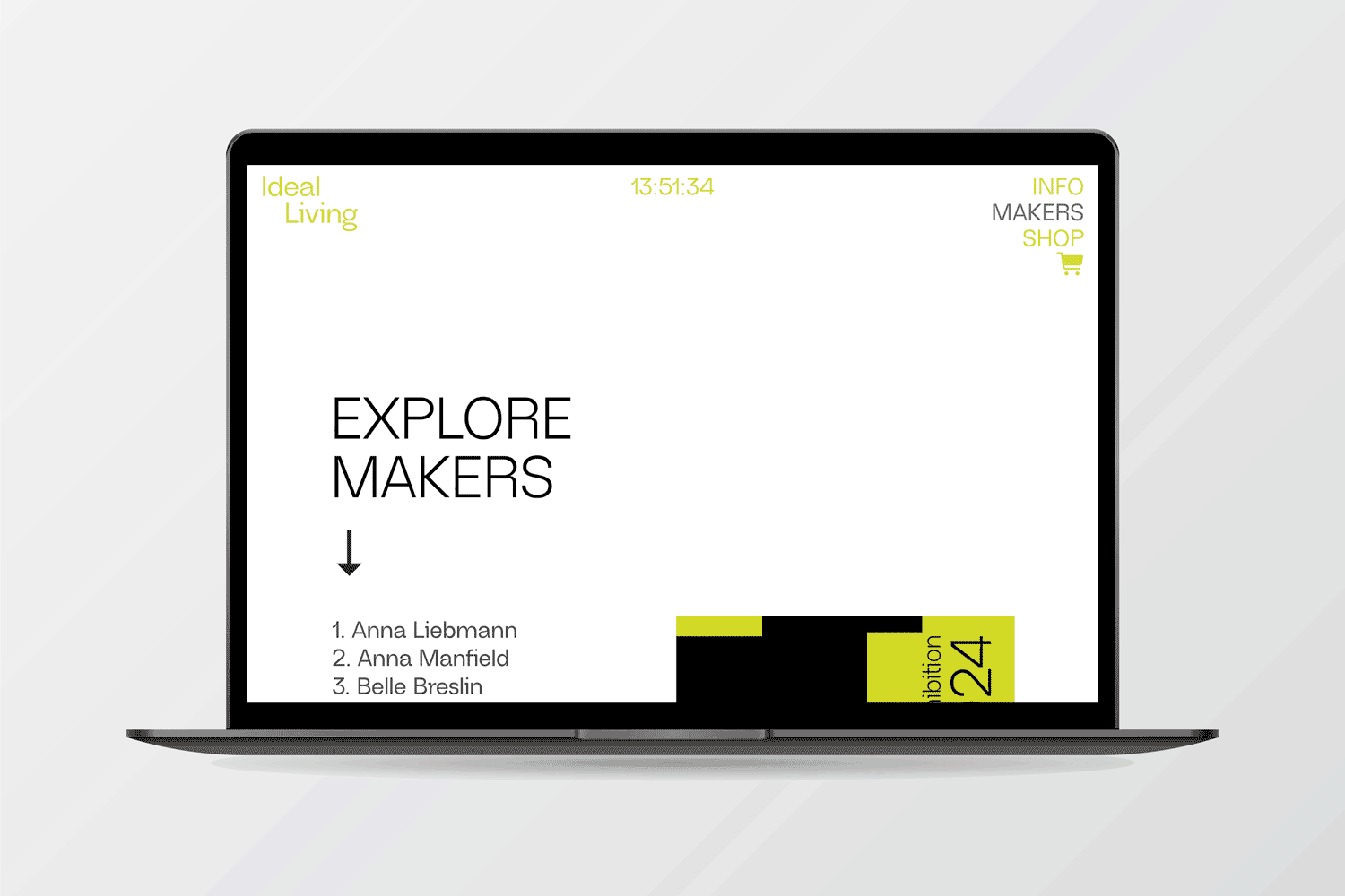
This page functions as a clear, scrollable index of all participating artists, presented as a simple list of clickable names. I kept the design intentionally minimal to reflect the exhibition’s clean aesthetic and to keep the focus on exploration. The straightforward layout allows users to easily browse and select an artist, serving as an accessible entry point into the deeper content found on each artist’s individual page.
Artists Landing Page
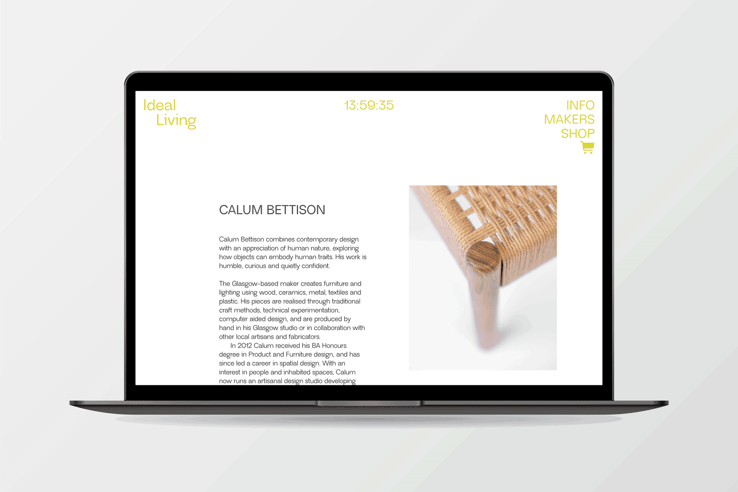
Each artist landing page offers a focused snapshot of the individual’s practice, combining a short biography, selected works, and links to any available items in the shop. These pages were designed to feel clean and editorial, with a visual emphasis on the artwork. I aimed to balance storytelling with usability, ensuring visitors could engage meaningfully with the content without distractions.
Reflections & Opportunities for Improvement
While the site successfully delivered an engaging and functional user experience within tight time and budget constraints, there were some limitations that impacted the final product. The web builder’s inability to crop images consistently within the app led to visual inconsistencies on the shop pages. Additionally, several content layout options did not translate well on mobile devices, which limited responsiveness and user experience on smaller screens. With more resources and time, I would prioritise conducting usability testing and gathering user feedback to validate assumptions and guide refinements. Future iterations would also benefit from more flexible design tools or custom solutions to ensure consistent image formatting and improved mobile content organisation, enhancing both visual cohesion and accessibility across devices.